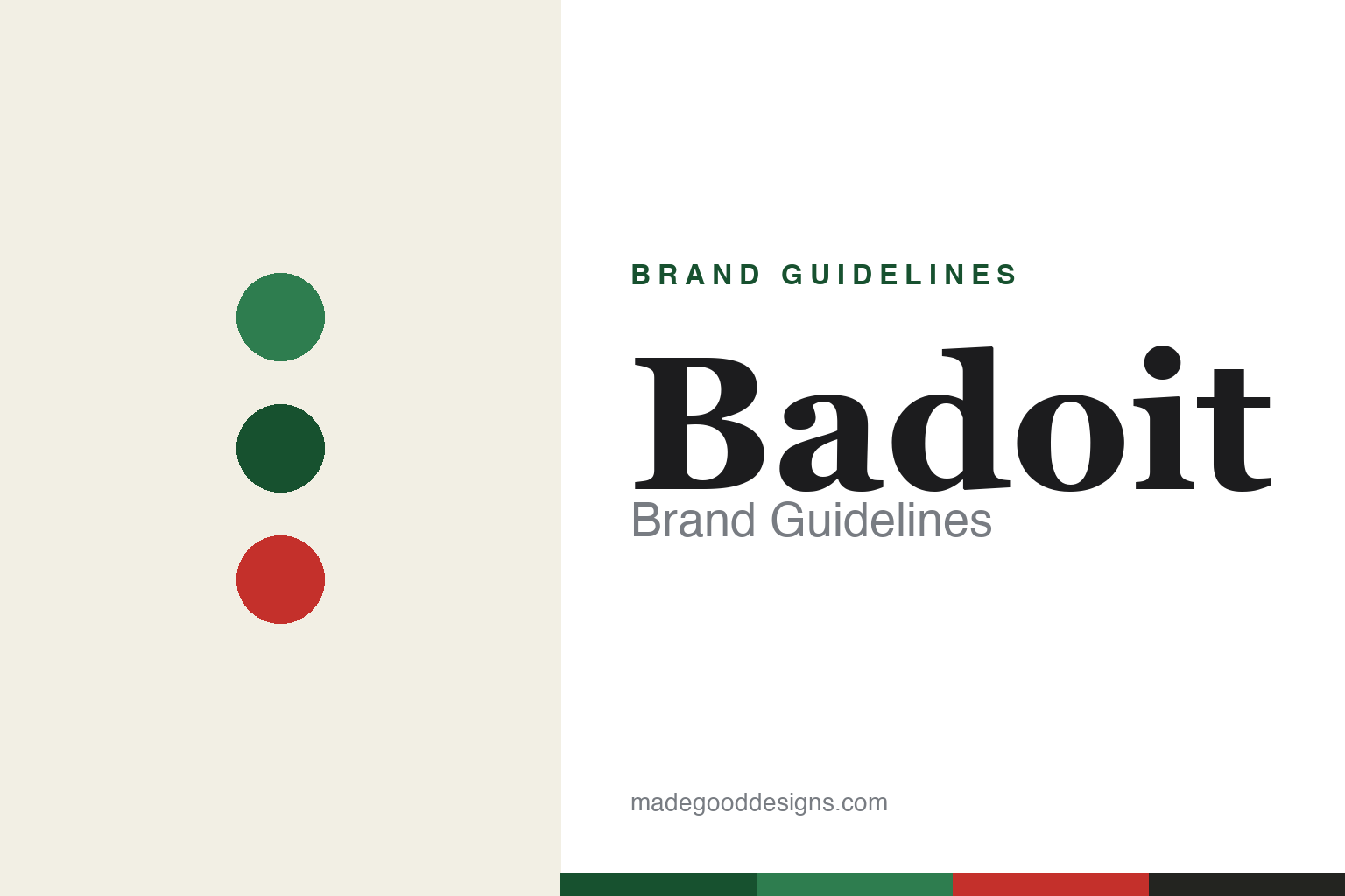
Badoit Brand Guidelines
The champagne of waters.
Aa
Two constants: a green (with red Rouge) palette and an elegant gastronomy serif. Abstract homage — not the Badoit bottle, label or wordmark.
The water for the table
Badoit built its brand on fine, natural bubbles.
Badoit is a lesson in owning fine dining. From Saint-Galmier in the Loire, France, it is a naturally sparkling mineral water that Auguste Saturnin Badoit began bottling in 1838, building on an 18th-century reputation as the “champagne of waters.” Its whole positioning is the restaurant table: a refined water to pair with food.
The product truth is real: Badoit is naturally carbonated, its carbon dioxide rising with the water underground so it emerges already sparkling, with characteristically fine, delicate bubbles. The line splits by colour — green for the classic, finer-bubbled Badoit, and Badoit Rouge (launched 2004), a red-liveried, more intensely sparkling version positioned as a digestif water.
(Honest notes: the name comes from Auguste Saturnin Badoit, the 19th-century bottler — not “Richard Badoit”; the carbonation is natural but adjusted with additional CO₂ at bottling, so it isn’t “untouched”; and Badoit is owned by Danone (acquired via its Evian arm around 1970), alongside evian and Volvic — not Nestlé. No official brand hex is published.)
Colour
Badoit lives in green, with a red for Rouge. Click a swatch to copy the hex.
Badoit’s identity is refined, green and French — a Badoit green, a deep green, a Rouge red, a cream, and an ink. The core is the green glass bottle; a distinct red marks the more intense Rouge. It signals a premium, gastronomic water rather than an everyday commodity. The honest caveat: with no published brand hex, these tones are an original, unofficial interpretation, not first-party values.
The lesson is colour can code a product range. Badoit’s world is green for the classic and red for the intense — a two-colour system that tells you the fizz before you taste it. For designers, it is a reminder that a clear colour code across variants helps a premium line stay legible on a wine-list or a shelf. The takeaways: use colour to distinguish variants; keep a heritage green as the anchor; and treat any single hex as unofficial — using the deep green for small text so the greens and red stay clean.
Typography
The wordmark spirit is an elegant serif — warm and gastronomic.
Badoit’s identity carries a warm, elegant, gastronomic spirit — a refined “Badoit” wordmark on a green bottle, at home on a restaurant table. An expressive serif captures the mood: it is characterful and appetising, the register of a water that markets itself alongside food and conviviality (its old jingles are part of French pop memory). Set against green and a red accent, the serif feels premium and inviting — exactly the fine-dining personality Badoit carries. It is warm rather than clinical, mirroring a bottle poured with a meal. (Badoit’s real wordmark and bottle are trademarks and trade dress we describe but do not reproduce, and the exact typeface is not published, so we don’t assert it.) Because the specific mark is not ours to use, the honest description is “an elegant gastronomy serif spirit,” not the Badoit logo. The type behaves like the brand: warm, refined and sociable.
Aa
An elegant gastronomy serif spirit — warm and refined. (Specimen set in Fraunces, an expressive serif; NOT the Badoit logo, which is a trademark.)
Positioning a commodity as fine dining
Badoit stands for the meal.
Badoit is a lesson in choosing a table, not a category. Rather than fight on the crowded shelf, it planted itself in restaurants and fine dining, where a naturally sparkling water with fine bubbles could be a considered choice beside the wine. That context turned a mineral water into a premium, grown-up product. The differentiator is a clear occasion: Badoit is for the meal.
For designers and brand-builders, Badoit offers a clear takeaway: occasion is positioning. The lessons: anchor a product to a specific moment (here, the table); back it with a real product truth (natural fine bubbles); and use a colour code to make the range legible (green classic, red Rouge). It is also a reminder to stay accurate: the namesake is Auguste Saturnin Badoit, the carbonation is natural but CO₂-adjusted, and the owner is Danone — with the palette here an unofficial interpretation. Badoit chose the table — proof that occasion can define a brand.
Explore & save
Keep Badoit’s identity on hand — save it to a board in the Made Good inspiration library.
Badoit identity set
Pin the green-and-Rouge palette and the gastronomy-serif spirit to your own board.


