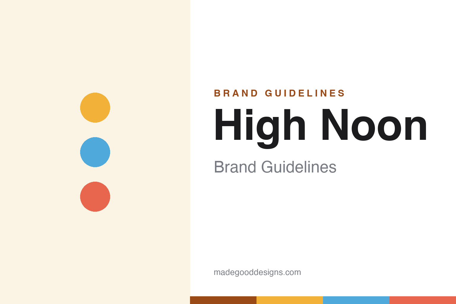
High Noon Brand Guidelines
Real vodka. Real juice.
Aa
Two constants: a sunny, beach palette and a friendly sans wordmark. Abstract homage — not the High Noon sun logo or cans.
The real-vodka breakout
High Noon won by being real vodka, not malt.
High Noon is a lesson in a single clear difference. Launched in 2019 by E. & J. Gallo Winery (the family-owned wine-and-spirits giant), it became the breakout winner of the RTD boom — one of the best-selling spirit brands in the US by volume. Its whole pitch is one word: real.
Unlike White Claw and Truly, which ferment sugar, High Noon is made with real vodka, real fruit juice and sparkling water — around 4.5% ABV — and its marketing hammers the contrast (“Real vodka. Real juice.”, “Enough With the Fake”). Its identity is sunny: a sun / sunburst emblem, bright beach-and-pool colour, and flavour colour-coding on clean slim cans. The range expanded into a tequila seltzer and a hit vodka iced tea (2024).
(Honest notes: High Noon is real vodka, not a malt seltzer — the key distinction; it is owned by Gallo, a wine company, not an independent startup; and in 2025 it issued a recall after some vodka-seltzer cans were mistakenly labelled as Celsius energy drink. No official brand hex is published.)
Colour
High Noon lives in sunny beach colour. Click a swatch to copy the hex.
High Noon’s identity is sunny, warm and beachy — a sun gold, a sky blue, a coral, a warm cream, and an ink. The palette is a day at the beach: sunshine gold, pool blue, and bright per-flavour accents. It signals easy, real, good-times refreshment. The honest caveat: with no published brand hex, these tones are an original, unofficial interpretation, not first-party values.
The lesson is a warm palette can carry a clear promise. High Noon’s world is sunshine, and the sun emblem makes the name literal. For designers, it is a reminder that a simple, ownable symbol (a sun) plus a warm palette can make a product feel instantly likeable — matching a brand built on “real” and “sunny.” The takeaways: tie a symbol to the name; build a warm, sunny palette; and treat any single hex as unofficial — using a deep amber for small text so the sun gold stays bright.
Typography
The wordmark spirit is a friendly sans — sunny and clear.
High Noon’s identity carries a sunny, friendly, easy-going spirit — a clean “High Noon” wordmark beneath a sun emblem, on bright beach-toned cans. A friendly geometric sans captures the mood: it is warm and legible, the register of a brand that sells sunshine and “real vodka, real juice.” Set against sun gold and sky blue, the friendly type feels breezy and honest — exactly the sunny, real personality High Noon carries. It is easy rather than formal, mirroring a can for the pool. (High Noon’s real wordmark, the sun emblem and cans are trademarks and trade dress we describe but do not reproduce, and the exact typeface is not published, so we don’t assert it.) Because the specific mark is not ours to use, the honest description is “a friendly sans spirit,” not the High Noon logo. The type behaves like the brand: sunny, friendly and clear.
Aa
A friendly sans spirit — sunny and clear. (Specimen set in Figtree, a friendly sans; NOT the High Noon logo, which is a trademark.)
Winning on one honest difference
High Noon stands for real.
High Noon is a lesson in a single, honest differentiator. In a category of near-identical fermented-sugar seltzers, High Noon offered one clear thing — real vodka and real juice — and built its whole brand, from tagline to sun emblem, around it. That clarity, plus Gallo’s distribution muscle, turned it into the category’s breakout winner. The differentiator is a real, communicable product truth.
For designers and brand-builders, High Noon offers a clear takeaway: a clear difference beats a clever look. The lessons: find the one true thing your product has (real vodka) and say it plainly; give it a warm, ownable symbol (the sun); and let the name and image agree (High Noon, sunshine). It is also a reminder to stay accurate: High Noon is real vodka (not malt), owned by Gallo, and had a 2025 mislabelling recall — with the palette here an unofficial interpretation. High Noon sold “real” — proof that one honest difference can be the difference.
Explore & save
Keep High Noon’s identity on hand — save it to a board in the Made Good inspiration library.
High Noon identity set
Pin the sunny beach palette and the friendly-sans spirit to your own board.