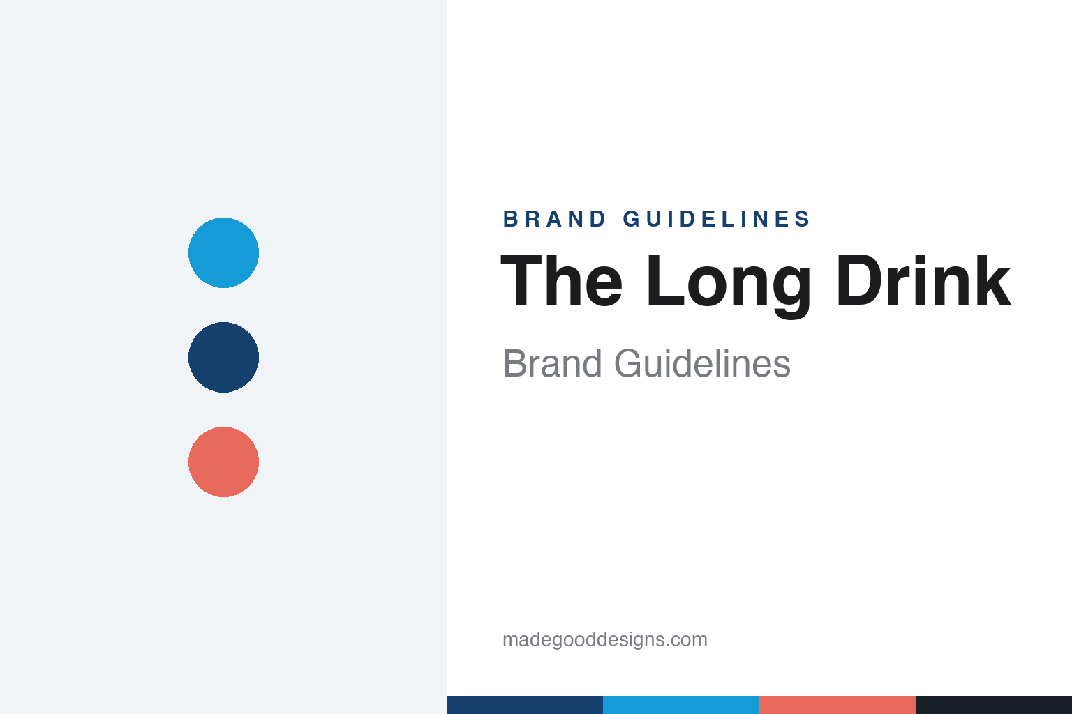
The Long Drink Brand Guidelines
The national drink of Finland.
Aa
Two constants: a Nordic blue palette (with grapefruit) and a clean grotesk wordmark. Abstract homage — not the Long Drink wordmark or cans.
Finland’s national drink, in a can
The Long Drink revived a 70-year-old Finnish idea.
The Long Drink is a lesson in importing a ready-made story. The drink itself — the Finnish “long drink” (lonkero), a mix of gin and grapefruit soda — was created for the 1952 Helsinki Olympics to serve crowds quickly, and has been a Finnish staple ever since. The Long Drink Company brought it to America, launching in the US in 2018 (founded by Evan Burns with Finnish co-founders).
It grew fast on a clear, likeable pitch — “the national drink of Finland” — and celebrity co-owners including actor Miles Teller, DJ Kygo and golfer Rickie Fowler. Its look leans Nordic and retro: the flagship Traditional comes in a distinctive blue, cyan-and-white can with a striped motif, with colour-coded Zero, Strong and Cranberry variants (around 5.5% ABV, Strong higher).
(Honest notes: 1952 is the drink category’s origin, while 2018 is the company’s — keep them distinct; the celebrity backer is Miles Teller, an investor/co-owner, not the founder; it is gin-based, not a vodka or malt seltzer; and as of April 2026 it is owned by the Mark Anthony Group — the company behind White Claw and Mike’s — so it is no longer independent. No official brand hex is published.)
Colour
The Long Drink lives in a Nordic blue. Click a swatch to copy the hex.
The Long Drink’s identity is Nordic, blue and retro — a Long Drink cyan, a deep Nordic blue, a grapefruit coral, a cream, and an ink. The flagship is a blue, cyan-and-white can with a striped motif; a warm grapefruit tone nods to the drink’s citrus. It signals a clean, Scandinavian, heritage-yet-fun product. The honest caveat: with no published brand hex, these tones are an original, unofficial interpretation, not first-party values.
The lesson is a national palette can carry a story. The Long Drink’s world is Finnish blue and white, which makes the “national drink of Finland” claim feel visual, not just verbal. For designers, it is a reminder that borrowing a country’s colour cues can instantly communicate origin and authenticity. The takeaways: let the origin story set the palette; keep one flagship colour (the blue); and treat any single hex as unofficial — using the deep Nordic blue for small text so the cyan stays bright.
Typography
The wordmark spirit is a clean Nordic grotesk — modern and heritage.
The Long Drink’s identity carries a clean, Nordic, heritage-yet-modern spirit — a “THE LONG DRINK” wordmark on a blue, striped, Scandinavian-feeling can. A clean grotesk captures the mood: it is crisp and unfussy, the register of a brand that pairs a 1952 origin story with a modern, social product. Set against Nordic blue and white, the clean type feels authentic and contemporary — exactly the heritage-fun personality the brand carries. It is modern rather than ornate, mirroring a can rooted in Finnish design sensibility. (The Long Drink’s real wordmark and cans are trademarks and trade dress we describe but do not reproduce, and the exact typeface is not published, so we don’t assert it; “long drink”/“lonkero” is a generic Finnish category, not ownable.) Because the specific mark is not ours to use, the honest description is “a clean Nordic grotesk spirit,” not the Long Drink logo. The type behaves like the brand: clean, Nordic and confident.
Aa
A clean Nordic grotesk spirit — modern and heritage. (Specimen set in Familjen Grotesk, a Nordic grotesk; NOT the Long Drink logo, which is a trademark.)
Selling a story a category already owned
The Long Drink stands for Finland.
The Long Drink is a lesson in packaging an existing tradition. Rather than invent a drink, it took a beloved 70-year-old Finnish staple — the gin-and-grapefruit long drink — gave it a clean Nordic identity and a memorable claim (“the national drink of Finland”), and rode celebrity backing to fast US growth. The story was pre-built; the brand’s job was to present it well. The differentiator is authentic heritage, well-designed.
For designers and brand-builders, The Long Drink offers a clear takeaway: a real tradition is a design gift. The lessons: find a genuine origin story and tell it simply; use a national colour language to make it visual; and let credible advocates amplify it. It is also a reminder to stay accurate: 1952 is the drink’s origin and 2018 the company’s, the backer is Miles Teller, it is gin-based, and it is now a Mark Anthony brand (2026) rather than independent — with the palette here an unofficial interpretation. The Long Drink brought Finland to the shelf — proof that a real story can be the difference.
Explore & save
Keep The Long Drink’s identity on hand — save it to a board in the Made Good inspiration library.
The Long Drink identity set
Pin the Nordic-blue palette and the clean-grotesk spirit to your own board.