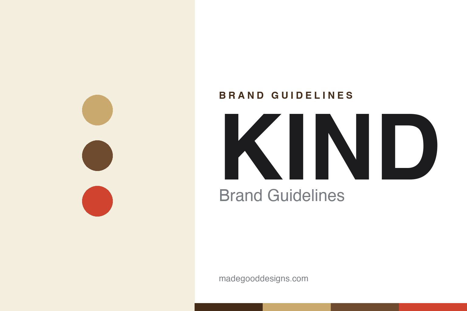
KIND Brand Guidelines
Ingredients you can see and pronounce.
Aa
Two constants: a warm kraft-and-nut palette and a clean lowercase wordmark. Abstract homage — not the KIND wordmark or wrapper.
You can see what’s inside
KIND made a transparent wrapper its whole brand.
KIND is a lesson in a package that proves the promise. Founded in 2004 by Daniel Lubetzky, it built a snack empire on one idea — whole nuts and fruit you can actually see — expressed through its signature transparent wrapper and the tagline “ingredients you can see and pronounce.” The see-through film wasn’t decoration; it was the argument.
Alongside the food ran a social mission — the KIND Movement and Foundation, “doing the kind thing” — a dual identity of transparent snack and kindness brand. The look is clean and ingredient-forward: a lowercase “kind” wordmark, warm kraft and white, whole ingredients front and centre.
(Honest notes: KIND is now owned by Mars — a minority stake in 2017, then a full acquisition announced in 2020 — with founder Lubetzky staying on as executive chairman; and its iconic clear wrapper is being phased out for a paper wrapper from 2025 (for recyclability), which prints a photo of the bar instead of showing it. So the see-through wrapper is the historic signature, now transitioning. No official brand hex is published.)
Colour
KIND lives in warm kraft and nut tones. Click a swatch to copy the hex.
KIND’s identity is warm, natural and ingredient-led — a kraft, a nut brown, a signal red, a cream, and an ink. The palette is the food itself: kraft and nut browns (the almonds and oats), a warm cream, and a red accent. It signals whole-food, minimally-processed snacking rather than candy. The honest caveat: with no published brand hex, these tones are an original, unofficial interpretation, not first-party values.
The lesson is let the ingredients be the palette. KIND’s world is nuts and fruit, shown honestly. For designers, it is a reminder that a warm, natural palette drawn from the product — paired with a package that reveals it — makes a health claim feel self-evident. The takeaways: draw colour from the ingredients; keep the pack ingredient-forward; and treat any single hex as unofficial — using a deep nut-brown for small text so the reds and kraft stay warm.
Typography
The wordmark spirit is a clean lowercase sans — warm and honest.
KIND’s identity carries a warm, honest, approachable spirit — a lowercase “kind” wordmark on a clean, ingredient-forward pack. A clean humanist sans captures the mood: it is friendly and trustworthy, the register of a brand whose name is a value and whose promise is transparency. Set against kraft and nut tones, the clean type feels honest and modern — exactly the see-what’s-inside personality KIND carries. It is warm rather than clinical, mirroring a bar you can literally see. (KIND’s real wordmark and the transparent wrapper are trademarks and trade dress we describe but do not reproduce, and the exact typeface is not published, so we don’t assert it.) Because the specific mark is not ours to use, the honest description is “a clean lowercase spirit,” not the KIND logo. The type behaves like the brand: warm, honest and clean.
Aa
A clean lowercase spirit — warm and honest. (Specimen set in Manrope, a humanist sans; NOT the KIND logo, which is a trademark.)
When the package is the proof
KIND stands for transparency.
KIND is a lesson in designing honesty into the pack. Instead of just claiming “whole ingredients,” it showed them through a clear wrapper — the design literally proved the promise — and wrapped it in a name and mission about kindness. That transparency, visual and moral, is the brand. The differentiator is a package that removes doubt.
For designers and brand-builders, KIND offers a clear takeaway: show, don’t just claim. The lessons: find a way to make the promise visible (the see-through wrapper); align name, mission and design (kindness, transparency); and let ingredients lead the palette. It is also a reminder to stay accurate: KIND is Mars-owned (from 2017/2020), and its iconic clear wrapper is transitioning to paper from 2025 — with the palette here an unofficial interpretation. KIND showed its ingredients — proof that a package can be the argument.
Explore & save
Keep KIND’s identity on hand — save it to a board in the Made Good inspiration library.
KIND identity set
Pin the kraft-and-nut palette and the clean-lowercase spirit to your own board.


