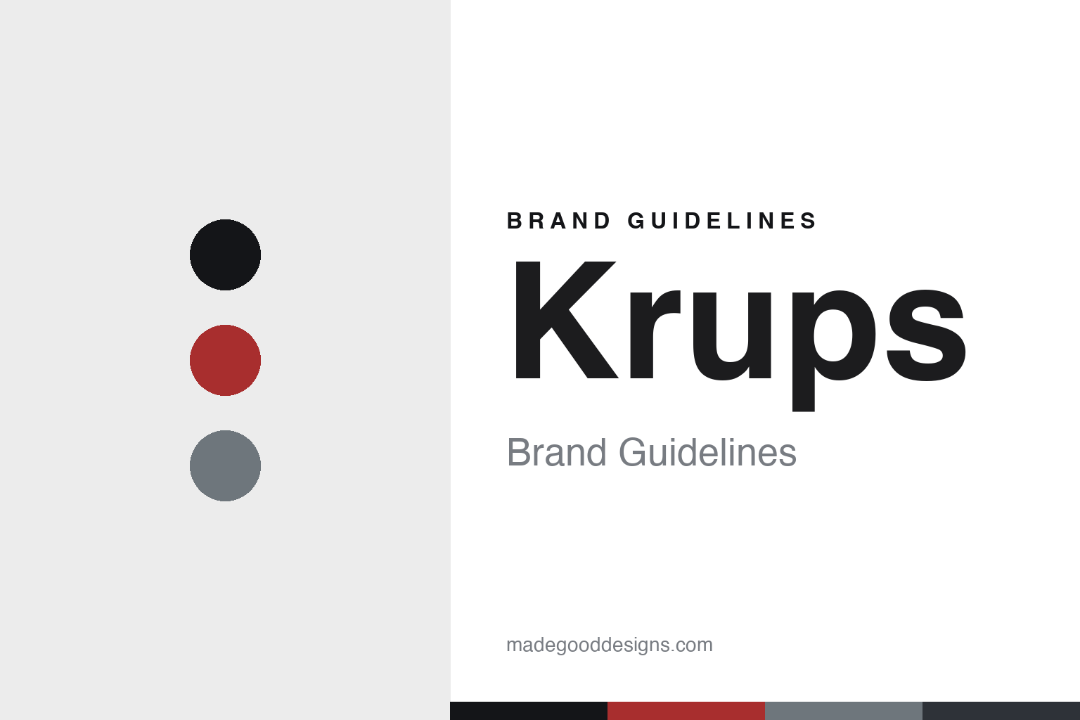
Krups Brand Guidelines
The coffee grinder.
Aa
Two constants: an engineered-black palette and an engineered sans register. Abstract homage — not the Krups machine or wordmark.
The coffee grinder
Krups went from precision scales to precision coffee.
Krups is a lesson in precision as the identity. Founded in 1846 by Robert Krups in Solingen, it spent a century as Germany’s leading precision-scale maker before turning that exactness to coffee.
Its identity is the coffee grinder. Krups makes coffee grinders, coffee makers and espresso machines — plus food processors, toasters and kitchen scales — but the grinder anchors its coffee identity. German precision, applied to coffee. A brand that measured before it brewed.
(Honest notes: Krups was founded in 1846 by Robert Krups in Wald, today a district of Solingen, in North Rhine-Westphalia, Germany. Its scale-then-coffee history is genuine: it began making high-precision scales and balances — Germany’s leading scale brand for around a century — before moving into household appliances in the 1950s, with its first coffee grinder around 1956, the 3Mix mixer in 1959 and the ONKO coffee maker in 1961. Its coffee range now includes espresso and bean-to-cup machines and Nespresso- and Dolce Gusto-licensed machines. On production, it is mixed — made across Germany (Solingen, premium lines), China (Guangdong) and Romania (Arad), varying by model — so we state it generically. On ownership, it is owned by Groupe SEB (France), the group behind Tefal, Moulinex and Rowenta, joining via Moulinex in 1991 and passing to Groupe SEB in 2001. One important disambiguation: it is entirely separate from Krupp / ThyssenKrupp, the steel-and-armaments dynasty — a different family and company. There’s no official brand hex — these tones are an unofficial interpretation. This is design commentary and does not promote any product.)
Colour
Krups lives in an engineered-black palette. Click a swatch to copy the hex.
Krups’ identity is precise, German and premium — a red, an ink, a steel, a graphite, and a chalk. The palette leans engineered black — the register of black-and-stainless coffee machines and German engineering. It signals precision and quality rather than novelty. The honest caveat: with no published brand hex, these tones are an original, unofficial interpretation, not first-party values.
The lesson is an engineered-black palette signals precision coffee. Krups’ world is a precise, premium, engineered object. For designers, it is a reminder that a brand can carry a value — here precision — from one category to another, and that a black-and-steel palette makes that engineering legible. Because a red can fail as small text, keep type dark and let the colour live in the accents, palette and band. The takeaways: carry the value across; signal precision; keep it engineered; and treat any single hex as unofficial.
Typography
The register is an engineered sans — precise, technical, solid.
Krups’ identity carries a precise, technical, solid spirit — an engineered, premium object. A sturdy grotesque captures the mood: it is exact and confident, the register of German engineering. Set in an engineered-black palette, the engineered sans feels precise and technical — exactly the personality Krups carries. It is solid rather than decorative, mirroring a well-built machine. (Krups’ real machine and wordmark are works we describe but do not reproduce, and the exact typeface is not ours to use.) Because it is not ours to use, the honest description is “an engineered sans spirit,” shown here in a stand-in. The type behaves like the brand: precise, technical and solid.
Aa
An engineered sans spirit — precise and technical. (Specimen set in Chivo, a sturdy grotesque STAND-IN; NOT the Krups wordmark.)
Precision as identity
Krups stands for the coffee grinder.
Krups is a lesson in carrying a value across categories. An engineered-black palette, an engineered sans and a precision grinder make German exactness the whole brand — precise, technical, premium. The value is the differentiator. The differentiator is a precision heritage — a century of scale-making — applied to coffee.
Put to work, the identity is a value transferred. A designer building in this spirit would identify the brand’s core value and carry it into a new category, so a coffee grinder inherits the credibility of a precision-scale past. The lesson Krups teaches is that a value can outlive a product: the exactness that made it Germany’s leading scale brand became the promise behind its grinders and espresso machines, and a black-and-steel design language keeps that engineering story visible.
For designers and brand-builders, Krups offers a clear takeaway: carry your core value into the new category. The lessons: carry the value across; signal precision; keep it engineered; and be honest about the story. It is also a reminder to stay accurate: it was founded in 1846 by Robert Krups in Solingen, its scale-then-coffee history is genuine, and — importantly — it is owned by Groupe SEB, having joined via Moulinex in 1991 — the palette here is an unofficial interpretation. And it is a reminder that made-where honesty matters even for a German engineering name: describing production as mixed across Germany, China and Romania, rather than implying it is all German-made, keeps the story trustworthy. It is a reminder, too, that names collide: this Krups is entirely separate from the Krupp / ThyssenKrupp steel dynasty, and saying so plainly spares the reader a genuine confusion. Krups made the coffee grinder the brand — proof that a transferred value can be the difference.
Explore & save
Keep Krups’s identity on hand — save it to a board in the Made Good inspiration library.
Krups identity set
Pin the engineered-black palette and the engineered-sans register to your own board.