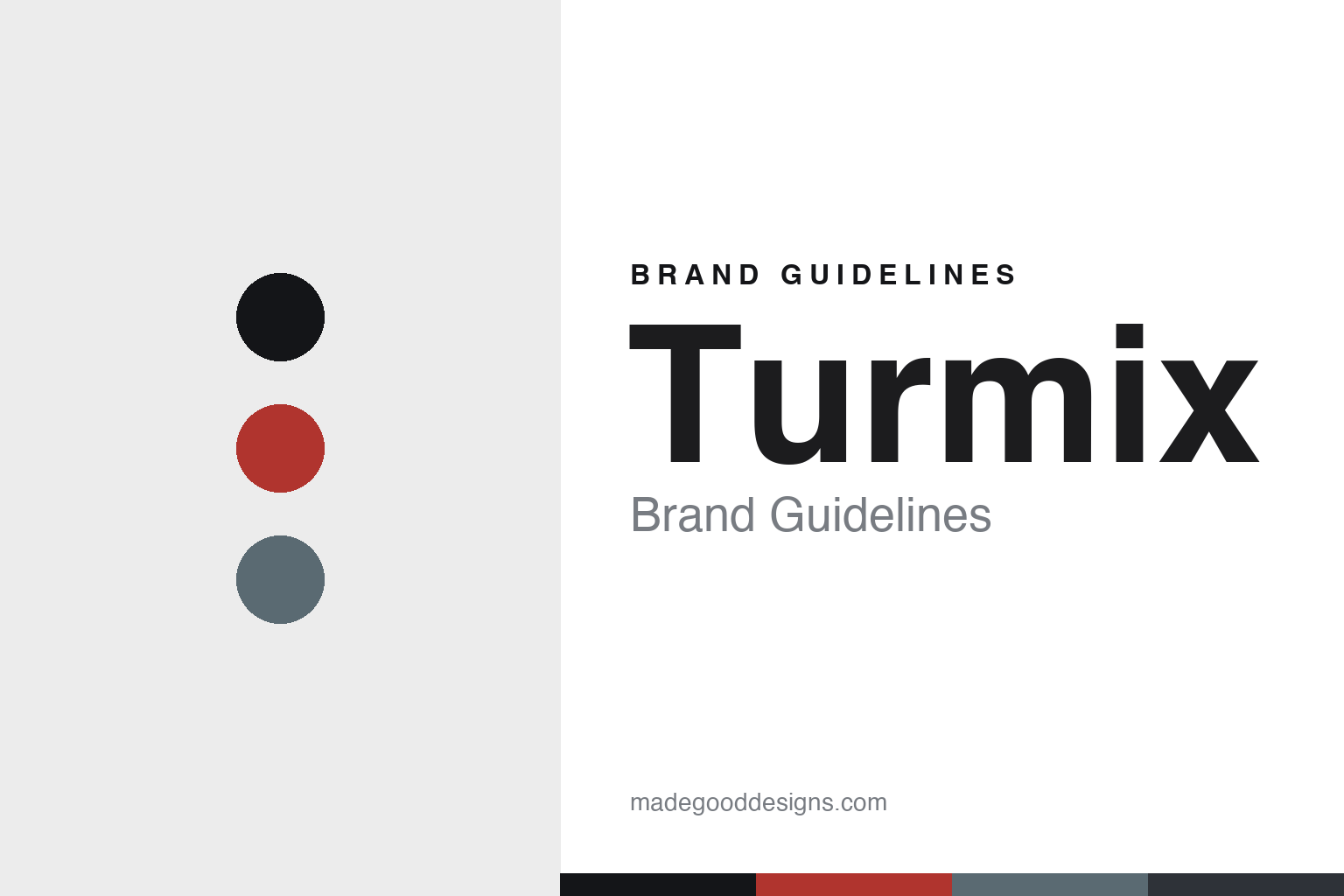
Turmix Brand Guidelines
The Swiss blender.
Aa
Two constants: a Swiss-modernist palette and a Swiss sans register. Abstract homage — not the Turmix blender or wordmark.
The Swiss blender
Turmix built its name on the Swiss household blender.
Turmix is a lesson in a heritage machine as the identity. A Swiss brand with roots in 1933, it built its name on the household blender — the Turmix Original, invented in 1943.
Its identity is the blender. Turmix makes household blenders and kitchen machines, later espresso machines and kettles too, but the blender is the object it is known for — a Swiss kitchen classic. A machine that carries Swiss engineering heritage. A blender with a real history.
(Honest notes: the company was founded in 1933 in Zürich, originally as Techag AG (an oil-heating and household-import business), by Traugott Oertli with his brother Walter; the Turmix Original household blender was invented in 1943 — so 1933 is the company and 1943 the blender, and neither is “~1949,” which we correct. The name blends the French tourner (“to turn”) with “mix.” Its heritage signature is the household blender and kitchen machine; it also built the first Swiss household espresso machine in 1974. Crucially, on production we do not claim “Made in Switzerland”: Turmix is a Swiss brand, designed in Switzerland (HQ in Oberarth), but its commodity range is almost certainly made offshore, so it is Swiss-designed with manufacturing unverified. On ownership, it belongs to the Diethelm Keller Group (acquired 1990) and is run under DKB Household, alongside sibling Swiss brands Koenig and Zyliss. One disambiguation: it is separate from the unrelated “Turmix de México.” There’s no official brand hex — these tones are an unofficial interpretation. This is design commentary and does not promote any product.)
Colour
Turmix lives in a Swiss-modernist palette. Click a swatch to copy the hex.
Turmix’s identity is precise, Swiss and modern — a Swiss red, an ink, a steel, a graphite, and a chalk. The palette leans Swiss modernist — the register of clean Swiss design and a heritage kitchen machine. It signals precision and history rather than novelty. The honest caveat: with no published brand hex, these tones are an original, unofficial interpretation, not first-party values.
The lesson is a Swiss-modernist palette signals a heritage kitchen machine. Turmix’s world is a clean, precise, historic object. For designers, it is a reminder that a genuine heritage — a blender invented in the 1940s — can anchor a brand, and that a restrained, Swiss-modernist palette makes that heritage legible. Because a Swiss red can fail as small text, keep type dark and let the colour live in the accents, palette and band. The takeaways: honour the heritage; keep it precise; keep it Swiss-modern; and treat any single hex as unofficial.
Typography
The register is a Swiss sans — clean, precise, modern.
Turmix’s identity carries a clean, precise, modern spirit — a Swiss, heritage object. A neutral grotesque captures the mood: it is exact and unfussy, the register of Swiss design. Set in a Swiss-modernist palette, the Swiss sans feels clean and precise — exactly the personality Turmix carries. It is modern rather than decorative, mirroring a well-engineered machine. (Turmix’s real blender and wordmark are works we describe but do not reproduce, and the exact typeface is not ours to use.) Because it is not ours to use, the honest description is “a Swiss sans spirit,” shown here in a stand-in. The type behaves like the brand: clean, precise and modern.
Aa
A Swiss sans spirit — clean and precise. (Specimen set in Hanken Grotesk, a neutral grotesque STAND-IN; NOT the Turmix wordmark.)
A heritage machine as identity
Turmix stands for the Swiss blender.
Turmix is a lesson in making a heritage machine the identity. A Swiss-modernist palette, a Swiss sans and a household blender make Swiss kitchen heritage the whole brand — clean, precise, modern. The heritage is the differentiator. The differentiator is a real history — a blender invented in the 1940s — carried by a Swiss design language.
Put to work, the identity is a history made present. A designer building in this spirit would anchor the brand to its genuine origin and let a clean, Swiss-modernist language carry it, so a modern machine reads as the heir to a classic. The lesson Turmix teaches is that heritage plus clarity is a durable position: a blender with a 1940s pedigree, presented in a precise Swiss aesthetic, feels trustworthy in a way a new brand cannot easily buy.
For designers and brand-builders, Turmix offers a clear takeaway: anchor to a real heritage. The lessons: honour the heritage; keep it precise; keep it Swiss-modern; and be honest about the story. It is also a reminder to stay accurate: the company dates to 1933 in Zürich and the blender to 1943 — not “~1949” — and it belongs to the Diethelm Keller Group under DKB Household — the palette here is an unofficial interpretation. And it is a reminder that made-where honesty matters most for a “Swiss” brand: because Turmix is Swiss-designed but its commodity range is likely made offshore, saying “Swiss-designed” rather than “Swiss-made” is the difference between a trustworthy claim and a misleading one. It is a reminder, too, that dates deserve care: keeping the company year (1933) and the blender year (1943) distinct is more honest than a single founding date. Turmix made the blender the brand — proof that a heritage machine can be the difference.
Explore & save
Keep Turmix’s identity on hand — save it to a board in the Made Good inspiration library.
Turmix identity set
Pin the Swiss-modernist palette and the Swiss-sans register to your own board.