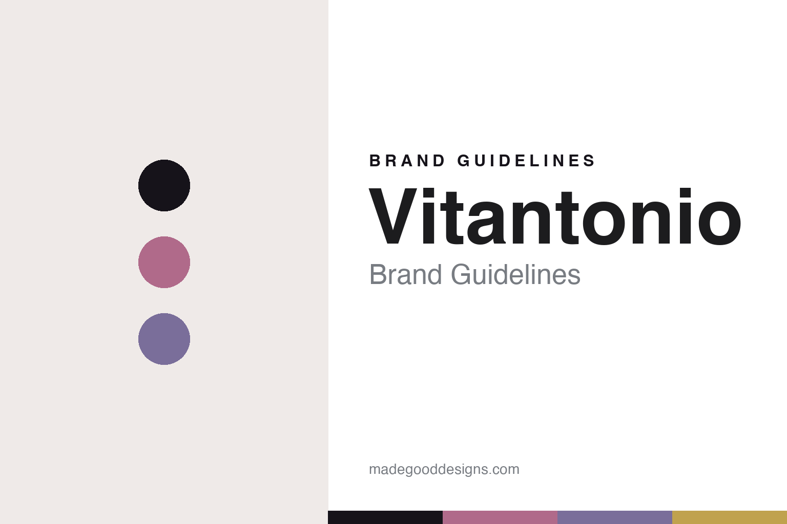
Vitantonio Brand Guidelines
The waffle baker.
Aa
Two constants: a retro-muted palette and a playful sans register. Abstract homage — not the Vitantonio baker, plates, colourways or wordmark.
The waffle baker
Vitantonio makes one baker that changes its plates.
Vitantonio is a lesson in a versatile object as the identity. A Japanese brand born in 1999, it made its name with the Waffle & Hot Sandwich Baker — a compact machine that changes its job by changing its plates.
Its identity is the waffle baker. Vitantonio’s flagship is a small clamshell baker with interchangeable plates — waffles, hot sandwiches, madeleines, fish-shaped cakes — joined by blenders, yogurt makers and toaster ovens, all in retro-muted colours. One machine, many treats. A cute, giftable object built around swappable plates.
(Honest notes: Vitantonio is a Japanese brand born in 1999 (a brand-stated date, so we hedge). Its operator is Sanyei Corporation, a Tokyo firm — not La-Luz or Ladonna, which are unrelated companies we do not credit. Its signature is the Waffle & Hot Sandwich Baker with interchangeable plates (waffles, hot sandwiches, madeleines, taiyaki), alongside blenders, yogurt makers and toaster ovens in retro-muted colourways. It is designed in Japan and manufactured in China (from retail country-of-origin data rather than the official page, so reliable but not first-party), and it sits within the Sanyei group. One important disambiguation: it is separate from the historic American “Vitantonio Manufacturing Company” (of Cleveland, Ohio, known for pizzelle and waffle irons) — any licensing link is unconfirmed, so we state them as distinct. English documentation is thin, so some details rest on Japanese and retail sources. There’s no official brand hex, and we reproduce no baker, plate pattern or colourway — these tones are an unofficial interpretation. This is design commentary and does not promote any product.)
Colour
Vitantonio lives in a retro-muted palette. Click a swatch to copy the hex.
Vitantonio’s identity is soft, retro and giftable — a rose, an ink, a lavender, a butter, and a cream. The palette leans retro muted — the register of a cute, table-top baker in gentle vintage colours. It signals warmth and gifting rather than novelty. The honest caveat: with no published brand hex, these tones are an original, unofficial interpretation, not first-party values.
The lesson is a retro-muted palette signals a cute, versatile appliance. Vitantonio’s world is a soft, charming, adaptable object. For designers, it is a reminder that one machine can be many products — that interchangeable plates turn a single baker into a whole range of treats — and that a muted, retro palette makes it feel giftable. Because a rose can fail as small text, keep type dark and let the colour live in the accents, palette and band. The takeaways: make it versatile; make it giftable; use muted colour; and treat any single hex as unofficial.
Typography
The register is a playful sans — soft, rounded, friendly.
Vitantonio’s identity carries a soft, rounded, friendly spirit — a cute, adaptable object. A rounded display sans captures the mood: it is warm and playful, the register of a giftable Japanese design brand. Set in a retro-muted palette, the playful sans feels soft and rounded — exactly the personality Vitantonio carries. It is friendly rather than serious, mirroring a cute, versatile baker. (Vitantonio’s real baker, plate patterns and wordmark are works we describe but do not reproduce, and the exact typeface is not ours to use.) Because it is not ours to use, the honest description is “a playful sans spirit,” shown here in a stand-in. The type behaves like the brand: soft, rounded and friendly.
Aa
A playful sans spirit — soft and rounded. (Specimen set in Fredoka, a rounded display sans STAND-IN; NOT the Vitantonio wordmark.)
A versatile object as identity
Vitantonio stands for the waffle baker.
Vitantonio is a lesson in making a versatile object the identity. A retro-muted palette, a playful sans and an interchangeable-plate baker make one adaptable machine the whole brand — soft, retro, giftable. The versatility is the differentiator. The differentiator is a single baker that becomes many treats by swapping its plates.
Put to work, the identity is one object, many uses. A designer building in this spirit would design a core machine and a system of interchangeable parts, so a single purchase keeps giving new possibilities — waffles today, madeleines tomorrow. The lesson Vitantonio teaches is that modularity can be charming: interchangeable plates make a compact baker feel like a collection, and a cute, retro-muted design language turns it into a gift people want to give.
For designers and brand-builders, Vitantonio offers a clear takeaway: build one object with a system of parts. The lessons: make it versatile; make it giftable; use muted colour; and be honest about the story. It is also a reminder to stay accurate: the brand was born in 1999 and is operated by Sanyei Corporation — not La-Luz or Ladonna — the palette here is an unofficial interpretation. And it is a reminder that made-where honesty matters even for a Japanese design brand: saying it is designed in Japan and made in China, rather than implying “made in Japan,” keeps the story trustworthy. It is a reminder, too, that names collide across borders: this Japanese Vitantonio is separate from the historic American Vitantonio waffle-iron maker, and with no confirmed link between them we keep them distinct. Vitantonio made the waffle baker the brand — proof that a versatile object can be the difference.
Explore & save
Keep Vitantonio’s identity on hand — save it to a board in the Made Good inspiration library.
Vitantonio identity set
Pin the retro-muted palette and the playful-sans register to your own board.


