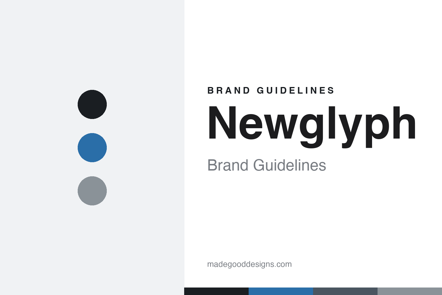
Newglyph Brand Guidelines
New Swiss type.
Aa
Two constants: a cool, Swiss palette and a precise grotesque register. Abstract homage — not the Newglyph wordmark or its typefaces.
New Swiss type
Newglyph is Swiss precision, built variable.
Newglyph is a lesson in Swiss precision, engineered variable. Founded in 2019 by Ian Party (with Daniela Retana and Emeric Turcat) in Lausanne, the independent foundry positions itself as “New Swiss Type Design” — its flagship, the 144-style variable grotesque Baikal, plus Antarctica and Atacama, all precision-engineered variable families.
Its brand identity is refined, minimalist and Swiss-modernist — a polished, art-directed presentation with a heavy emphasis on variable-font technology. Baikal is described in its own terms: simplicity, minimalism, purity — and is used by the likes of HAVAS, the National Theatre of Scotland and Kunstmuseum Bern.
(Honest notes: it’s Lausanne, not Geneva. And there’s an important lineage to keep straight: Ian Party ran BP Foundry, which became Swiss Typefaces, which he sold in 2019 before founding Newglyph — so Newglyph is a separate company, and famous Swiss Typefaces faces (like Suisse) are not Newglyph’s. Ian Party designs all Newglyph typefaces himself. And there’s no official brand hex, so the tones here are an unofficial interpretation.)
Colour
Newglyph lives in a cool, Swiss palette. Click a swatch to copy the hex.
Newglyph’s identity is cool, refined and Swiss — an ink, a cool blue, a steel, a cool grey, and a paper. The palette is a cool, near-monochrome Swiss set with a single cool-blue accent — the register of precise Swiss modernism. It signals precision, refinement and technical rigour rather than warmth or noise. The honest caveat: with no published brand hex, these tones are an original, unofficial interpretation, not first-party values.
The lesson is a cool, Swiss palette signals precision and refinement. Newglyph’s world is a precise, art-directed Swiss page. For designers, it is a reminder that a cool, near-monochrome palette with one restrained accent reads as precise and modern — right for a foundry built on variable-font engineering and Swiss minimalism. The takeaways: use a cool, near-monochrome palette; add one restrained accent; and treat any single hex as unofficial — using ink for small text so the palette stays cool.
Typography
The register is a precise grotesque — cool and refined.
Newglyph’s identity carries a precise, refined, Swiss spirit — variable-font engineering and modernist minimalism. A clean, precise grotesque captures the mood: it is exact and refined, the register of “New Swiss” type. Set in a cool palette, the precise grotesque feels cool and refined — exactly the personality Newglyph carries. It is exact rather than warm, mirroring a precise Swiss specimen. (Newglyph’s real wordmark and its retail typefaces — Baikal, Antarctica and the rest — are commercial products and trademarks we name but do not reproduce or set text in; the exact brand typeface is not ours to use.) Because those faces are not ours to set, the honest description is “a precise grotesque spirit,” shown here in a stand-in. The type behaves like the brand: precise, cool and refined.
Aa
A precise grotesque spirit — cool and refined. (Specimen set in Chivo, a grotesque STAND-IN; NOT Newglyph’s wordmark or any Newglyph retail typeface, which are trademarks.)
Precision as identity
Newglyph stands for New Swiss precision.
Newglyph is a lesson in engineering Swiss precision into a brand. A cool, refined palette, an art-directed presentation and precision-engineered variable families make “New Swiss” precision the whole identity — refined, minimal, technical. The variable-font precision is the differentiator. The differentiator is a cool, refined, Swiss-modernist identity.
For designers and brand-builders, Newglyph offers a clear takeaway: technical rigour can be a positioning. The lessons: build precise, variable families; present them refined and art-directed; and keep the palette cool and Swiss. It is also a reminder to stay accurate: it’s Lausanne (not Geneva), separate from Swiss Typefaces, and Ian Party designs all its faces — with the palette here an unofficial interpretation. Newglyph made precision the brand — proof that rigour can be the difference.
Explore & save
Keep Newglyph’s identity on hand — save it to a board in the Made Good inspiration library.
Newglyph identity set
Pin the cool Swiss palette and the precise-grotesque register to your own board.


