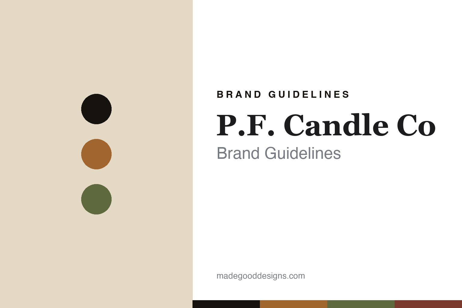
P.F. Candle Co Brand Guidelines
The amber jar.
Aa
Two constants: an amber-and-kraft palette and a vintage slab register. Abstract homage — not the P.F. Candle Co labels or packaging.
The amber jar
P.F. Candle Co numbers its scents.
P.F. Candle Co is a lesson in an amber jar and a numbering system as the identity. Founded in 2008 by Kristen Pumphrey, it pours soy candles into amber apothecary glass and labels them with kraft paper and a vintage, numbered typographic system.
Its identity is the amber jar. P.F. Candle Co makes soy-wax candles plus reed diffusers, incense and room sprays — the signature an amber apothecary jar with a kraft-paper label, retro Americana typography, and a “No. XX” scent-numbering system (like No. 11 Amber & Moss, No. 21 Golden Coast). Vintage warmth, catalogued. A candle numbered like a hardware part.
(Honest notes: P.F. Candle Co was founded in 2008 by Kristen Pumphrey — the “P.F.” comes from her early DIY blog, “Pommes Frites,” a play on her surname — and grew from an Etsy shop. It began in Texas (Pumphrey had moved from New York), so Los Angeles is its current home, not its birthplace; her husband, Thomas Neuberger, is co-owner. Its candles are hand-poured at its own factory in Los Angeles, and its vegan, cruelty-free, domestic-soy and Climate Neutral claims are the brand’s own. Its lines are the Classics, HI-FI and Alchemy ranges (a couple of specific scent numbers and any “Sunset/Dusk” framing we treat as unverified). It is independently owned by the couple. There’s no official brand hex, and we reproduce no label or logo — these tones are an unofficial interpretation. This is design commentary and does not promote any product.)
Colour
P.F. Candle Co lives in an amber-and-kraft palette. Click a swatch to copy the hex.
P.F. Candle Co’s identity is vintage, warm and American — an amber, an ink, a moss, a rust, and a kraft. The palette pairs an amber with a kraft — the register of an apothecary jar and a paper label. It signals warmth and craft rather than novelty. The honest caveat: with no published brand hex, these tones are an original, unofficial interpretation, not first-party values.
The lesson is amber-and-kraft signals a vintage-Americana candle house. P.F.’s world is a warm, catalogued object. For designers, it is a reminder that a material (amber glass, kraft paper) plus a system (numbered scents) can be a whole identity, and that a numbering convention makes a range feel like a considered catalogue. Because amber can fail as small text, keep type dark and let the colour live in the accents, palette and band. The takeaways: fix the material; number the range; go vintage; and treat any single hex as unofficial.
Typography
The register is a vintage slab — sturdy, warm, Americana.
P.F. Candle Co’s identity carries a sturdy, warm, Americana spirit — a catalogued, amber-glass object. A slab serif captures the mood: it is solid and characterful, the register of vintage American packaging. Set in an amber-and-kraft palette, the vintage slab feels sturdy and warm — exactly the personality P.F. carries. It is nostalgic rather than slick, mirroring a kraft label. (P.F.’s real labels and wordmark are works we describe but do not reproduce, and the exact typeface is not ours to use.) Because it is not ours to use, the honest description is “a vintage slab spirit,” shown here in a stand-in. The type behaves like the brand: sturdy, warm and Americana.
Aa
A vintage slab spirit — sturdy and warm. (Specimen set in Roboto Slab, a solid slab serif STAND-IN; NOT the P.F. Candle Co packaging.)
A jar and a system as identity
P.F. Candle Co stands for the amber jar.
P.F. Candle Co is a lesson in making a jar and a system the identity. An amber-and-kraft palette, a vintage slab and a numbered apothecary jar make catalogued warmth the whole brand — vintage, warm, American. The jar-and-number is the differentiator. The differentiator is a fixed material — amber glass and kraft paper — plus a “No. XX” system that turns scents into a catalogue.
Put to work, the identity is a system you can extend forever. A designer building in this spirit would lock a material and a labelling convention — here amber glass, kraft paper and a scent number — so every new release drops straight into an established, recognisable catalogue rather than needing its own look. The lesson P.F. teaches is that a humble numbering system is a powerful brand device: “No. 11” or “No. 21” makes a small candle brand feel like an archive with history, and the consistent amber-and-kraft object means customers recognise it instantly across dozens of scents. Growing from an Etsy shop to an LA factory without losing that look shows how much discipline the system enforces.
For designers and brand-builders, P.F. Candle Co offers a clear takeaway: fix the material, number the range. The lessons: fix the material; number the range; go vintage; and be honest about the story. It is also a reminder to stay accurate: it was founded in 2008 by Kristen Pumphrey (beginning in Texas, now in Los Angeles), the “P.F.” is from her Pommes Frites blog, and it is independently owned by the couple — the palette here is an unofficial interpretation. P.F. made the amber jar and the number the brand — proof that a system can be the difference.
Explore & save
Keep P.F. Candle Co’s identity on hand — save it to a board in the Made Good inspiration library.
P.F. Candle Co identity set
Pin the amber-and-kraft palette and the vintage-slab register to your own board.