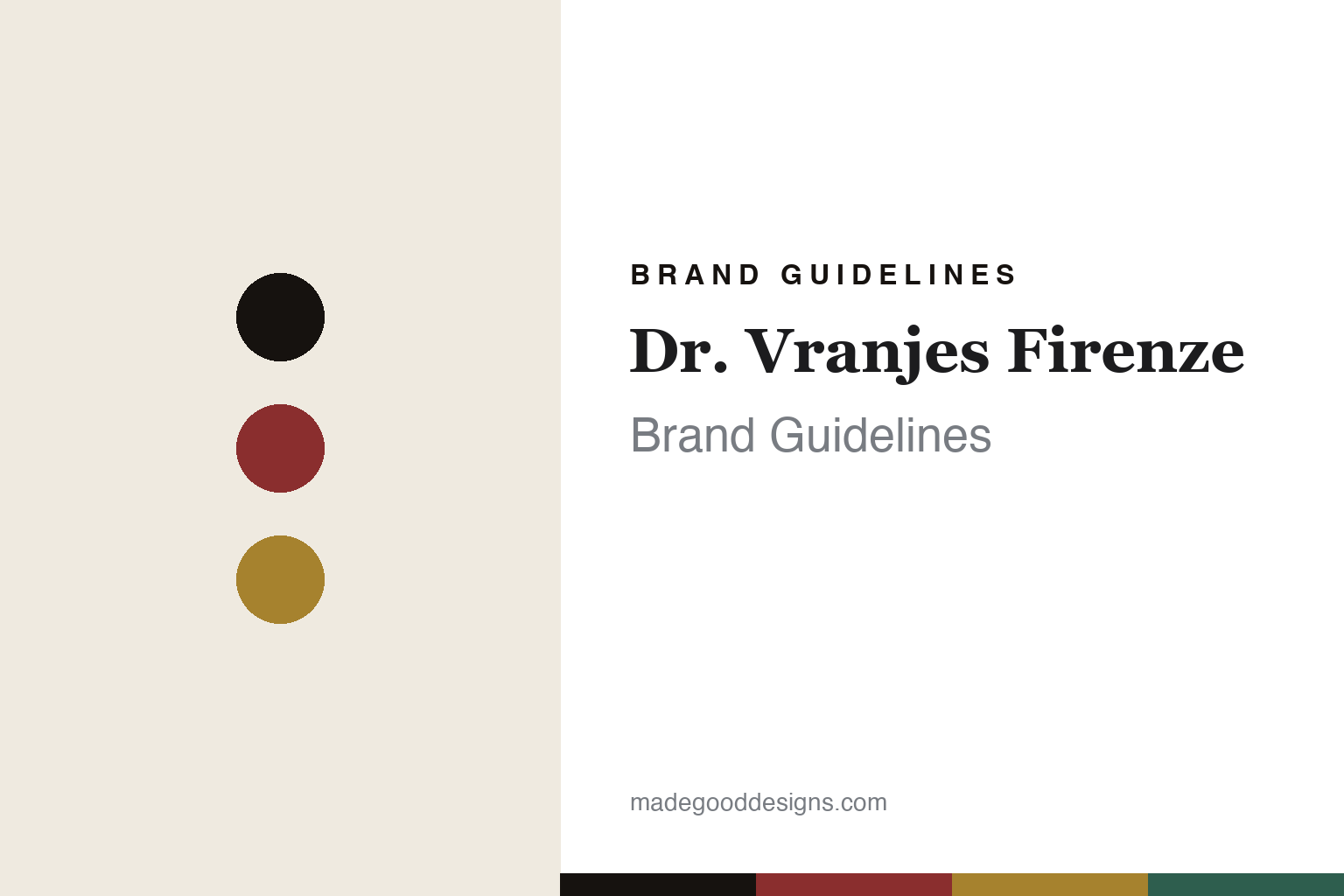
Dr. Vranjes Firenze Brand Guidelines
The diffuser bottle.
Aa
Two constants: a Florentine-red palette and an apothecary serif register. Abstract homage — not the Dr. Vranjes bottle silhouettes or labels.
The diffuser bottle
Dr. Vranjes bottles Florence as home fragrance.
Dr. Vranjes Firenze is a lesson in a bottle as the identity. Founded in 1983 in Florence by the pharmacist Dr. Paolo Vranjes and his wife Anna Maria, it began as an apothecary lab and became a home-fragrance house known for one faceted glass bottle.
Its identity is the diffuser bottle. Dr. Vranjes makes room fragrance — reed diffusers in distinctive faceted glass bottles (its Rosso Nobile and Oud Nobile among them), plus room sprays, candles, catalytic lamps and car fragrance. Florence, decanted into a bottle. A diffuser that reads as an object.
(Honest notes: Dr. Vranjes Firenze was founded in 1983 in Florence by Dr. Paolo Vranjes, a chemist/pharmacist, with his wife Anna Maria, as an apothecary-style lab — the home-fragrance brand and its iconic faceted bottle came later, around the turn of the millennium, so we credit both the 1983 lab and the later brand pivot rather than collapsing them. It is a home-fragrance house, not a fine-perfume house. Its “Made in Tuscany” and B Corp status are its own account. On ownership, the key fact: since January 2024 it has been owned by the French L’Occitane Group, which acquired it from the private-equity firm BlueGem (a majority holder from 2017) — so it is no longer independent. There’s no official brand hex, and we reproduce no bottle silhouette or logo — these tones are an unofficial interpretation. This is design commentary and does not promote any product.)
Colour
Dr. Vranjes lives in a Florentine-red palette. Click a swatch to copy the hex.
Dr. Vranjes’ identity is rich, Florentine and refined — a nobile red, an ink, a gold, a green, and a cream. The palette pairs a deep red with a gold — the register of a Florentine apothecary and a jewel-like diffuser. It signals heritage and craft rather than novelty. The honest caveat: with no published brand hex, these tones are an original, unofficial interpretation, not first-party values.
The lesson is Florentine red signals an apothecary home-fragrance house. Dr. Vranjes’ world is a faceted, gem-coloured bottle. For designers, it is a reminder that a single, recognisable vessel — a specific bottle cut, a colour-coded set of scents — can be a whole identity, and that a pharmacist’s pedigree lends credibility. Because a deep red can fail as small text, keep type dark and let the colour live in the accents, palette and band. The takeaways: own the bottle; colour-code the range; lean on the apothecary story; and treat any single hex as unofficial.
Typography
The register is an apothecary serif — refined, Florentine, cultured.
Dr. Vranjes’ identity carries a refined, Florentine, cultured spirit — a faceted, gem-coloured bottle. A high-contrast old-style serif captures the mood: it is elegant and pharmaceutical-classical, the register of a Florentine officina. Set in a Florentine-red palette, the apothecary serif feels refined and cultured — exactly the personality Dr. Vranjes carries. It is heritage rather than trendy, mirroring a chemist’s label. (Dr. Vranjes’ real bottles, labels and wordmark are works we describe but do not reproduce, and the exact typeface is not ours to use.) Because it is not ours to use, the honest description is “an apothecary serif spirit,” shown here in a stand-in. The type behaves like the brand: refined, Florentine and cultured.
Aa
An apothecary serif spirit — refined and Florentine. (Specimen set in Cormorant, a high-contrast old-style serif STAND-IN; NOT the Dr. Vranjes labels.)
A bottle as identity
Dr. Vranjes stands for the diffuser bottle.
Dr. Vranjes Firenze is a lesson in making a bottle the identity. A Florentine-red palette, an apothecary serif and a faceted glass diffuser make the vessel the whole brand — rich, Florentine, refined. The bottle is the differentiator. The differentiator is one recognisable faceted vessel, colour-coded across a range of scents.
Put to work, the identity is a container you display. A designer building in this spirit would treat the bottle as the hero — a distinctive cut, a jewel palette, a gold-crested label — so a reed diffuser becomes a piece of decor rather than a functional object hidden in a corner. The lesson Dr. Vranjes teaches is that in home fragrance, where the product is invisible, the vessel does all the branding: a faceted bottle in a deep, nameable colour is what customers recognise and re-buy, and the pharmacist’s-lab story gives that object a credible origin. Its acquisition by a larger group also shows how a strong vessel identity becomes an asset worth buying.
For designers and brand-builders, Dr. Vranjes offers a clear takeaway: let the vessel do the branding. The lessons: own the bottle; colour-code the range; lean on the apothecary story; and be honest about the story. It is also a reminder to stay accurate: it was founded in 1983 in Florence by Dr. Paolo Vranjes, it is a home-fragrance house built on a faceted diffuser bottle, and since 2024 it has been owned by the L’Occitane Group — the palette here is an unofficial interpretation. Dr. Vranjes made the diffuser bottle the brand — proof that a vessel can be the difference.
Explore & save
Keep Dr. Vranjes Firenze’s identity on hand — save it to a board in the Made Good inspiration library.
Dr. Vranjes Firenze identity set
Pin the Florentine-red palette and the apothecary-serif register to your own board.


