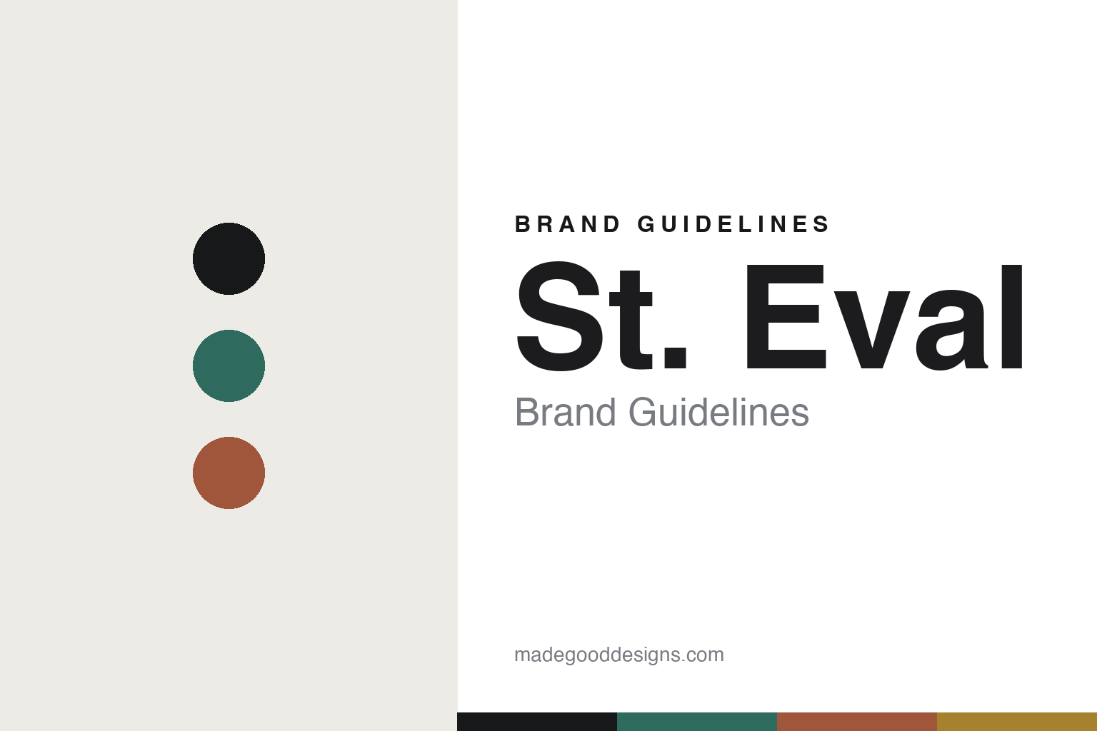
St. Eval Brand Guidelines
The tin candle.
Aa
Two constants: a coastal-Cornish palette and a coastal sans register. Abstract homage — not the St. Eval tins or labels.
The tin candle
St. Eval makes candles on a Cornish farm.
St. Eval is a lesson in a place as the identity. Founded in 1993 by Sarah and Tim Young-Jamieson on their family farm in North Cornwall, it began as a way to diversify the farm and grew into a candle maker rooted in its coastal home.
Its identity is the tin candle. St. Eval makes scented and unscented candles — its signature the scented enamel-tin candle pot — plus dinner candles, tealights and pillars (drawn on 1940s-era machines), reed diffusers, melts and a bath-and-body range. Cornwall, in a candle. Coastal calm, in a tin.
(Honest notes: St. Eval was founded in 1993 by Sarah and Tim Young-Jamieson (Tim is now deceased) on the family farm at Engollan, near St Eval in North Cornwall — the candles began in the farmhouse as farm diversification. We date it to 1993 rather than to the 2002 incorporation of the limited company. Its candles are made at its own Cornwall site, cut, milled and hand-packed in the UK, and its renewable-energy, conservation and B Corp credentials are its own account. It is an independent, family-owned Cornish business. Note we don’t repeat a “beekeeping/honey” origin story — that appears to be a mix-up; its origin is farm diversification. There’s no official brand hex, and we reproduce no tin or logo — these tones are an unofficial interpretation. This is design commentary and does not promote any product.)
Colour
St. Eval lives in a coastal-Cornish palette. Click a swatch to copy the hex.
St. Eval’s identity is coastal, natural and calm — a sea green, an ink, a terracotta, an ochre, and a chalk. The palette leans coastal Cornish — the register of an enamel tin and a clifftop farm. It signals place and craft rather than novelty. The honest caveat: with no published brand hex, these tones are an original, unofficial interpretation, not first-party values.
The lesson is coastal Cornish signals a place-rooted candle maker. St. Eval’s world is a calm, enamel-tin object. For designers, it is a reminder that a genuine place — a specific farm, a coastline, a “made here” — can anchor a whole identity, and that provenance is a durable differentiator. Because a mid green can fail as small text, keep type dark and let the colour live in the accents, palette and band. The takeaways: root it in a place; own the tin; make it here; and treat any single hex as unofficial.
Typography
The register is a coastal sans — clean, warm, unpretentious.
St. Eval’s identity carries a clean, warm, unpretentious spirit — a coastal, enamel-tin object. A rounded humanist sans captures the mood: it is friendly and legible, the register of an honest Cornish maker. Set in a coastal-Cornish palette, the coastal sans feels clean and warm — exactly the personality St. Eval carries. It is unpretentious rather than luxe, mirroring a working farm. (St. Eval’s real tins, labels and wordmark are works we describe but do not reproduce, and the exact typeface is not ours to use.) Because it is not ours to use, the honest description is “a coastal sans spirit,” shown here in a stand-in. The type behaves like the brand: clean, warm and unpretentious.
Aa
A coastal sans spirit — clean and warm. (Specimen set in Mulish, a rounded humanist sans STAND-IN; NOT the St. Eval packaging.)
A place as identity
St. Eval stands for the tin candle.
St. Eval is a lesson in making a place the identity. A coastal-Cornish palette, a coastal sans and an enamel-tin candle make Cornwall the whole brand — coastal, natural, calm. The place is the differentiator. The differentiator is a genuine origin — a clifftop farm — and candles actually made there.
Put to work, the identity is provenance you can defend. A designer building in this spirit would tie the brand to a real, specific place and keep production there, so “made in Cornwall” is a fact rather than a mood board, and every tin carries that story. The lesson St. Eval teaches is that authenticity compounds slowly but durably: three decades of making candles on the same farm, powered by its own renewable energy and tied to local conservation, turns a modest object into something with real roots — a harder thing to copy than a look. The enamel tin then becomes the physical token of that place.
For designers and brand-builders, St. Eval offers a clear takeaway: anchor the brand to a real place. The lessons: root it in a place; own the tin; make it here; and be honest about the story. It is also a reminder to stay accurate: it was founded in 1993 by Sarah and Tim Young-Jamieson on a North Cornwall farm, its candles are made at its own Cornwall site, and it is an independent family business — the palette here is an unofficial interpretation. And it is a reminder that provenance only counts when it is literally true: a brand that keeps making where it says it makes can lean on that story for decades, while one that borrows a place purely as a mood eventually gets found out. St. Eval made the tin candle the brand — proof that a place can be the difference.
Explore & save
Keep St. Eval’s identity on hand — save it to a board in the Made Good inspiration library.
St. Eval identity set
Pin the coastal-Cornish palette and the coastal-sans register to your own board.


