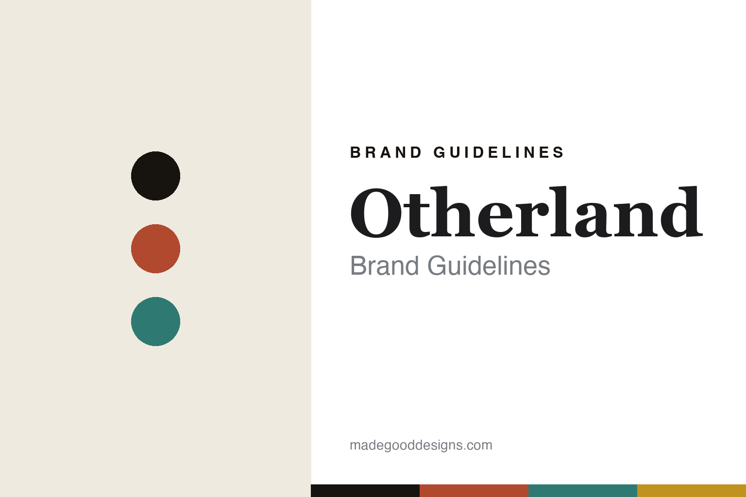
Otherland Brand Guidelines
The collectible candle.
Aa
Two constants: a vintage-colourful palette and a vintage serif register. Abstract homage — not the Otherland box art, illustrations or matchboxes.
The collectible candle
Otherland turns a candle into collectible art.
Otherland is a lesson in the collectible object as the identity. Founded in New York around 2017 by Abigail Cook Stone, it makes design-forward candles released in themed seasonal collections — each one a small, collectible art object.
Its identity is the collectible candle. Otherland makes scented candles plus matches, incense and room sprays, released in themed collections with a new visual artist for each — colourful, vintage-inspired boxes, illustrated labels, and collectible matchbooks whose art mirrors the candle. A candle you keep the box of. Art, on a shelf.
(Honest notes: Otherland was founded in New York around 2017 (some sources say 2018) by Abigail Cook Stone (its CEO; her partner Sayyid Markar is cited as co-founder). We drop a common claim that she came from Away — that appears unsupported; her background is in art acquisitions at Ralph Lauren and in venture roles. Its candles are made in the USA from a coconut-and-soy blend, with its “clean/non-toxic” framing treated as the brand’s own claim. Its identity rests on commissioning a new artist per seasonal collection and on collectible matchbooks; its core branding was built by the studio Red Antler. On ownership, one correction: it was venture-backed (a seed round led by Lerer Hippeau) and was acquired by CURiO Brands in 2023 — so it is not independent. There’s no official brand hex, and we reproduce no box art, illustration or matchbox — these tones are an unofficial interpretation. This is design commentary and does not promote any product.)
Colour
Otherland lives in a vintage-colourful palette. Click a swatch to copy the hex.
Otherland’s identity is colourful, vintage and playful — a vintage red, an ink, a teal, a gold, and a cream. The palette pairs a vintage red with a teal — the register of an illustrated, collectible box. It signals art and play rather than novelty. The honest caveat: with no published brand hex, these tones are an original, unofficial interpretation, not first-party values.
The lesson is vintage colour signals a collectible candle. Otherland’s world is a bright, illustrated object. For designers, it is a reminder that packaging can turn a consumable into a collectible — that a new artist per season and a keepable matchbook give people a reason to buy repeatedly and to display. Because bright hues can fail as small text, keep type dark and let the colour live in the accents, palette and band. The takeaways: commission the art; theme by season; make it collectible; and treat any single hex as unofficial.
Typography
The register is a vintage serif — characterful, warm, illustrative.
Otherland’s identity carries a characterful, warm, illustrative spirit — a colourful, collectible object. A soft, retro-flavoured serif captures the mood: it is warm and expressive, the register of a vintage-illustrated brand. Set in a vintage-colourful palette, the vintage serif feels characterful and warm — exactly the personality Otherland carries. It is expressive rather than austere, mirroring an illustrated box. (Otherland’s real box art, illustrations, matchboxes and wordmark are works we describe but do not reproduce, and the exact typeface is not ours to use.) Because it is not ours to use, the honest description is “a vintage serif spirit,” shown here in a stand-in. The type behaves like the brand: characterful, warm and illustrative.
Aa
A vintage serif spirit — characterful and warm. (Specimen set in Fraunces, a soft retro-flavoured serif STAND-IN; NOT the Otherland artwork.)
The collectible object as identity
Otherland stands for the collectible candle.
Otherland is a lesson in making the collectible object the identity. A vintage-colourful palette, a vintage serif and an illustrated box make the collectible candle the whole brand — colourful, vintage, playful. The collectibility is the differentiator. The differentiator is a new artist per collection and a keepable matchbook that turn a consumable into art.
Put to work, the identity is packaging as the reason to buy. A designer building in this spirit would commission original art for each release, theme it by season, and design a keepable extra — here a collectible matchbook — so customers collect the range and display it rather than burning through it anonymously. The lesson Otherland teaches is that in a commodity category, the artwork is the product: rotating artists keep the brand fresh and give each drop a reason to exist, and the collectible framing converts a one-off purchase into a habit. The strong founding design system (built with a branding studio) is what lets many different artists still feel like one brand.
For designers and brand-builders, Otherland offers a clear takeaway: make the packaging collectible. The lessons: commission the art; theme by season; make it collectible; and be honest about the story. It is also a reminder to stay accurate: it was founded around 2017 in New York by Abigail Cook Stone, its identity is artist-collaboration and collectible matchbooks, and it was acquired by CURiO Brands in 2023 — the palette here is an unofficial interpretation. Otherland made the collectible candle the brand — proof that the object can be the difference.
Explore & save
Keep Otherland’s identity on hand — save it to a board in the Made Good inspiration library.
Otherland identity set
Pin the vintage-colourful palette and the vintage-serif register to your own board.


