Marie-Stella-Maris Brand Guidelines
The numbered bottle.
Aa
Two constants: a clean-water palette and a minimal sans register. Abstract homage — not the Marie-Stella-Maris numbered labels or packaging.
The numbered bottle
Marie-Stella-Maris numbers its fragrances.
Marie-Stella-Maris is a lesson in a numbering system with a mission as the identity. Founded in 2011 in Amsterdam by Patrick Munsters and Carel Neuberg, it makes minimalist home fragrance and care — and ties every product to clean drinking water.
Its identity is the numbered bottle. Marie-Stella-Maris makes scented candles, diffusers and room sprays, personal care and natural eau de parfum — plus bottled mineral water — in a clean, monochrome, white-and-black aesthetic, with fragrances catalogued as numbers (No. 03, No. 12, No. 20). Minimalism, with a cause. A bottle numbered like an archive.
(Honest notes: Marie-Stella-Maris was founded in 2011 in Amsterdam by Patrick Munsters and Carel Neuberg. Its founding idea ties commerce to clean water: it says it structurally donates a share of its revenue, through its own foundation and the partner Aqua for All, to clean-water projects — we describe this as “a share of revenue” rather than a specific percentage, and treat its “145,000+ people” figure as the brand’s own claim. Its care products are produced in the Netherlands; a candle-specific manufacturing location isn’t documented, so we don’t assert one. It is an independent, privately held B Corp with a numbered-fragrance system and a refill programme. There’s no official brand hex, and we reproduce no numbered label or logo — these tones are an unofficial interpretation. This is design commentary and does not promote any product.)
Colour
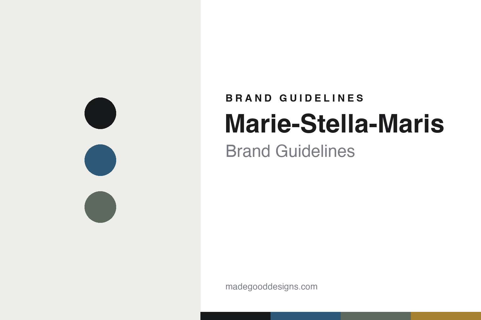
Marie-Stella-Maris lives in a clean-water palette. Click a swatch to copy the hex.
Marie-Stella-Maris’ identity is minimal, clean and purposeful — a water blue, an ink, a sage, a sand, and an off-white. The palette leans clean water — the register of a white, monochrome bottle with a numbered label. It signals restraint and purpose rather than novelty. The honest caveat: with no published brand hex, these tones are an original, unofficial interpretation, not first-party values.
The lesson is a clean palette plus numbers signals a purpose-led fragrance house. Marie-Stella-Maris’ world is a spare, catalogued object. For designers, it is a reminder that a numbering system unifies a range, and that a genuine mission — clean water — can be woven into an identity without shouting. Because a mid blue can fail as small text, keep type dark and let the colour live in the accents, palette and band. The takeaways: number the range; keep it monochrome; carry the mission honestly; and treat any single hex as unofficial.
Typography
The register is a minimal sans — clean, geometric, quiet.
Marie-Stella-Maris’ identity carries a clean, geometric, quiet spirit — a white, numbered object. A low-contrast geometric sans captures the mood: it is calm and modern, the register of a minimalist Amsterdam brand. Set in a clean-water palette, the minimal sans feels clean and geometric — exactly the personality Marie-Stella-Maris carries. It is quiet rather than loud, mirroring a numbered label. (Marie-Stella-Maris’ real numbered labels and wordmark are works we describe but do not reproduce, and the exact typeface is not ours to use.) Because it is not ours to use, the honest description is “a minimal sans spirit,” shown here in a stand-in. The type behaves like the brand: clean, geometric and quiet.
Aa
A minimal sans spirit — clean and geometric. (Specimen set in Sora, a low-contrast geometric sans STAND-IN; NOT the Marie-Stella-Maris packaging.)
A numbering system with a mission
Marie-Stella-Maris stands for the numbered bottle.
Marie-Stella-Maris is a lesson in making a numbered system with a mission the identity. A clean-water palette, a minimal sans and a white numbered bottle make purposeful minimalism the whole brand — minimal, clean, purposeful. The system-plus-cause is the differentiator. The differentiator is a numbered fragrance range wrapped around a clean-water mission.
Put to work, the identity is minimalism with meaning. A designer building in this spirit would use a numbering convention to hold a broad range together — home fragrance, care, even bottled water — in one calm, monochrome look, and let a genuine cause give that restraint a reason to exist. The lesson Marie-Stella-Maris teaches is that purpose and minimalism reinforce each other: the spare white packaging reads as considered rather than cold precisely because it stands for something, and the numbered labels make an ever-widening range feel like a single, deliberate archive. Being candid — “a share of revenue,” care made in the Netherlands — keeps the mission credible rather than vague.
For designers and brand-builders, Marie-Stella-Maris offers a clear takeaway: let a system carry both range and mission. The lessons: number the range; keep it monochrome; carry the mission honestly; and be honest about the story. It is also a reminder to stay accurate: it was founded in 2011 in Amsterdam by Patrick Munsters and Carel Neuberg, its fragrances are numbered, and it ties a share of revenue to clean-water projects as a B Corp — the palette here is an unofficial interpretation. And it is a reminder that a mission has to be stated in checkable terms: “a share of revenue” to a named partner is more durable than a rounded-up percentage or a headline number, because the claim survives scrutiny and the restraint of the packaging then reads as integrity rather than pose. Marie-Stella-Maris made the numbered bottle the brand — proof that a system with a mission can be the difference.
Explore & save
Keep Marie-Stella-Maris’s identity on hand — save it to a board in the Made Good inspiration library.
Marie-Stella-Maris identity set
Pin the clean-water palette and the minimal-sans register to your own board.