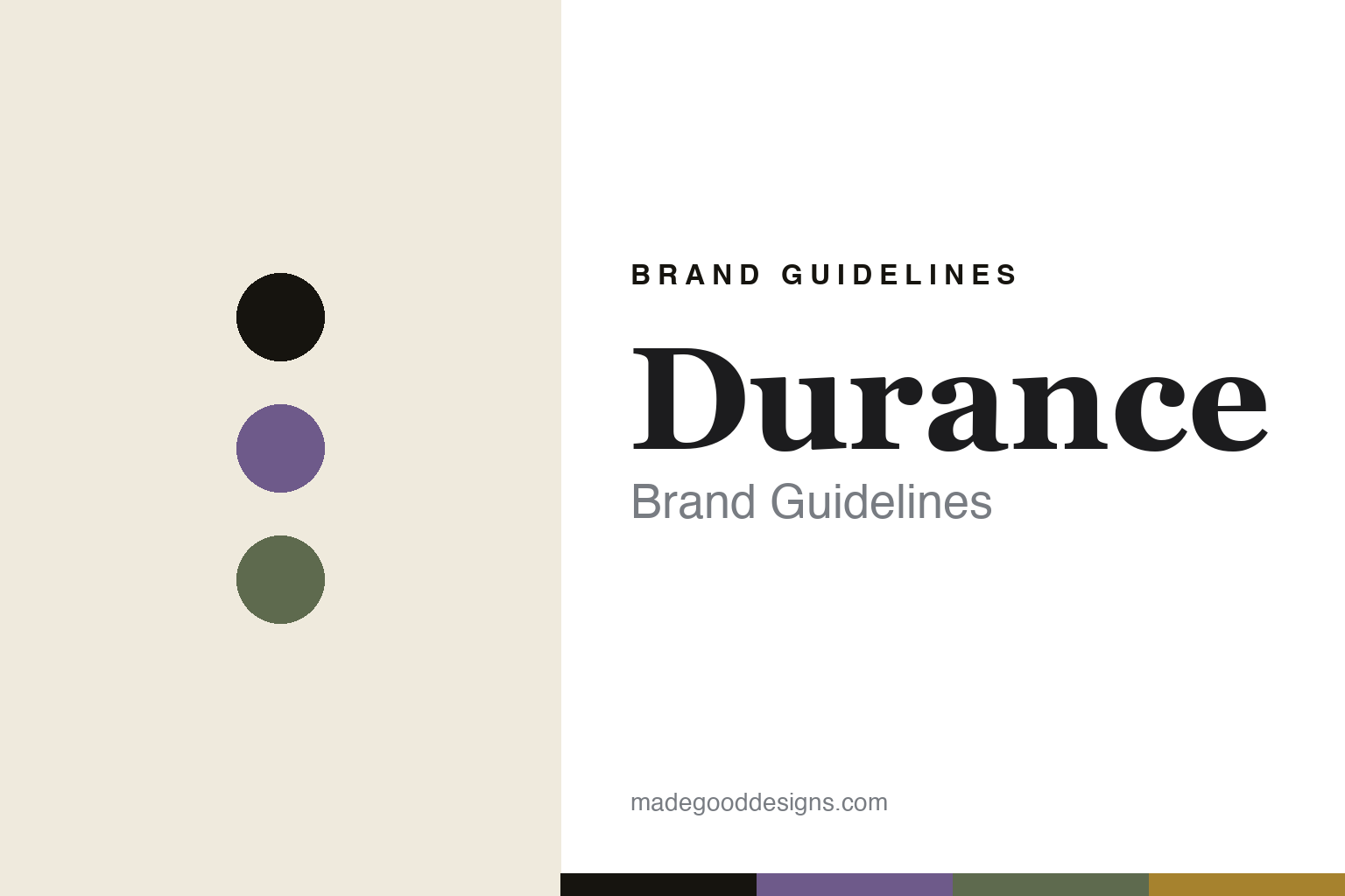
Durance Brand Guidelines
The reed diffuser.
Aa
Two constants: a Provence-natural palette and a Provençal serif register. Abstract homage — not the Durance bottles or labels.
The reed diffuser
Durance scents Provence from Grignan.
Durance is a lesson in Provence as the identity. Built around a lavender farm in Grignan and established as a brand in the late 1990s by the Ruth family, it makes natural home fragrance from the Drôme Provençale.
Its identity is the reed diffuser. Durance makes home fragrance — its signature the faceted-glass reed diffuser finished with a hand-tied raffia strand — alongside scented candles, room sprays, scented sachets, natural soaps and body care. Provence, decanted. A diffuser tied with raffia.
(Honest notes: Durance’s lavender-farm precursor dates to 1986, but the brand itself was established when the Ruth family acquired the Grignan farm in 1997 and adopted the Durance name in 1998 — so we date the brand to the late 1990s, not 1990, and attribute its origin to a farming couple / the Ruth family rather than a single named founder. Its signature is the faceted-glass reed diffuser with a raffia tie (we don’t assert a “perfumed ceramic pebble,” which we couldn’t verify). It fills and packages at its own Grignan workshops, working with Grasse perfumers; “made in France” and its natural claims are its own account. It is not fully independent — it sits within a Ruth-family group (PND / Oliniro), so we call it a family-owned group. There’s no official brand hex — these tones are an unofficial interpretation. This is design commentary and does not promote any product.)
Colour
Durance lives in a Provence-natural palette. Click a swatch to copy the hex.
Durance’s identity is natural, botanical and Provençal — a lavender, an ink, a sage, an ochre, and a cream. The palette pairs a lavender with a sage — the register of Provence botanicals and a raffia-tied bottle. It signals nature and place rather than novelty. The honest caveat: with no published brand hex, these tones are an original, unofficial interpretation, not first-party values.
The lesson is a Provence-natural palette signals a place-rooted fragrance house. Durance’s world is a soft, botanical object. For designers, it is a reminder that a genuine place — a lavender farm in Grignan — plus a signature finishing detail (the raffia tie) can carry a whole range. Because a mid lavender can fail as small text, keep type dark and let the colour live in the accents, palette and band. The takeaways: root it in a place; own a finishing detail; keep it natural; and treat any single hex as unofficial.
Typography
The register is a Provençal serif — soft, natural, refined.
Durance’s identity carries a soft, natural, refined spirit — a botanical, Provençal object. A light old-style serif captures the mood: it is gentle and elegant, the register of a Provence house. Set in a Provence-natural palette, the Provençal serif feels soft and natural — exactly the personality Durance carries. It is refined rather than rustic, mirroring a botanical label. (Durance’s real bottles, raffia tie and wordmark are works we describe but do not reproduce, and the exact typeface is not ours to use.) Because it is not ours to use, the honest description is “a Provençal serif spirit,” shown here in a stand-in. The type behaves like the brand: soft, natural and refined.
Aa
A Provençal serif spirit — soft and natural. (Specimen set in Cormorant Garamond, a light old-style serif STAND-IN; NOT the Durance packaging.)
Provence as identity
Durance stands for the reed diffuser.
Durance is a lesson in making Provence the identity. A Provence-natural palette, a Provençal serif and a raffia-tied diffuser make place the whole brand — natural, botanical, Provençal. The place is the differentiator. The differentiator is a real Grignan lavender farm and a signature finishing detail.
Put to work, the identity is provenance plus a signature gesture. A designer building in this spirit would anchor the brand to a genuine place and add one repeatable detail — here a hand-tied raffia strand — so every bottle reads as made, natural and from somewhere specific. The lesson Durance teaches is that a small, consistent finishing touch can do enormous brand work: the raffia tie signals hand-finishing and Provençal craft at a glance, and pairing it with a real farm keeps the “natural” story honest rather than cosmetic. Filling and packaging at its own Grignan workshops is what lets that story hold together across candles, diffusers and soaps.
For designers and brand-builders, Durance offers a clear takeaway: pair a real place with a signature detail. The lessons: root it in a place; own a finishing detail; keep it natural; and be honest about the story. It is also a reminder to stay accurate: it was established as a brand in the late 1990s around a Grignan lavender farm by the Ruth family, its signature is the raffia-tied reed diffuser, and it sits within a family group — the palette here is an unofficial interpretation. And it is a reminder that a modest handmade detail can be a cheaper, more durable brand asset than any logo: a strand of hand-tied raffia costs little, survives every redesign, and communicates “natural” and “made by hand” faster than a paragraph of copy ever could. Durance made the reed diffuser the brand — proof that a place can be the difference.
Explore & save
Keep Durance’s identity on hand — save it to a board in the Made Good inspiration library.
Durance identity set
Pin the Provence-natural palette and the Provençal-serif register to your own board.