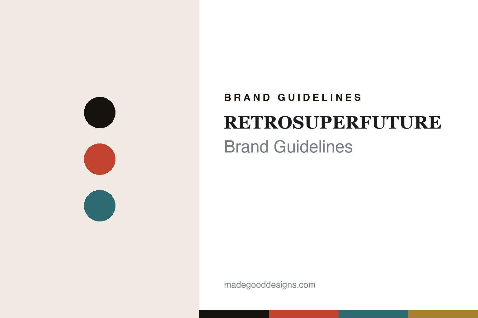
RETROSUPERFUTURE Brand Guidelines
The bold acetate.
Aa
Two constants: a bold-acetate palette and a fashion serif register. Abstract homage — not the SUPER frames, temple details or collab marks.
The bold acetate
RETROSUPERFUTURE made acetate loud.
RETROSUPERFUTURE is a lesson in bold acetate as the identity. Founded in 2007 in Milan by Daniel Beckerman, it built a fashion-and-streetwear following on vivid, sculptural acetate sunglasses — sold under its “Super” eyewear line.
Its identity is the bold acetate. RETROSUPERFUTURE makes bold, colourful acetate sunglasses (and optical), with signature silhouettes like the Flat Top and a long history of collaborations. Acetate, turned up loud. A sunglass as a statement.
(Honest notes: RETROSUPERFUTURE was founded in 2007 in Milan by Daniel Beckerman; “Super” is its eyewear line (marketed “Super by Retrosuperfuture”), while RETROSUPERFUTURE is the brand — the two are a brand and a line, not synonyms. Its frames are handmade in Italy, reportedly using Mazzucchelli acetate and ZEISS lenses (we attribute this). The Flat Top is an early, signature silhouette (we don’t claim it was literally the first — the brand launched with several). On ownership, a key fact: it is not independent — Renzo Rosso’s Red Circle took a minority stake in 2017 and a majority (51%) in 2019. There’s no official brand hex, and we reproduce no frame silhouette, temple detail or collaborator mark — these tones are an unofficial interpretation. This is design commentary and does not promote any product.)
Colour
RETROSUPERFUTURE lives in a bold-acetate palette. Click a swatch to copy the hex.
RETROSUPERFUTURE’s identity is bold, colourful and Italian — a bold red, an ink, a teal, a gold, and a cream. The palette leans bold acetate — the register of vivid, patterned Italian acetate. It signals boldness and colour rather than novelty. The honest caveat: with no published brand hex, these tones are an original, unofficial interpretation, not first-party values.
The lesson is a bold-acetate palette signals a statement eyewear brand. RETROSUPERFUTURE’s world is a vivid, sculptural object. For designers, it is a reminder that in a category full of black frames, committing to bold shapes and loud acetate can be a whole identity — and that a strong silhouette (the Flat Top) plus collaborations keeps a brand culturally current. Because a bold red can fail as small text, keep type dark and let the colour live in the accents, palette and band. The takeaways: go bold; own a silhouette; collaborate; and treat any single hex as unofficial.
Typography
The register is a fashion serif — bold, high-contrast, Italian.
RETROSUPERFUTURE’s identity carries a bold, high-contrast, Italian spirit — a vivid, statement object. A dramatic fashion serif captures the mood: it is confident and stylish, the register of a Milanese eyewear label. Set in a bold-acetate palette, the fashion serif feels bold and high-contrast — exactly the personality RETROSUPERFUTURE carries. It is statement rather than quiet, mirroring loud acetate. (RETROSUPERFUTURE’s real frames, temple details and collab marks are works we describe but do not reproduce, and the exact typeface is not ours to use.) Because it is not ours to use, the honest description is “a fashion serif spirit,” shown here in a stand-in. The type behaves like the brand: bold, high-contrast and Italian.
Aa
A fashion serif spirit — bold and high-contrast. (Specimen set in Bodoni Moda, a dramatic fashion serif STAND-IN; NOT the SUPER wordmark.)
Bold acetate as identity
RETROSUPERFUTURE stands for the bold acetate.
RETROSUPERFUTURE is a lesson in making bold acetate the identity. A bold-acetate palette, a fashion serif and a vivid frame make the statement sunglass the whole brand — bold, colourful, Italian. The boldness is the differentiator. The differentiator is loud, sculptural Italian acetate and a silhouette people recognise.
Put to work, the identity is confidence in colour and shape. A designer building in this spirit would reject the safe black frame, commit to strong silhouettes and vivid acetate, and use collaborations to stay in the cultural conversation. The lesson RETROSUPERFUTURE teaches is that a distinctive shape plus loud material can build a fashion brand fast: the Flat Top gave it an instantly recognisable signature, Italian acetate gave the colour real quality, and a steady stream of collaborations kept it current — which is exactly the kind of momentum that attracts a fashion investor. Being clear that it is now majority-owned by Red Circle keeps the “independent upstart” story accurate.
For designers and brand-builders, RETROSUPERFUTURE offers a clear takeaway: own a bold shape and a loud material. The lessons: go bold; own a silhouette; collaborate; and be honest about the story. It is also a reminder to stay accurate: it was founded in 2007 in Milan by Daniel Beckerman, “Super” is its eyewear line, it is handmade in Italy, and it is majority-owned by Red Circle since 2019 — the palette here is an unofficial interpretation. And it is a reminder that collaborations are a distribution strategy disguised as design: each partner brand lends its audience for the length of a capsule, so a small eyewear label can borrow reach it could never buy — which only works if the house silhouette is strong enough to stay recognisably itself inside every collaboration. RETROSUPERFUTURE made bold acetate the brand — proof that boldness can be the difference.
Explore & save
Keep RETROSUPERFUTURE’s identity on hand — save it to a board in the Made Good inspiration library.
RETROSUPERFUTURE identity set
Pin the bold-acetate palette and the fashion-serif register to your own board.