Ester & Erik Brand Guidelines
The colour range.
Aa
Two constants: a curated-colour palette and a Danish sans register. Abstract homage — not the Ester & Erik heart mark or labels.
The colour range
Ester & Erik dips candles in 85+ colours.
Ester & Erik is a lesson in a colour range as the identity. Founded in 1987 by the Danish couple Erik and Ester Møller, it built a candle company around one idea: the hand-dipped dinner candle, offered in a huge, curated palette of colours.
Its identity is the colour range. Ester & Erik hand-dips taper and dinner candles in more than eighty colours, matte and lacquered, alongside pillars, cones, scented candles and candlesticks. Colour, catalogued. A candle chosen like a paint chip.
(Honest notes: Ester & Erik was founded in 1987 by Erik and Ester Møller — the name is simply the two founders — with Erik drawing on around fifteen years in the candle trade; their son Søren Møller took over in 2001 and it remains an independent, family-owned Danish business. Its candles are made in Denmark (widely reported as Silkeborg), hand-dipped on the founder’s custom machine. Its signature is the wide curated colour range — reportedly over eighty-five colours, matte and lacquered. We note its candles are paraffin (not a “natural” wax), and treat its material and FSC-packaging claims as the brand’s own. Its wordmark carries a small heart between the names, which we describe but do not reproduce. There’s no official brand hex — these tones are an unofficial interpretation. This is design commentary and does not promote any product.)
Colour
Ester & Erik lives in a curated-colour palette. Click a swatch to copy the hex.
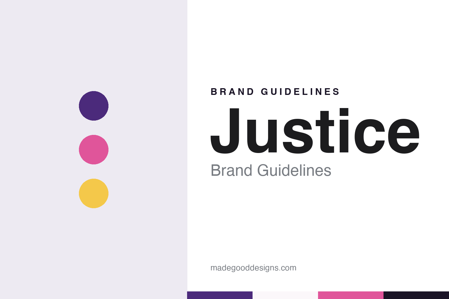
Ester & Erik’s identity is colourful, Danish and considered — an ochre, an ink, a sage, a rose, and a chalk. The palette leans curated colour — the register of a wall of dipped tapers. It signals colour and craft rather than novelty. The honest caveat: with no published brand hex, these tones are an original, unofficial interpretation, not first-party values.
The lesson is a curated colour range signals a design candle maker. Ester & Erik’s world is a considered wall of colour. For designers, it is a reminder that range itself — a carefully edited spectrum, matte against lacquered — can be a whole identity, and that offering colour as a system turns a simple object into a decorating decision. Because a mid ochre can fail as small text, keep type dark and let the colour live in the accents, palette and band. The takeaways: curate the spectrum; hold one object; pair matte and lacquer; and treat any single hex as unofficial.
Typography
The register is a Danish sans — clean, quiet, considered.
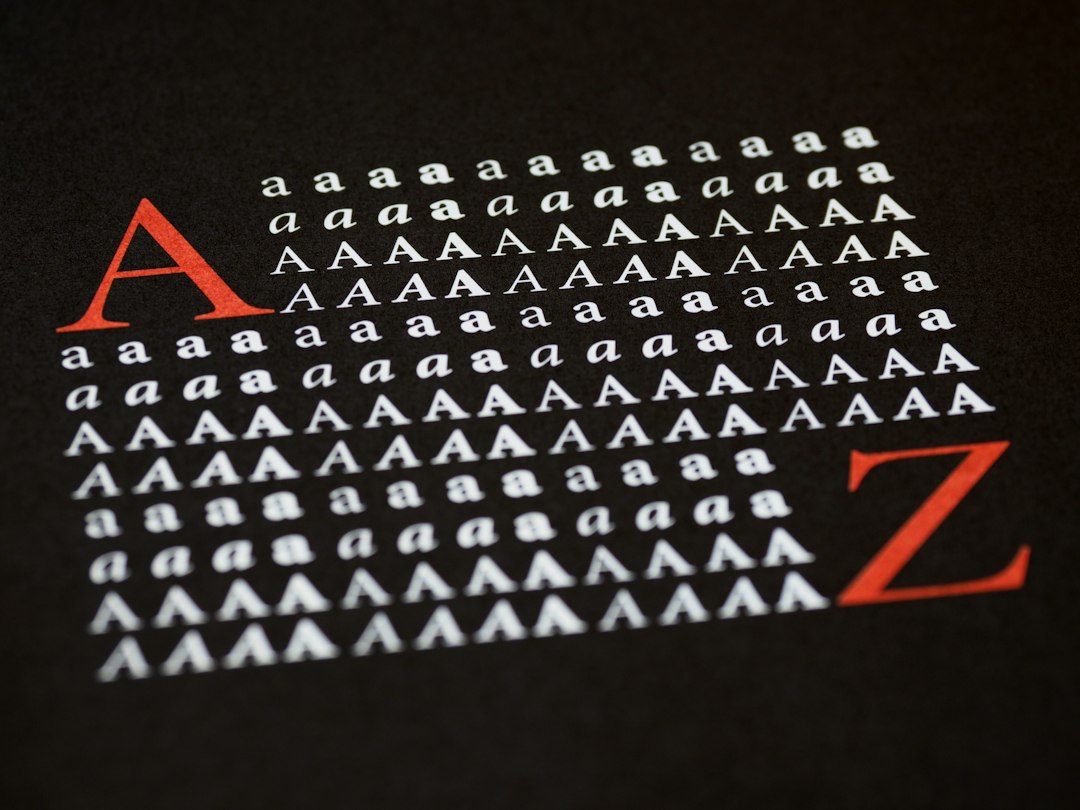
Ester & Erik’s identity carries a clean, quiet, considered spirit — a colourful, dipped object. A soft geometric sans captures the mood: it is calm and modern, the register of a Danish design house. Set in a curated-colour palette, the Danish sans feels clean and quiet — exactly the personality Ester & Erik carries. It is understated rather than loud, letting the colours speak. (Ester & Erik’s real heart mark, wordmark and labels are works we describe but do not reproduce, and the exact typeface is not ours to use.) Because it is not ours to use, the honest description is “a Danish sans spirit,” shown here in a stand-in. The type behaves like the brand: clean, quiet and considered.
Aa
A Danish sans spirit — clean and quiet. (Specimen set in Onest, a soft geometric sans STAND-IN; NOT the Ester & Erik packaging.)
A colour range as identity
Ester & Erik stands for the colour range.
Ester & Erik is a lesson in making a colour range the identity. A curated-colour palette, a Danish sans and a dipped taper make the spectrum the whole brand — colourful, Danish, considered. The range is the differentiator. The differentiator is one object — the dinner candle — offered in a carefully edited wall of colour.
Put to work, the identity is range as a system. A designer building in this spirit would treat colour as the product — a curated, named spectrum, matte and lacquered pairs, seasonal additions — so a customer chooses a candle the way they choose a paint or a textile, to match a room. The lesson Ester & Erik teaches is that depth beats breadth of product: rather than many different objects, it perfected one and multiplied it across colour, which makes the brand instantly legible on a shelf and endlessly collectible at home. Keeping the making in the family, on the founder’s own dipping machine, is what lets that range stay coherent.
For designers and brand-builders, Ester & Erik offers a clear takeaway: perfect one object, multiply it by colour. The lessons: curate the spectrum; hold one object; pair matte and lacquer; and be honest about the story. It is also a reminder to stay accurate: it was founded in 1987 by Erik and Ester Møller in Denmark, it hand-dips tapers in more than eighty colours, and it is an independent family business now led by their son — the palette here is an unofficial interpretation. Ester & Erik made the colour range the brand — proof that range can be the difference.
Explore & save
Keep Ester & Erik’s identity on hand — save it to a board in the Made Good inspiration library.
Ester & Erik identity set
Pin the curated-colour palette and the Danish-sans register to your own board.