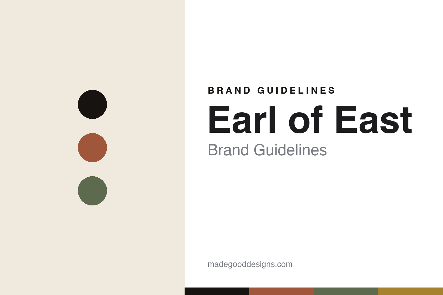
Earl of East Brand Guidelines
The apothecary jar.
Aa
Two constants: a muted-earthy palette and an apothecary sans register. Abstract homage — not the Earl of East labels or packaging.
The apothecary jar
Earl of East pours candles in East London.
Earl of East is a lesson in the apothecary jar as the identity. Founded in 2014 by the couple Paul Firmin and Niko Dafkos, it began as a market stall in London and grew into a hand-poured candle and home-fragrance brand with its own shops.
Its identity is the apothecary jar. Earl of East hand-pours soy-wax scented candles and makes incense, diffusers, room mists and soaps, all in a muted, earthy apothecary style — amber and frosted glass, restrained typographic labels. Slow living, bottled. A candle that looks like a chemist’s jar.
(Honest notes: Earl of East was founded in 2014 by Paul Firmin and Niko Dafkos — a couple — who began at Netil Market in Hackney and opened an early shop in a converted shipping container shortly after (sources vary between 2014 and 2015). Its candles are hand-poured in small batches at its own East London studio, so we say “hand-poured in East London” rather than claiming that every product is UK-made. It is independent and self-funded — the founders bootstrapped it while holding full-time jobs — and still runs several London shops. The brand’s primary name today is “Earl of East” (it dropped “London”), though it appears historically as “Earl of East London.” There’s no official brand hex, and we reproduce no label or logo — these tones are an unofficial interpretation. This is design commentary and does not promote any product.)
Colour
Earl of East lives in a muted-earthy palette. Click a swatch to copy the hex.
Earl of East’s identity is muted, earthy and calm — a terracotta, an ink, a sage, an ochre, and a bone. The palette leans muted earthy — the register of an apothecary jar and a soy candle. It signals calm and craft rather than novelty. The honest caveat: with no published brand hex, these tones are an original, unofficial interpretation, not first-party values.
The lesson is muted earthy signals a modern apothecary. Earl of East’s world is a calm, amber-glass object. For designers, it is a reminder that a restrained palette and a consistent jar style can turn a candle into a lifestyle, and that “slow living” can be a whole positioning. Because a mid terracotta can fail as small text, keep type dark and let the colour live in the accents, palette and band. The takeaways: keep the palette muted; hold one jar style; sell the ritual; and treat any single hex as unofficial.
Typography
The register is an apothecary sans — clean, calm, understated.
Earl of East’s identity carries a clean, calm, understated spirit — a muted, apothecary object. A humanist grotesque sans captures the mood: it is quiet and modern, the register of a considered home-fragrance brand. Set in a muted-earthy palette, the apothecary sans feels clean and calm — exactly the personality Earl of East carries. It is understated rather than loud, mirroring a chemist’s label. (Earl of East’s real labels and wordmark are works we describe but do not reproduce, and the exact typeface is not ours to use.) Because it is not ours to use, the honest description is “an apothecary sans spirit,” shown here in a stand-in. The type behaves like the brand: clean, calm and understated.
Aa
An apothecary sans spirit — clean and calm. (Specimen set in Hanken Grotesk, a humanist grotesque sans STAND-IN; NOT the Earl of East packaging.)
The apothecary jar as identity
Earl of East stands for the apothecary jar.
Earl of East is a lesson in making the apothecary jar the identity. A muted-earthy palette, an apothecary sans and an amber-glass candle make the modern apothecary the whole brand — muted, earthy, calm. The jar is the differentiator. The differentiator is a consistent, restrained apothecary style across everything it makes.
Put to work, the identity is coherence. A designer building in this spirit would fix a jar silhouette, a muted palette and a quiet label system, then apply them across candles, incense, mists and soaps so the whole range reads as one calm world. The lesson Earl of East teaches is that consistency compounds: by holding a single apothecary look from a market stall to a set of shops, it made an inexpensive object feel considered, and turned “slow living” from a slogan into something you can see on a shelf. Bootstrapping it also kept the aesthetic tight, because every product had to fit the same modest, coherent story.
For designers and brand-builders, Earl of East offers a clear takeaway: hold one coherent look. The lessons: keep the palette muted; hold one jar style; sell the ritual; and be honest about the story. It is also a reminder to stay accurate: it was founded in 2014 by Paul Firmin and Niko Dafkos, it hand-pours in East London, and it is independent and self-funded — the palette here is an unofficial interpretation. Earl of East made the apothecary jar the brand — proof that coherence can be the difference.
Explore & save
Keep Earl of East’s identity on hand — save it to a board in the Made Good inspiration library.
Earl of East identity set
Pin the muted-earthy palette and the apothecary-sans register to your own board.