Real Estate Branding: A Complete Guide
Strong real estate branding is the difference between an agent who chases listings and one who gets called first. It is not a logo and a color you like — it is a repeatable system that makes you recognizable across a yard sign, a listing brochure, an open-house flyer, and a thumbnail in someone’s inbox. This guide walks through the full identity, from the agent-versus-brokerage relationship to print specs, so every touchpoint looks like it came from the same confident business.
What Real Estate Branding Actually Means
Branding is the total impression a buyer or seller forms before they ever shake your hand. In real estate that impression is built almost entirely from marketing materials — signage, photography, flyers, social posts, and the way you present a listing — because most prospects research you long before they call. A coherent brand identity tells them you are organized, established, and worth trusting with their largest transaction.
Effective branding answers three questions instantly: who you are, what kind of properties you handle, and why you are the obvious choice in your market. A luxury waterfront specialist and a first-time-buyer FHA expert should not look the same. The visual system — typeface, color, photography style, tone — should match the clientele you actually want.
It also compounds over time. Real estate runs on referrals and repeat business, and a buyer who saw your sign on three corners, your flyer at an open house, and your face on a postcard already feels like they know you before the first call. That cumulative familiarity is the entire point of a consistent brand: it shortens the distance between “I’ve seen that agent around” and “I should call that agent.” Inconsistency does the opposite — a different logo on the sign than the flyer, a stock-photo headshot here and a phone selfie there, reads as scattered, and sellers read scattered as risky.
Personal Brand vs. Brokerage Brand
This is the relationship that trips up most new agents. In the United States, the vast majority of agents license under a brokerage (Keller Williams, RE/MAX, Coldwell Banker, eXp, and countless independents). The brokerage owns a registered trademark and enforces strict rules on how its logo, name, and colors appear. Your personal brand lives on top of that, and the two must coexist legally and visually.
- Brokerage brand: the franchise or company identity. Its logo, legal name, and contact info usually must appear on every public-facing piece, often at a minimum size and in approved colors.
- Personal/team brand: your name, your logo or wordmark, your headshot, your tagline, and your contact details — the part clients actually remember.
- The lockup: a pre-approved arrangement that combines your name with the brokerage logo at a fixed relationship. Most brokerages publish brand guidelines and require you to use the official lockup rather than recreating it.
Rules vary by brokerage, by state license law, and by local MLS — disclosure of the brokerage name is frequently mandated on advertising. Always pull your brokerage’s brand guidelines and your state’s advertising rules before you print anything, and verify current requirements rather than assuming. For the foundations of building any identity system, our overview of visual identity design covers the principles that apply here too.
The Real Estate Logo
Your logo is the anchor of the system, but in real estate it rarely stands alone — it sits beside your headshot, your name, and the brokerage lockup, so it has to be simple enough to survive that crowd. A clean wordmark of your name, a monogram, or a restrained property-related mark (a roofline, a key, an abstract door) all work. Avoid clip-art houses and gradients that fall apart at small sizes on a sign.
Design it to scale from a 16px favicon to a 24×36 inch yard sign without losing legibility, and supply it in vector format (SVG/EPS/PDF) so your printer can scale cleanly. For a deeper walkthrough of marks, ideas, and examples tailored to agents, see our guide to real estate logo design, and for the broader workflow read our logo design process primer.
Typography and Color
Pick a maximum of two typefaces and stick to them everywhere. A common pairing is a confident serif or geometric sans for headlines and a highly legible sans for body and contact details. Inter is a free, widely available sans (Google Fonts) with a high x-height that stays readable on signs and small print; pair it with a serif like Source Serif 4 (also free) for a balance of authority and warmth.
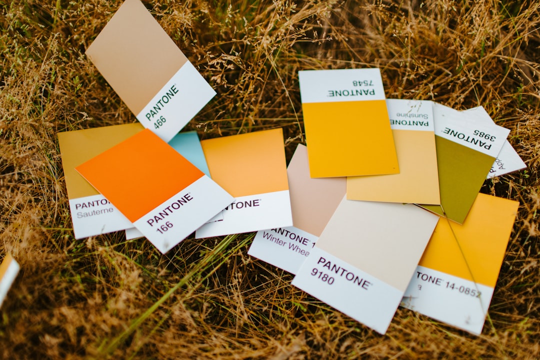
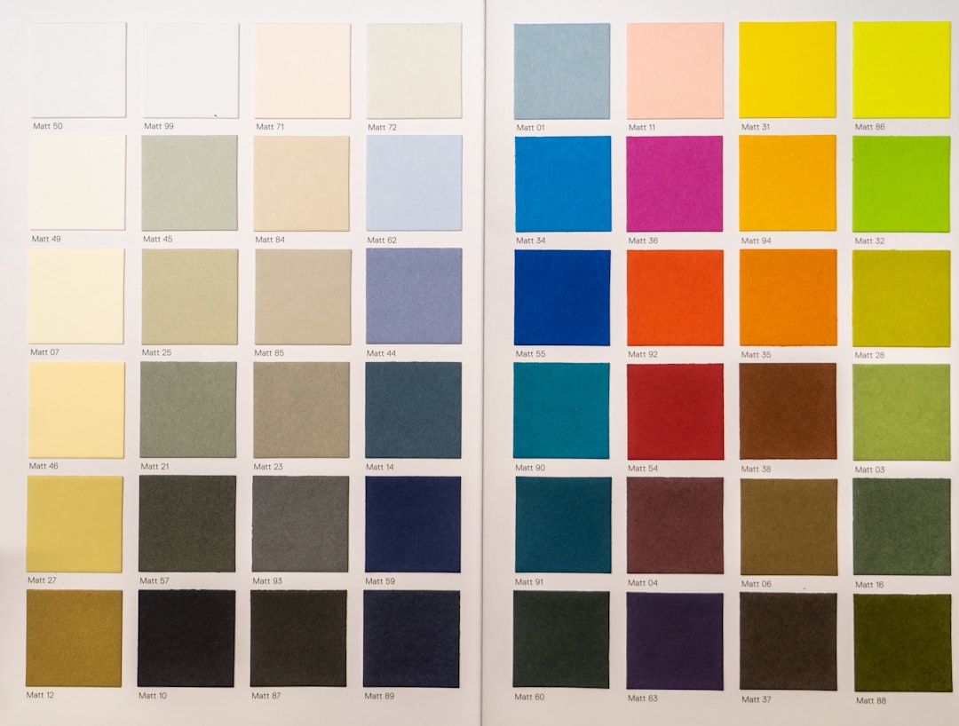
Choose a tight color palette — typically one primary, one accent, and one neutral. Many brokerages dictate the primary color, so build your accent and neutrals around it. High contrast matters more than fashion: a yard sign must read from a moving car, and a flyer must survive a cheap office printer.
Whatever you choose, document it as a one-page brand sheet: the exact font names and weights, the color values in both CMYK (for print) and RGB/HEX (for screen), the logo lockup spacing, and your headshot crop. This is what keeps you consistent when you are tired, rushing a listing live, or handing a template to an assistant or a designer. The brands that look expensive are rarely the ones with the most elaborate logos — they are the ones that repeat the same handful of decisions everywhere, without exception.
| Brand element | Constraint to design for |
|---|---|
| Logo | Legible from favicon to 24×36 sign; vector source |
| Headline font | Reads at distance and small print |
| Body font | Phone number and license # legible at 9–10pt |
| Color palette | High contrast, brokerage-compliant primary |
| Headshot | Consistent crop, lighting, background |
Photography: Your Most Important Asset
In real estate, photography outranks almost every other brand element. A beautiful brand on a listing with dim, crooked phone photos signals that you cut corners — exactly the opposite of what a seller wants. Two photo standards define the brand:
- Your headshot. Use one consistent, professionally lit headshot across signage, flyers, and profiles. Define a fixed crop and background so it looks identical everywhere.
- Listing photography. Commission wide-angle, properly exposed, straightened interior/exterior shots, plus twilight and drone images for higher-end homes. This is where your marketing budget earns its keep.
The Core Marketing Materials
Branding only pays off when it is applied consistently across the pieces buyers and sellers actually touch. Build a templated kit so every new listing looks on-brand in minutes:
- Yard signs and riders. The most public expression of your brand — standardized layout, your name, headshot optional, and a clear phone/QR. See our guide to yard sign design for sizes and stake hardware.
- Listing flyers. The one-page sheet in the sign rider box and on the kitchen counter. Our real estate flyer design guide covers templates and layout.
- Property brochures. The multi-page piece for higher-value homes. See property brochure design for how to structure listings that sell.
- Open-house flyers. Event-focused, with date, time, and address front and center — covered in our open house flyer design guide.
- Business cards, postcards (EDDM), and social templates that all reuse the same logo, fonts, and color.
Print Specs Every Agent Should Know
If your printed pieces look muddy or get rejected by the printer, it is almost always a file problem. Bake these specs into every template so you never have to fix them per job:
- 300 DPI resolution for anything printed — web images pulled at 72 DPI will look pixelated.
- CMYK color mode for print (RGB is for screens). Convert and proof your brand colors so they do not shift.
- 0.125″ (1/8″) bleed on any design where color or images run to the edge, plus a safe margin to keep text from being trimmed.
- Standard sizes: flyers on US Letter 8.5×11, postcards at 4×6, 5×7, or 6×9 (the larger sizes qualify for USPS EDDM), yard signs at 18×24 or 24×36 on corrugated plastic.
For the underlying print fundamentals that apply to any piece, our general guides to flyer design and brochure design are useful references.
Compliance and Required Information
Real estate advertising is regulated, and the rules differ by state and MLS. Common requirements include the brokerage’s legal name, the agent’s license number, equal-housing language or logo, and sometimes the brokerage phone number. MLS info conventions — what you may publish from a listing, and how — also vary. Treat these as non-optional design elements: build a fixed footer zone into every template so the license number and brokerage line never get left off. Confirm current requirements with your broker and state regulator, because they change.
Tools to Build and Maintain the System
You do not need a full studio to run a tight brand. Canva (with Brand Kit) lets you lock fonts, colors, and logos into reusable templates that non-designers can fill in safely. Adobe InDesign is the professional choice for multi-page brochures and precise print control, and Adobe Photoshop handles photo retouching and twilight edits. Whatever you choose, the goal is the same: templated, locked-down files so every listing looks like it came from one organized brand.
The practical workflow is to build the system once and reuse it forever. Set up master templates for each piece — sign, flyer, brochure, open-house flyer, postcard, social — with your fonts, colors, logo lockup, and footer already in place. When a new listing comes in, you swap the photos, address, price, and stats and you are done in minutes, with zero risk of an off-brand layout slipping out. That speed is its own competitive advantage: the agent whose marketing is live the day a listing hits the MLS looks more capable than the one scrambling to design from scratch.
How the Pieces Fit Together
A real estate brand is not any single asset; it is the consistency across all of them. The buyer’s journey usually runs: they spot a yard sign while driving, grab a flyer from the rider box, attend an open house with a flyer or brochure, and later recognize your logo on a postcard or social post. Every one of those touchpoints should share the same typeface, color, headshot, and lockup, so each encounter reinforces the last instead of starting from zero.
Use this cluster as your build checklist. Start with the logo and brand sheet, then template the listing flyer and open house flyer, design the yard sign and riders, and reserve the property brochure for higher-value listings. Build them in that order and each piece inherits the decisions from the one before it.
Frequently Asked Questions
Do I need my own brand if my brokerage already has one?
Yes. The brokerage brand establishes credibility, but buyers and sellers hire a person. A consistent personal brand — your name, headshot, fonts, and color used across every piece — is what makes you memorable and referable, layered correctly on top of the required brokerage lockup.
Can I change my brokerage’s logo to match my colors?
No. Brokerage logos are trademarks with strict usage rules covering color, spacing, and minimum size. You must use the approved logo and the official name-plus-brokerage lockup. Build your personal accent colors around the brand, and always check your brokerage’s current guidelines.
What information is legally required on real estate marketing?
Requirements vary by state and MLS but commonly include the brokerage’s legal name, the agent’s license number, and equal-housing language. Build a fixed footer into every template so these never get omitted, and verify the exact rules with your broker and state regulator before printing.
What matters most in real estate branding?
Consistency and photography. A clean, repeated visual system across signs, flyers, and brochures builds recognition, while professional listing photos and one consistent headshot do more for perceived quality than any logo. Invest in both before chasing trendy design.
What is the cheapest way to look professional?
Build a locked Brand Kit in Canva with your fonts, colors, and logo, commission one professional headshot, and always hire a photographer for listings. That combination delivers a coherent, premium-looking brand at minimal cost while keeping every template print-ready at 300 DPI and CMYK.