Shades of Copper: Names and Hex Codes
There are many recognized shades of copper, from the warm metallic classic to dark antique patinas and soft copper roses. Below is a practitioner reference: each shade with its name, hex code, RGB value, and a note on where it works best. Use it as a swatch library when building a palette, and pair it with our guide to color psychology when you need the symbolism behind the swatch.
A quick note on terminology, because copper sits in a warm metallic-brown zone. Copper — commonly cited as #B87333 — is a warm reddish-brown that mimics the metal, named after the element. It is frequently confused with bronze (more yellow-brown) and rose gold (pinker). If you need that distinction, see our comparison of copper vs bronze and our reference on shades of gold. Throughout this guide, “shades of copper” covers every named variation in that warm, metallic red-brown family.
Each entry below gives three values so you can use it anywhere: the hex code (for CSS, HTML, and most design tools), the RGB triplet (for screen-based tools that ask for red, green, and blue channels separately), and a short note on the mood and best use of that shade. If you need CMYK or a Pantone match for print, convert from the hex value in your design software, and always proof — metallic tones flatten and shift noticeably between screen and press.
Classic coppers
These are the core coppers most people picture — warm, polished metal tones used in craft, premium, and heritage branding.
| Shade name | Hex | RGB | Notes / use |
|---|---|---|---|
| Copper | #B87333 | 184, 115, 51 | Classic warm metal tone; rich, premium. |
| Pale Copper | #B66E41 | 182, 110, 65 | Softer warm copper; mellow, natural. |
| Copper Penny | #AD6F69 | 173, 111, 105 | Muted pink-brown copper; vintage, soft. |
| Bright Penny | #C88141 | 200, 129, 65 | Warm shiny copper; lively, rich. |
| Bronze Copper | #A97142 | 169, 113, 66 | Yellow-leaning copper; antique, warm. |
| Polished Copper | #BB6B3D | 187, 107, 61 | Clean warm metal; refined, modern. |
Bright and red coppers
The warmer, more orange-red coppers — bright, energetic, and unmistakably metallic.
| Shade name | Hex | RGB | Notes / use |
|---|---|---|---|
| Bright Copper | #CB6D51 | 203, 109, 81 | Warm orange-red copper; vivid, lively. |
| Copper Red | #B05C3D | 176, 92, 61 | Deep red-brown copper; rich, earthy. |
| Copper Orange | #D2691E | 210, 105, 30 | Bright orange-copper; energetic, warm. |
| Mahogany Copper | #C04000 | 192, 64, 0 | Deep red-orange; bold, dramatic. |
| Bronze-Toned Copper | #CD7F32 | 205, 127, 50 | Warm metallic gold-brown; classic, rich. |
| Burnt Copper | #E97451 | 233, 116, 81 | Soft orange-copper; warm, friendly. |
Antique and dark coppers
Pushed toward brown and patina, these aged coppers signal heritage and craft — perfect for vintage and luxury identities.
| Shade name | Hex | RGB | Notes / use |
|---|---|---|---|
| Antique Copper | #6A4928 | 106, 73, 40 | Dark aged brown-copper; heritage, rich. |
| Dark Copper | #7E481C | 126, 72, 28 | Deep brown-copper; moody, grounded. |
| Saddle Copper | #8B4513 | 139, 69, 19 | Warm leather-brown; rustic, classic. |
| Aged Copper | #5E3719 | 94, 55, 25 | Deep weathered brown; antique, subtle. |
| Oxidized Copper | #43302E | 67, 48, 46 | Near-black patina brown; moody, deep. |
| Bronze Patina | #7F5217 | 127, 82, 23 | Dark gold-brown; antique, warm. |
Rose and pink coppers
Softer, pinker coppers that tip toward rose gold and blush — the most contemporary and elegant of the family.
| Shade name | Hex | RGB | Notes / use |
|---|---|---|---|
| Copper Rose | #996666 | 153, 102, 102 | Muted pink-brown copper; soft, elegant. |
| Rose Gold Copper | #B76E79 | 183, 110, 121 | Pink metallic copper; modern, luxe. |
| Blush Copper | #C08081 | 192, 128, 129 | Soft warm pink; romantic, refined. |
| Dusty Copper | #A57164 | 165, 113, 100 | Muted earthy copper; subtle, natural. |
| Terracotta Copper | #BD8479 | 189, 132, 121 | Warm clay-pink; earthy, soft. |
| Mauve Copper | #8C5A56 | 140, 90, 86 | Deep dusty rose-brown; editorial, muted. |
What are the most popular shades of copper?
The most-used named coppers in design are copper (#B87333), bright copper (#CB6D51), antique copper (#6A4928), copper rose (#996666), and copper red (#B05C3D). Classic copper dominates craft, premium, and heritage branding; bright copper brings warm energy; antique copper adds aged richness; and copper rose pushes toward soft, contemporary elegance. Lighter coppers feel warm and approachable, while darker coppers project craft and prestige.
Copper’s appeal is that it reads as the warmest, most tactile metallic — it carries the richness of metal but trades cold shine for an earthy, handmade warmth. That makes it a favorite for craft and artisan brands, premium kitchenware, beauty packaging, and hospitality, where the metal association does instant quality work. Because it sits between brown, orange, and rose, copper flexes from rustic and traditional to soft and modern. Choosing a copper is really choosing how bright, how aged, or how pink you want that warm metal to lean.
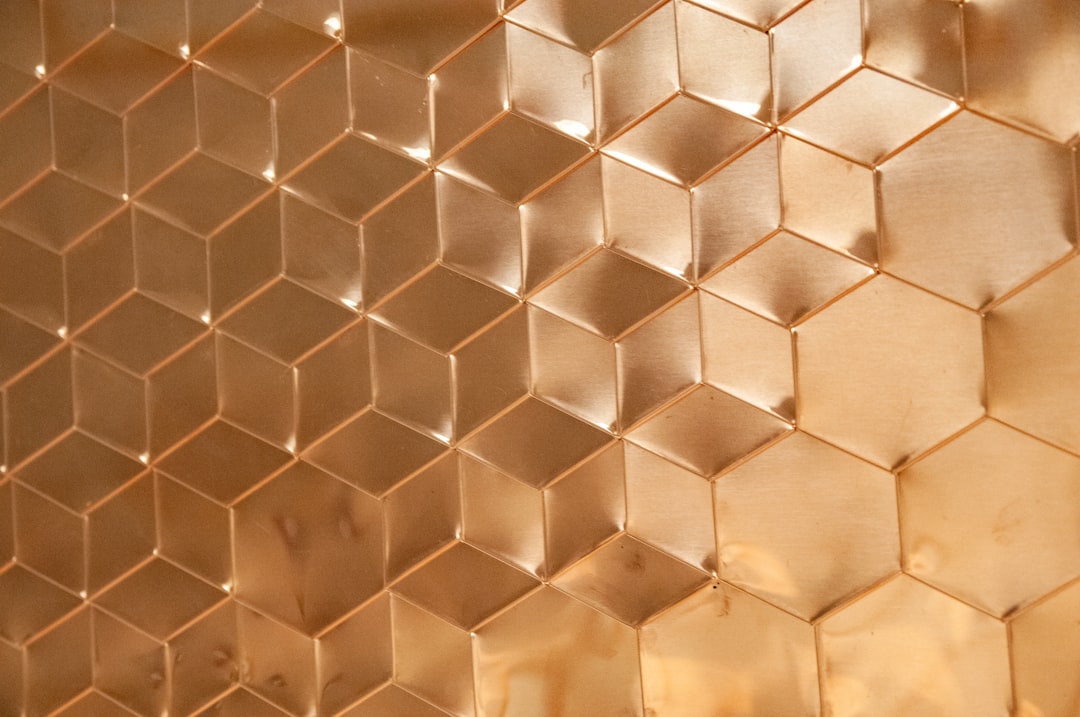
Copper is a metallic effect, not just a flat color, which is the single most useful thing to know when specifying it. On screen, a hex like #B87333 captures the base tone, but the real copper look comes from gradients, highlights, and foil in print. The values in the tables above — copper at #B87333, bright copper at #CB6D51, antique copper at #6A4928 — are the widely cited references, but always pin the exact hex and note whether you want a flat or metallic finish in your documentation. This matters doubly in packaging and signage, where copper is often realized in foil or ink, and small hue shifts read as completely different colors under store lighting.
How to use shades of copper in design
Copper is a warm, premium accent that signals craft and quality. Pair classic copper with deep teal, navy, or charcoal for a sophisticated, high-contrast palette, or with cream and soft gray for a warm, modern look. Deeper antique copper works beautifully as a heritage accent, while copper rose brings elegant softness to beauty and lifestyle brands.
Practical guidance: copper’s near-complement is a deep teal or blue-green, which gives a rich, balanced contrast — a reliable luxury and craft pairing. For type, dark and antique coppers stay readable on light backgrounds, while bright copper works best as an accent or for metallic foil treatments. To keep copper from feeling dated, pair it with cool grays, teal, and plenty of white space. Copper also pairs beautifully with other warm metals; see our comparison of copper vs bronze, and explore the broader warm-neutral range in shades of tan.
Frequently Asked Questions
What is the hex code for copper?
Copper is most commonly cited as #B87333, which is RGB 184, 115, 51 — a warm reddish-brown that mimics the polished metal. It is the widely accepted reference value, though true copper is a metallic effect, so designers often add gradients or foil to capture its shine.
What is the difference between copper and bronze?
Copper (#B87333) is a warmer, redder metal tone, while bronze (#CD7F32) leans more yellow-brown and muted. Copper reads as bright and energetic; bronze reads as antique and grounded. See our full copper vs bronze comparison for examples and palette ideas.
What is the difference between copper and rose gold?
Copper (#B87333) is a warm red-brown metal, while rose gold (#B76E79) is pinker and lighter. Copper feels earthy and rustic; rose gold feels soft and luxurious. Copper rose (#996666) bridges the two with a muted pink-brown that works in both directions.
Which shade of copper is best for a brand?
For craft and premium products, classic copper (#B87333) conveys warmth and quality. For heritage identities, antique copper (#6A4928) feels aged and rich. For beauty or lifestyle brands, copper rose (#996666) is soft and modern. Choose by how bright versus how aged or pink you want the identity to feel.
What colors go well with copper?
Copper pairs beautifully with deep teal or blue-green — its near-complement — for rich contrast, and with cream, charcoal, and soft gray for a warm, modern palette. Navy creates a classic combination, while forest green gives copper a natural, organic feel.


