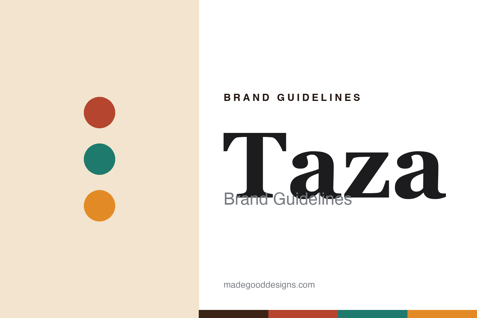
Taza Chocolate Brand Guidelines
Stone-ground, rustic Mexican-style chocolate.
Aa
Two constants: a folk-art palette and a rustic slab. Abstract homage — not the Taza wordmark or logo.
Bold, rustic and gritty
Taza makes stone-ground Mexican-style chocolate.
Taza Chocolate is a lesson in embracing texture as identity. Founded in 2005 by Alex Whitmore (with his wife Kathleen Fulton, its chief design officer) in Somerville, Massachusetts, Taza was inspired by the stone-ground chocolate Whitmore tasted in Oaxaca, Mexico — he even learned to hand-carve granite mill stones. Ground on traditional Mexican molinos, its chocolate is deliberately bold, rustic and “satisfyingly gritty,” minimally processed and organic. Its signature is the round “Chocolate Mexicano” discs in flavours like Cinnamon, Salted Almond and Guajillo Chili.
Taza is also a sourcing pioneer: it created what it calls the chocolate industry’s first third-party-certified Direct Trade cacao program, independently verified and paying premiums well above Fair Trade, with an annual transparency report. Its identity is bold, warm and folk-art influenced.
(Honest notes: Taza is stone-ground and deliberately gritty — the rustic texture is the point, not a defect; its signature format is the round discs; it says it created the first third-party-certified Direct Trade cacao program in the industry; and it is based in Somerville, MA, inspired by Oaxaca. No official brand hex is published.)
Colour
Taza lives in a folk-art palette. Click a swatch to copy the hex.
Taza’s identity is warm, rustic and folk-art bold — a deep cacao brown, a terracotta, a folk-art teal, a marigold, and a cream. The palette reads like Mexican folk art: warm cacao and terracotta, bright teal and marigold, hand-made and vivid. It signals rustic, traditional, hand-ground chocolate rather than sleek luxury. The honest caveat: with no published brand hex, these tones are an original, unofficial interpretation, not first-party values.
The lesson is a folk-art palette signals rustic, stone-ground chocolate. Taza’s world reads as warm and hand-made. For designers, it is a reminder that cacao and terracotta with folk-art teal and marigold convey a traditional, hand-ground craft, matching a brand built on stone-ground Mexican-style chocolate. The takeaways: draw on warm, folk-art colour; let rustic craft and heritage lead; and treat any single hex as unofficial — using the deep cacao brown for small text so the brights stay in the palette.
Typography
The wordmark spirit is a rustic slab — warm and hand-made.
Taza’s identity carries a warm, hand-made, rustic spirit — a “TAZA” wordmark whose sturdy forms match a stone-ground, folk-art brand. A rustic slab serif captures the mood: it is grounded and characterful, the register of traditional, hand-ground chocolate rather than sleek luxury. Set against a folk-art palette, the rustic slab feels warm and hand-made — exactly the stone-ground, Mexican-style personality Taza carries. It is characterful rather than polished, mirroring rustic, gritty chocolate. (Taza’s real wordmark is a trademark we describe but do not reproduce, and the exact typeface is not something we assert.) Because the specific mark is not ours to use, the honest description is “a rustic slab spirit,” not the Taza logo. The type behaves like the brand: warm, hand-made and rustic.
Aa
A rustic slab spirit — warm and hand-made. (Specimen set in Bitter, a slab serif; NOT the Taza logo, which is a trademark.)
Rustic texture and transparency as the difference
Taza stands for stone-ground, direct-trade chocolate.
Taza Chocolate is a lesson in owning what others smooth away. Most chocolate is conched silky-smooth; Taza kept it rustic and gritty, turning a “flaw” into its signature and celebrating the stone-ground Mexican tradition. It paired that distinctive texture with pioneering Direct Trade transparency — the first third-party-certified program of its kind — so it stands out on both taste and ethics. The differentiator is an ownable texture plus verifiable, transparent sourcing.
For designers and brand-builders, Taza offers a clear takeaway: an unusual, ownable quality plus real transparency can define a brand. The lessons: embrace a distinctive trait rivals avoid (gritty, stone-ground texture); anchor it in a genuine tradition (Oaxacan stone-grinding); and back it with verifiable ethics (certified Direct Trade). It is also a reminder to stay accurate: Taza is Somerville-based and Oaxaca-inspired, its discs are stone-ground and rustic, and it says it created the first certified Direct Trade cacao program — with the palette here an unofficial interpretation. Taza embraced the grit — proof that a distinctive texture and transparency can be the difference.
Explore & save
Keep Taza Chocolate’s identity on hand — save it to a board in the Made Good inspiration library.
Taza Chocolate identity set
Pin the folk-art palette and the rustic-slab spirit to your own board.


