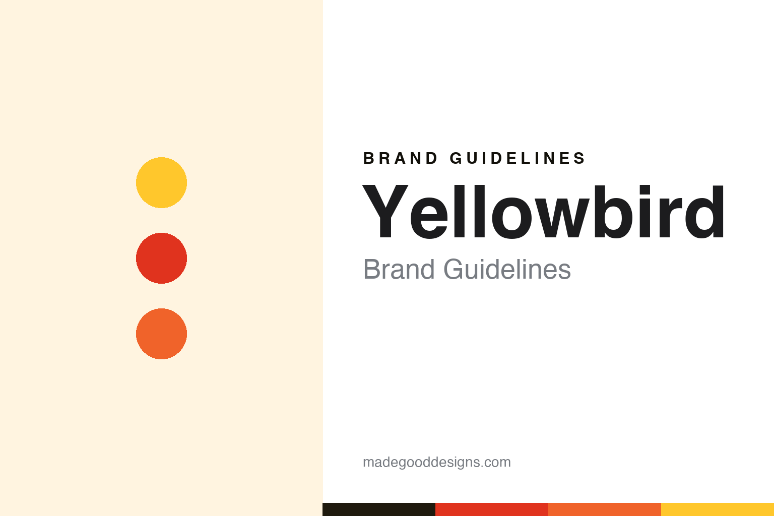
Yellowbird Brand Guidelines
Veggie-forward hot sauce — from Austin.
Aa
Two constants: a bold bright palette and a rounded sans. Abstract homage — not the Yellowbird wordmark or logo.
Veggie-forward heat
Yellowbird makes real-ingredient hot sauce.
Yellowbird is a lesson in real ingredients and a playful identity. Founded in 2012 in Austin, Texas by co-founders George Milton (a musician) and Erin Link (an artist), it began as a backyard-garden habanero sauce sold at farmers markets, then grew into supermarkets, Whole Foods and Amazon (a top seller). Its point of difference is being veggie-forward — whole real ingredients, with carrots giving its sauces a thick, pourable body rather than a thin vinegar base.
Its range spans Jalapeño, Serrano, Habanero, Ghost Pepper and Blue Agave Sriracha, plus a certified-organic line, all gluten-, shellfish- and dairy-free. And its identity is bold and fun: a bright yellow bird mascot, vivid flavour-keyed colours and a playful, slightly retro streak.
(Honest notes: Yellowbird is veggie-forward — carrots and vegetables give body, not just vinegar; it was co-founded by George Milton and Erin Link in 2012 in Austin, Texas; it is independent and venture-backed — not owned by Hormel (a common mix-up with Hormel’s Austin, Minnesota home); and its bird mascot and bold, colourful design are core to the brand. No official brand hex is published.)
Colour
Yellowbird lives in a bold bright palette. Click a swatch to copy the hex.
Yellowbird’s identity is bold, bright and playful — a bright yellow, a chilli red, a habanero orange, a serrano green, and a cream. The palette reads like its shelf: vivid, flavour-keyed brights led by its signature yellow. It signals a fun, real-ingredient hot sauce rather than a serious gourmet bottle. The honest caveat: with no published brand hex, these tones are an original, unofficial interpretation, not first-party values.
The lesson is a bold bright palette signals a fun, veggie-forward hot sauce. Yellowbird’s world reads as vivid and playful. For designers, it is a reminder that a signature yellow with chilli-keyed brights conveys fun, real-ingredient heat, matching a brand with a bird mascot and an irreverent voice. The takeaways: lead with a signature bright and key each flavour to a colour; keep it fun and bold; and treat any single hex as unofficial — using a dark ink for small text so the brights stay in the palette.
Typography
The wordmark spirit is a rounded sans — bold and playful.
Yellowbird’s identity carries a bold, playful, friendly spirit — a “YELLOWBIRD” wordmark and bird mascot whose rounded forms match a fun, irreverent hot sauce. A rounded sans captures the mood: it is friendly and energetic, the register of a playful, mascot-forward brand rather than a serious gourmet one. Set against a bold bright palette, the rounded sans feels bold and playful — exactly the veggie-forward, bird-mascot personality Yellowbird carries. It is fun rather than precious, mirroring a bright, real-ingredient sauce. (Yellowbird’s real wordmark and bird mascot are trademarks we describe but do not reproduce, and the exact typeface is not something we assert.) Because the specific mark is not ours to use, the honest description is “a rounded sans spirit,” not the Yellowbird logo. The type behaves like the brand: bold, playful and friendly.
Aa
A rounded sans spirit — bold and playful. (Specimen set in Fredoka, a rounded sans; NOT the Yellowbird logo, which is a trademark.)
Real ingredients plus fun as the difference
Yellowbird stands for veggie-forward, playful heat.
Yellowbird is a lesson in pairing a real product difference with a fun brand. It made hot sauce with whole vegetables — carrots giving real body and flavour, not just vinegar and heat — and wrapped that substance in a bold, playful, bird-mascot identity that stands out in a category full of tough-guy branding. That mix of genuine, veggie-forward quality and irreverent fun, born from an Austin backyard garden, is what set Yellowbird apart. The differentiator is real ingredients delivered with personality.
For designers and brand-builders, Yellowbird offers a clear takeaway: a real product difference plus a fun identity is a strong combination. The lessons: build a genuine point of difference (veggie-forward, whole ingredients); give it a friendly, memorable mark (the bird); and keep the voice playful to stand out. It is also a reminder to stay accurate: Yellowbird is veggie-forward, co-founded by George Milton and Erin Link in Austin, Texas, and independent (not Hormel-owned) — with the palette here an unofficial interpretation. Yellowbird made heat fun and real — proof that substance plus personality can be the difference.
Explore & save
Keep Yellowbird’s identity on hand — save it to a board in the Made Good inspiration library.
Yellowbird identity set
Pin the bold bright palette and the rounded-sans spirit to your own board.