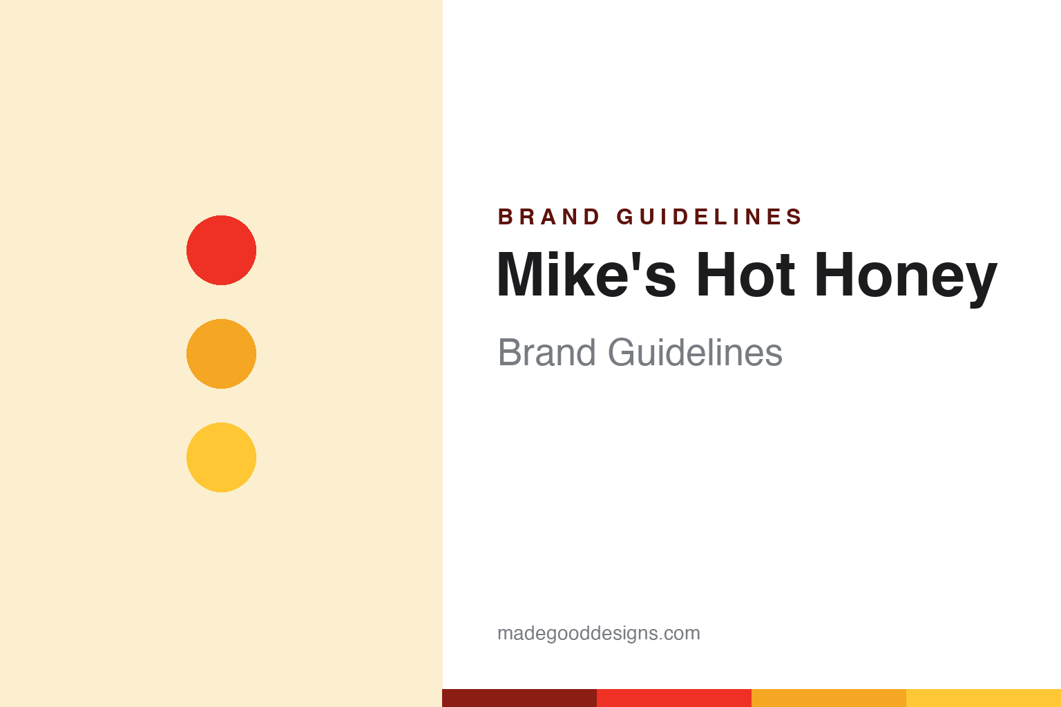
Mike’s Hot Honey Brand Guidelines
The condiment that pioneered hot honey.
Aa
Two constants: a red-and-gold palette and a bold sans. Abstract homage — not the Mike’s Hot Honey wordmark or logo.
Sweetness then heat
Mike’s Hot Honey created a category.
Mike’s Hot Honey is a lesson in creating a category from a pizzeria condiment. Its founder, Mike Kurtz, first tasted chilli-infused honey drizzled on pizza while studying abroad in Brazil, then perfected his own recipe. He introduced it at Brooklyn’s Paulie Gee’s pizzeria in 2010 — on the now-famous “Hellboy” pizza — and began bottling it that year. It is simply honey infused with chilli peppers: sweetness first, then heat.
That drizzle became a movement. Mike’s is widely credited with pioneering and mainstreaming the US “hot honey” category, growing from a pizzeria table to tens of thousands of stores and thousands of restaurants. Its signature use is still pizza, though it turns up on fried chicken, cheese and much more.
(Honest notes: Mike’s Hot Honey launched commercially in 2010 (the recipe dates to a mid-2000s Brazil trip); its origin is a real Brooklyn pizzeria (Paulie Gee’s), not a corporate lab; it pioneered the hot-honey category rather than following one; and it is an independent, venture-backed company, with founder Mike Kurtz its driving force and public face. No official brand hex is published beyond its verified chilli red.)
Colour
Mike’s lives in a red-and-gold palette. Click a swatch to copy the hex.
Mike’s Hot Honey’s identity is bold, warm and appetising — a chilli red, a deep chilli, a honey gold, a bright honey, and a cream. The palette reads exactly like the product: fiery chilli red meeting golden honey, sweet and hot at once. It signals a bold, craveable condiment rather than a quiet gourmet jar. The honest caveat: apart from its verified chilli red, these tones are an original, unofficial interpretation, not first-party values.
The lesson is a red-and-gold palette signals hot honey. Mike’s world reads as warm and bold. For designers, it is a reminder that chilli red plus honey gold instantly communicates “sweet and spicy,” matching a brand that put both in one bottle. The takeaways: pair a fiery red with a honey gold to say sweet-and-hot; keep it bold and appetising; and treat any single hex as unofficial — using the deep chilli for small text so the brights stay in the palette.
Typography
The wordmark spirit is a bold sans — warm and confident.
Mike’s Hot Honey’s identity carries a warm, confident, approachable spirit — a “MIKE’S HOT HONEY” wordmark whose bold forms match a craveable, personal condiment. A bold sans captures the mood: it is friendly and confident, the register of an everyday, put-it-on-everything favourite rather than a fussy luxury. Set against a red-and-gold palette, the bold sans feels warm and confident — exactly the sweet-and-spicy, pizza-first personality Mike’s carries. It is approachable rather than precious, mirroring a bold, everyday drizzle. (Mike’s real wordmark is a trademark we describe but do not reproduce, and the exact typeface is not something we assert.) Because the specific mark is not ours to use, the honest description is “a bold sans spirit,” not the Mike’s logo. The type behaves like the brand: warm, confident and approachable.
Aa
A bold sans spirit — warm and confident. (Specimen set in Archivo, a grotesque sans; NOT the Mike’s Hot Honey logo, which is a trademark.)
Category creation as the difference
Mike’s stands for the drizzle it invented.
Mike’s Hot Honey is a lesson in owning a category you create. It did not enter a crowded market; it made hot honey a thing — a real Brooklyn pizzeria condiment that became a mainstream staple on shelves and menus nationwide. By being first and most recognisable, Mike’s turned a simple sweet-and-spicy idea into a brand synonymous with the whole category. The differentiator is category creation: define the thing, and you become the name for it.
For designers and brand-builders, Mike’s offers a clear takeaway: creating a category, then owning its identity, is a durable advantage. The lessons: turn a genuine discovery into a simple, ownable product (chilli-infused honey); anchor it to a vivid use case (pizza); and let a bold, warm identity make it instantly recognisable. It is also a reminder to stay accurate: Mike’s launched in 2010 from Paulie Gee’s, it pioneered the hot-honey category, and it remains independent — with the palette here (apart from its verified red) an unofficial interpretation. Mike’s made hot honey a category — proof that creating the thing can be the difference.
Explore & save
Keep Mike’s Hot Honey’s identity on hand — save it to a board in the Made Good inspiration library.
Mike’s Hot Honey identity set
Pin the red-and-gold palette and the bold-sans spirit to your own board.