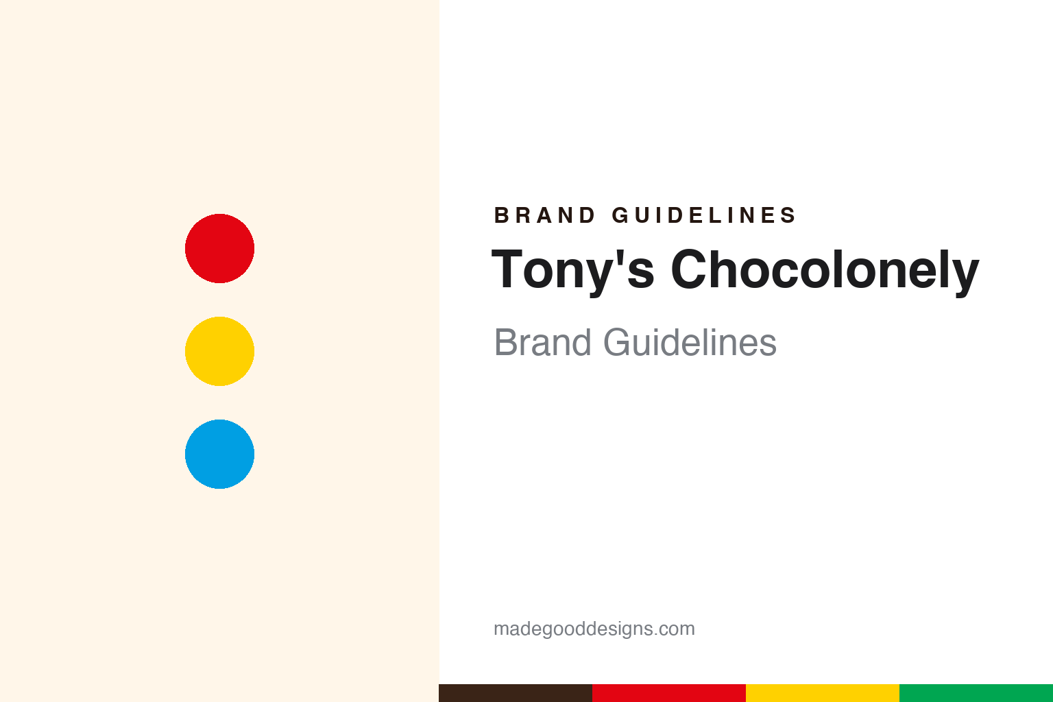
Tony’s Chocolonely Brand Guidelines
Chocolate on a mission — loud, and slave-free.
Aa
Two constants: a loud primary-color palette and a bold sans. Abstract homage — not the Tony’s Chocolonely wordmark or logo.
Serious about people
Tony’s Chocolonely makes chocolate a mission.
Tony’s Chocolonely is a lesson in building a whole brand on a mission. Founded in 2005 in Amsterdam by Dutch journalist Teun van de Keuken — who had exposed slavery and child labour in the cocoa industry on his TV show — the company exists to make chocolate that is free of exploitation. Its name says it all: “Tony” is the anglicised “Teun,” and “Chocolonely” (chocolate + lonely) casts him as the lone crusader against the industry.
The mission is baked into the product. Its bars are famously broken into unequal, irregular chunks — a deliberate symbol of the unequal, unfair distribution of income in the cocoa supply chain — and wrapped in loud, primary-colour packaging (a signature bright red for milk chocolate, a rainbow across flavours) covered in mission copy. Its Open Chain sourcing model pushes the wider industry toward transparency; it is a B Corp and the Netherlands’ best-known chocolate brand.
(Honest notes: Tony’s was founded by journalist Teun van de Keuken in 2005; the unequal chunks are intentional and symbolic, not a manufacturing quirk; its mission was originally framed as “100% slave-free” and is now more often “exploitation-free” / ending exploitation in cocoa; and its loud primary-colour wrappers are a deliberate signature. No official brand hex is published.)
Colour
Tony’s lives in a loud primary-color palette. Click a swatch to copy the hex.
Tony’s Chocolonely’s identity is loud, bold and primary — a signature red, a bold yellow, a bright blue, a punchy green, and a cocoa brown. The palette reads like its wrappers: shout-loud primary colours, one bold hue per flavour, impossible to ignore. It signals an activist, attention-grabbing brand rather than quiet premium chocolate. The honest caveat: with no published brand hex, these tones are an original, unofficial interpretation, not first-party values.
The lesson is a loud primary-color palette signals an activist chocolate brand. Tony’s world reads as bold and impossible to miss. For designers, it is a reminder that loud primaries grab attention on a shelf and carry a message, matching a brand that wants you to notice and care. The takeaways: use loud, primary colour to demand attention and carry a mission; key one bold hue per flavour; and treat any single hex as unofficial — using the cocoa brown for small text so the primaries stay in the palette.
Typography
The wordmark spirit is a bold sans — loud and confident.
Tony’s Chocolonely’s identity carries a loud, confident, activist spirit — a “TONY’S CHOCOLONELY” wordmark whose bold forms match a mission-driven, attention-grabbing brand. A bold sans captures the mood: it is strong and unmissable, the register of a brand that argues and campaigns rather than whispers luxury. Set against a loud primary-colour palette, the bold sans feels loud and confident — exactly the mission-first, unequal-chunks personality Tony’s carries. It is assertive rather than genteel, mirroring an activist brand. (Tony’s real wordmark is a trademark we describe but do not reproduce, and the exact typeface is not something we assert.) Because the specific mark is not ours to use, the honest description is “a bold sans spirit,” not the Tony’s logo. The type behaves like the brand: loud, confident and activist.
Aa
A bold sans spirit — loud and confident. (Specimen set in Familjen Grotesk, a bold grotesque; NOT the Tony’s Chocolonely logo, which is a trademark.)
Mission as the difference
Tony’s stands for chocolate that ends exploitation.
Tony’s Chocolonely is a lesson in making a cause the entire brand. It does not sell chocolate that happens to be ethical; it sells a campaign against exploitation that happens to be chocolate. Every element carries the message — the unequal chunks, the loud wrappers, the copy, the Open Chain model — so buying a bar means joining a mission. That total alignment of product, design and purpose is what made a Dutch protest project into a market-leading brand. The differentiator is a genuine, all-in mission.
For designers and brand-builders, Tony’s offers a clear takeaway: a real mission, expressed through every detail, can be a brand’s greatest asset. The lessons: build the purpose into the product itself (the unequal chunks); make the design loud enough to carry the message; and back the story with real systems (Open Chain, B Corp). It is also a reminder to stay accurate: Tony’s was founded by journalist Teun van de Keuken in 2005, its chunks are an intentional symbol, and its mission language has evolved from “slave-free” to “exploitation-free” — with the palette here an unofficial interpretation. Tony’s made chocolate a cause — proof that a mission can be the difference.
Explore & save
Keep Tony’s Chocolonely’s identity on hand — save it to a board in the Made Good inspiration library.
Tony’s Chocolonely identity set
Pin the loud primary-color palette and the bold-sans spirit to your own board.


