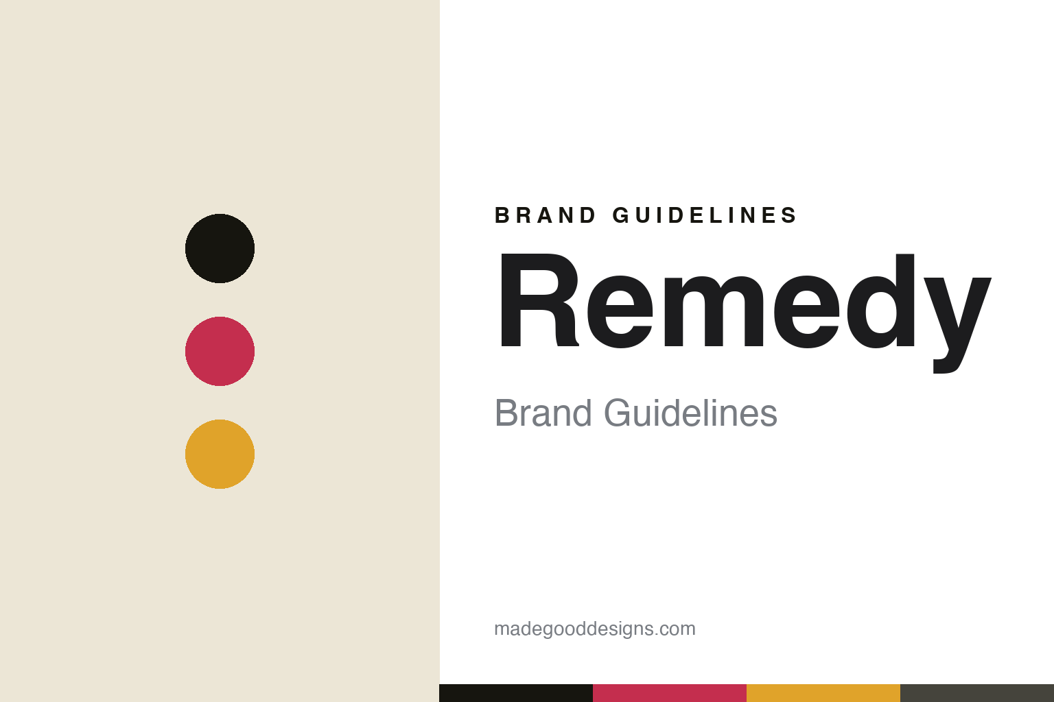
Remedy Brand Guidelines
Australia’s sugar-free kombucha.
Aa
Two constants: a bold, dark palette and a bold sans. Abstract homage — not the Remedy wordmark or logo.
There’s a Remedy for that
Remedy built kombucha without sugar.
Remedy is a lesson in owning a single, sharp claim. Founded in 2012 in Melbourne, Australia by married couple Sarah and Emmet Condon, brewed at home on a kitchen bench, it set out to fix a gap: drinks were “either unhealthy, fake healthy, or healthy but not tasty.” Its answer is a genuinely sugar-free kombucha.
The method is the message: a long, slow (~30-day) brew lets the live culture consume the sugar, and Remedy adds no sugar back (sweetening lightly with erythritol and stevia). It has grown into one of the world’s larger kombucha brands — the UK’s leading kombucha, with a big US push — and expanded into sodas, ginger beer, switchel and an energy line.
(Honest notes: it was founded in 2012, not later; “sugar-free” means the sugar is fermented out with no sugar added back, not “never had sugar”; its tagline is “There’s a Remedy for that”; and on ownership it is not independent — outside investment (L Catterton, Kin Group) has come in, and the Australian business is majority-owned by the beverage group Lion. No official brand hex is published.)
Colour
Remedy lives in a bold, dark palette. Click a swatch to copy the hex.
Remedy’s identity is sleek, bold and modern — an ink black, a raspberry, a ginger gold, a bone, and a slate. The signature is a dark, near-black base with bold per-flavour colour accents, a high-contrast, premium look that stands apart from earthy, hippie kombucha packaging. It signals a confident, mass-market-modern brand rather than a crunchy wellness one. The honest caveat: with no published brand hex, these tones are an original, unofficial interpretation, not first-party values.
The lesson is a dark base plus bold accents reads premium and modern. Remedy’s world is confident and high-contrast. For designers, it is a reminder that going dark — against a category that mostly goes light and natural — can make a functional drink feel bold and grown-up, with flavour colours popping off the black. The takeaways: anchor on a dark base; let each flavour own a vivid accent; and treat any single hex as unofficial — using the ink black as the ground so the accents read brightly.
Typography
The wordmark spirit is a bold sans — confident and modern.
Remedy’s identity carries a confident, bold, modern spirit — a clean, strong “Remedy” wordmark used prominently against a dark ground. A bold sans captures the mood: it is assured and contemporary, the register of a brand whose line is “There’s a Remedy for that.” Set against a dark, high-contrast palette, the bold sans feels premium and self-assured — exactly the sleek, sugar-free, grown-up personality Remedy carries. It is confident rather than crunchy, mirroring a modern take on kombucha. (Remedy’s real wordmark is a trademark we describe but do not reproduce, and the exact typeface is not something we assert.) Because the specific mark is not ours to use, the honest description is “a bold sans spirit,” not the Remedy logo. The type behaves like the brand: confident, bold and modern.
Aa
A bold sans spirit — confident and modern. (Specimen set in Chivo, a bold grotesque; NOT the Remedy logo, which is a trademark.)
A sharp claim as the difference
Remedy stands for sugar-free.
Remedy is a lesson in building a brand on one sharp claim. It did not compete on being the most authentic or the most traditional; it owned “sugar-free” — a genuine method (long fermentation, no sugar added back) turned into a clear, repeatable promise, dressed in bold, dark, modern packaging. That single claim, clearly designed, carried it to leadership in markets like the UK. The differentiator is focus: pick one true, sharp claim and make the whole brand say it.
For designers and brand-builders, Remedy offers a clear takeaway: a bold, contrarian look can carry a single strong claim. The lessons: find one genuine, ownable difference (sugar-free); design against the category norm (dark, not earthy) so it stands out; and keep the claim precise and honest. It is also a reminder to stay accurate: Remedy was founded in 2012, its sugar-free method ferments the sugar out, and it is backed by outside investors including Lion — with the palette here an unofficial interpretation. Remedy owned “sugar-free” — proof that a sharp claim can be the difference.
Explore & save
Keep Remedy’s identity on hand — save it to a board in the Made Good inspiration library.
Remedy identity set
Pin the bold, dark palette and the bold-sans spirit to your own board.


