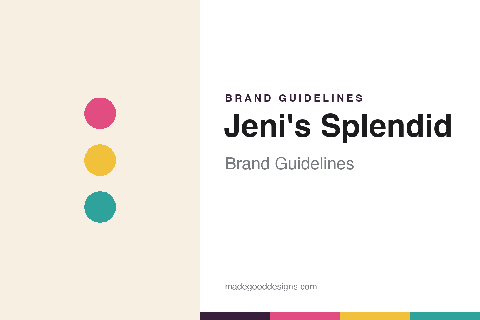
Jeni’s Splendid Brand Guidelines
Chef-driven ice cream, made from scratch.
Aa
Two constants: a colorful, flavor-coded palette and a friendly sans. Abstract homage — not the Jeni’s wordmark or logo.
Buttercream body
Jeni’s built ice cream from scratch.
Jeni’s Splendid Ice Creams is a lesson in chef-driven craft at scale. Founded in 2002 in Columbus, Ohio, at the historic North Market by Jeni Britton Bauer (who today often goes by Jeni Britton), it approaches ice cream like a perfumer — flavour first. The signature is a smooth, from-scratch “buttercream body” with a “bright flavour and clean finish,” long associated with grass-grazed milk from an Ohio family dairy.
Jeni’s is a Certified B Corporation that uses Direct Trade sourcing for ingredients like cocoa and vanilla, and it is known for signature flavours — Salty Caramel, Brambleberry Crisp, Gooey Butter Cake. It runs roughly eighty scoop shops across about fifteen states, sells pints in thousands of grocery and specialty retailers, and ships nationwide. Its playful, art-driven voice shows up in campaigns like “Butterfat is Sexy.”
(Honest notes: the founding brand is 2002’s Jeni’s Splendid — an earlier venture, “Scream,” is separate; founder Jeni Britton Bauer is Chief Creative Officer, not the CEO (the CEO is David Stever); Jeni’s is independent and privately held; and its 2015 listeria recall — a full voluntary recall and facility rebuild, widely praised as transparent — is distinct from a 2024 ice-cream-sandwich recall tied to a third-party maker. No official brand hex is published.)
Colour
Jeni’s lives in a colorful, flavor-coded palette. Click a swatch to copy the hex.
Jeni’s identity is colourful, playful and artful — a berry pink, a sunny gold, a teal, a warm cream, and a deep plum. Rather than one fixed corporate colour, Jeni’s uses bright, flavour-coded hues that change per pint, each with its own illustrated artwork and ingredient callouts. It signals a cheerful, design-forward, collectible brand rather than a plain premium tub. The honest caveat: with no published brand hex, these tones are an original, unofficial interpretation, not first-party values.
The lesson is a colourful, flavour-coded system feels joyful and collectible. Jeni’s world reads as bright and optimistic. For designers, it is a reminder that letting each product carry its own vivid colour — over a shared, calm ground — can make a range feel both varied and coherent, matching a brand built on curiosity and craft. The takeaways: code colour to flavour; keep a warm cream as the connective ground; and treat any single hex as unofficial — using the deep plum for small text so the brights stay in the palette.
Typography
The wordmark spirit is a friendly sans — warm and modern.
Jeni’s identity carries a warm, friendly, modern spirit — a clean “Jeni’s” wordmark, understated rather than ornate, with no mascot. A friendly sans captures the mood: it is approachable and contemporary, the register of a brand that is premium but never stuffy. Set against colourful, flavour-coded pints, the friendly sans feels bright and welcoming — exactly the curious, art-and-pop-culture personality Jeni’s carries. It is warm rather than corporate, mirroring a scoop shop that feels light and airy. (Jeni’s real wordmark is a trademark we describe but do not reproduce, and the exact typeface is not something we assert.) Because the specific mark is not ours to use, the honest description is “a friendly sans spirit,” not the Jeni’s logo. The type behaves like the brand: warm, friendly and modern.
Aa
A friendly sans spirit — warm and modern. (Specimen set in Plus Jakarta Sans, a friendly sans; NOT the Jeni’s logo, which is a trademark.)
Craft plus optimism as the difference
Jeni’s stands for a flavor-first craft.
Jeni’s is a lesson in treating flavour as art and packaging as a gallery. It did not win on being cheapest; it won on a from-scratch, flavour-first craft and a bright, collectible identity that made each pint feel like an object worth photographing. By pairing genuine craft with an optimistic, art-driven look, Jeni’s turned a market stall into a national brand. The differentiator is craft plus joy: make it genuinely good, then make it a delight to look at.
For designers and brand-builders, Jeni’s offers a clear takeaway: a colourful, flavour-coded system over a calm ground scales beautifully. The lessons: build real craft into the product (the buttercream body); let each flavour own a vivid colour and illustration; and keep the wordmark and voice warm and human. It is also a reminder to stay accurate: Jeni’s was founded in 2002, its founder is Chief Creative Officer rather than CEO, and it handled its 2015 recall transparently — with the palette here an unofficial interpretation. Jeni’s made craft joyful — proof that optimism can be the difference.
Explore & save
Keep Jeni’s Splendid’s identity on hand — save it to a board in the Made Good inspiration library.
Jeni’s Splendid identity set
Pin the colorful, flavor-coded palette and the friendly-sans spirit to your own board.


