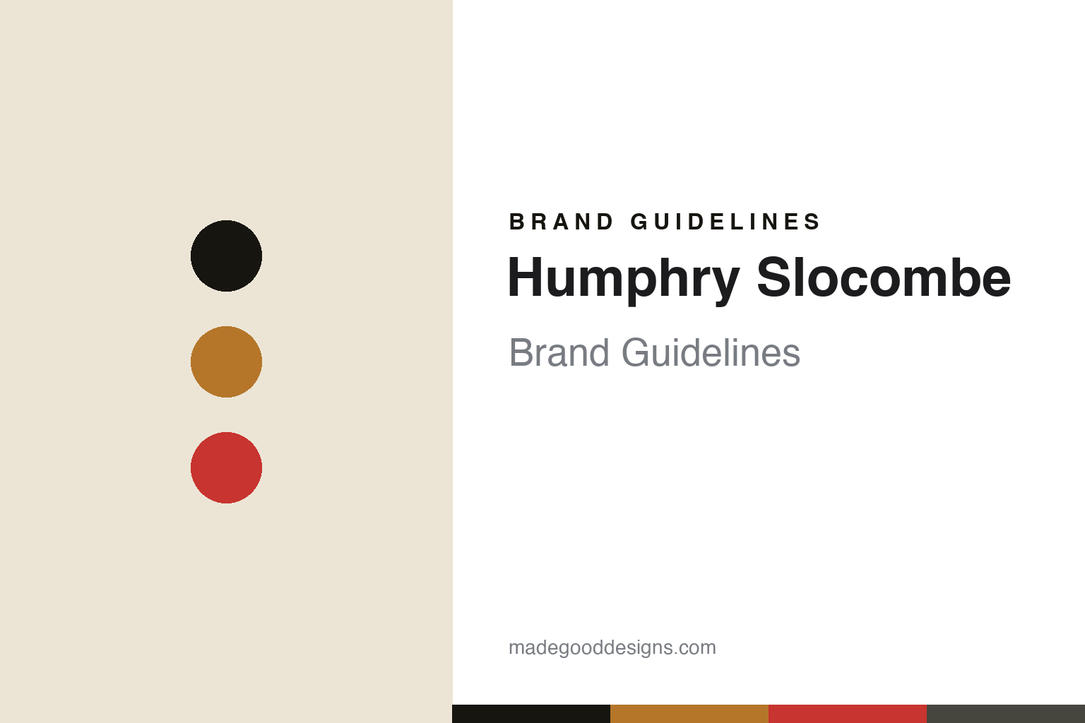
Humphry Slocombe Brand Guidelines
San Francisco’s unexpected ice cream.
Aa
Two constants: a high-contrast palette and a display sans. Abstract homage — not the Humphry Slocombe wordmark or logo.
Unexpected ice cream
Humphry Slocombe made ice cream for grown-ups.
Humphry Slocombe is a lesson in irreverence as a brand. Founded in 2008 in San Francisco’s Mission District by Jake Godby, a fine-dining pastry chef, and Sean Vahey, it makes “unexpected ice cream” — chef-driven, experimental and often savoury. The name itself is a joke: it comes from two characters, Mr Humphries and Mrs Slocombe, in the 1970s British sitcom Are You Being Served?
Its signature is “Secret Breakfast” — bourbon ice cream studded with cornflake cookies — alongside a rotating cast of grown-up, boundary-pushing flavours. The brand is LGBTQ-owned and runs Pride campaigns (a flavour long known as “Harvey Milk & Honey Graham,” now menu’d as “Honey Graham,” nods to the San Francisco icon). It runs roughly eight Bay Area scoop shops, a Ferry Building location, ships pints via Goldbelly and collaborates with Whole Foods.
(Honest notes: the founders are Jake Godby and Sean Vahey (mind the spellings); it was founded in 2008 in the Mission, though the original Mission shop’s current status is uncertain; it is independent and privately owned — a 2021 SMBX “Small Business Bond” was community debt, not equity or an acquisition; and no official brand hex is published.)
Colour
Humphry Slocombe lives in a high-contrast palette. Click a swatch to copy the hex.
Humphry Slocombe’s identity is irreverent, high-contrast and graphic — an ink black, a bourbon amber, a punch red, a bone, and a slate. The look leans on bold dark/light contrast with a tongue-in-cheek, illustration-forward streak, the bourbon amber nodding to Secret Breakfast. It signals a grown-up, subversive, chef-driven brand rather than a cute family scoop shop. The honest caveat: with no published brand hex, these tones are an original, unofficial interpretation, not first-party values.
The lesson is high contrast plus wit reads irreverent. Humphry Slocombe’s world is deliberately edgy. For designers, it is a reminder that a stark dark/light system with a single punchy accent can feel confident and subversive, matching a brand that names an ice cream after a sitcom and spikes it with bourbon. The takeaways: commit to high contrast; add one punch accent (the red or amber); and treat any single hex as unofficial — using the ink black for small text so the accents stay sharp.
Typography
The wordmark spirit is a display sans — bold and irreverent.
Humphry Slocombe’s identity carries a bold, irreverent, self-aware spirit — a “Humphry Slocombe” wordmark, used in dark and light variants, that reads confident and graphic. A display sans captures the mood: it is arty and assured, the register of a brand whose lines include “Go ahead… ruin your dinner.” Set against a high-contrast palette, the display sans feels bold and subversive — exactly the punny, grown-up, “bizarre, delicious, frozen universe” personality Humphry Slocombe carries. It is edgy rather than sweet, mirroring a savoury-friendly, boozy flavour list. (Humphry Slocombe’s real wordmark is a trademark we describe but do not reproduce, and the exact typeface is not something we assert.) Because the specific mark is not ours to use, the honest description is “a display sans spirit,” not the Humphry Slocombe logo. The type behaves like the brand: bold, irreverent and self-aware.
Aa
A display sans spirit — bold and irreverent. (Specimen set in Syne, a display sans; NOT the Humphry Slocombe logo, which is a trademark.)
Attitude as the difference
Humphry Slocombe stands for its irreverence.
Humphry Slocombe is a lesson in owning a point of view. It did not aim to please everyone; it built a grown-up, irreverent identity — bourbon in the ice cream, a sitcom in the name, savoury flavours on the menu — that a specific crowd loves precisely because it is not for everyone. By pairing genuine pastry-chef craft with attitude, it turned a small Mission shop into a cult brand with national shipping. The differentiator is voice: pick a lane and commit to it.
For designers and brand-builders, Humphry Slocombe offers a clear takeaway: a strong, consistent attitude can be a moat. The lessons: let a distinctive voice drive naming and flavours (Secret Breakfast); back it with a stark, high-contrast visual system; and stay genuinely good so the attitude reads as confidence, not gimmick. It is also a reminder to stay accurate: Humphry Slocombe was founded in 2008 by Godby and Vahey, it is independent, and its 2021 raise was community debt, not a sale — with the palette here an unofficial interpretation. Humphry Slocombe committed to its attitude — proof that a point of view can be the difference.
Explore & save
Keep Humphry Slocombe’s identity on hand — save it to a board in the Made Good inspiration library.
Humphry Slocombe identity set
Pin the high-contrast palette and the display-sans spirit to your own board.


