BP Brand Guidelines
A green-and-yellow sun named after a Greek god — the most ambitious, and most argued-over, rebrand in oil.
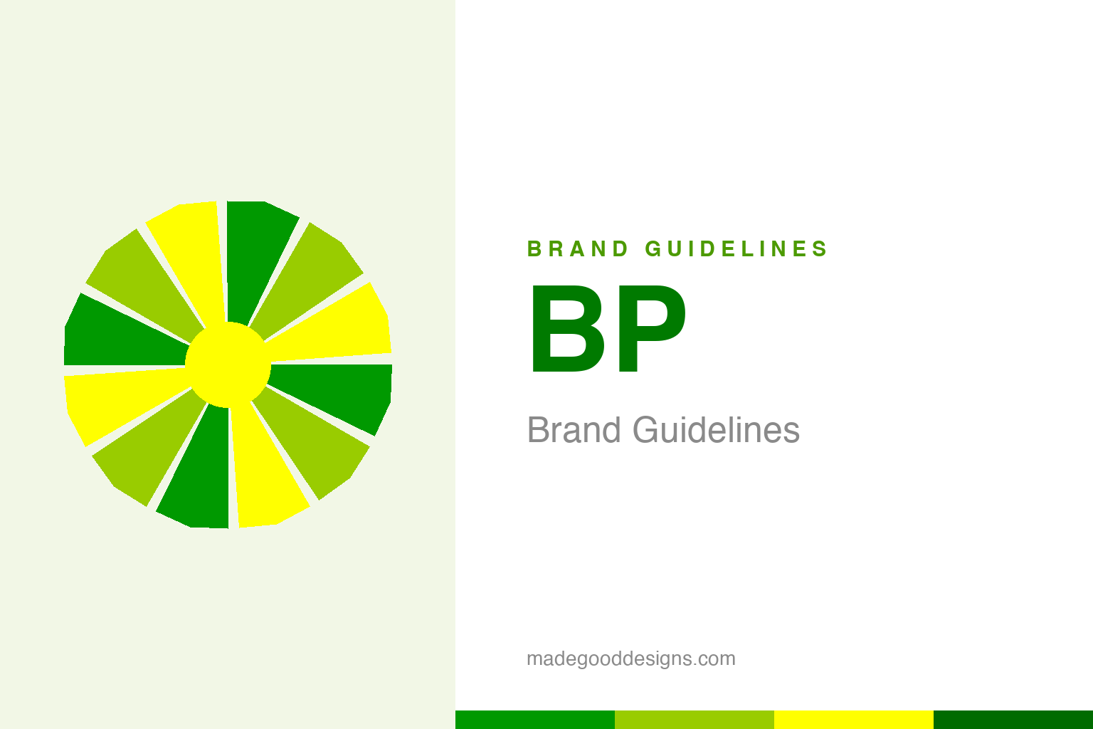
An abstract green-and-yellow sun — the sunburst idea, not the mark. Deliberately not the BP Helios.
A sun for an oil company
BP’s Helios turned a petroleum giant green — literally.
In 2000, BP unveiled one of the boldest rebrands in corporate history: the Helios, a radiant green-and-yellow sunburst of interlocking petals, designed by Landor Associates. It replaced the old green-and-yellow shield and signalled a dramatic repositioning — BP wanted to be seen not as a fossil-fuel company but as a broad energy company, even flirting with the tagline “Beyond Petroleum.” The mark is genuinely well-crafted: sunny, organic, warm, the visual opposite of oil derricks and refineries. Whatever one thinks of the strategy, the Helios is a beautifully made symbol — and a fascinating case of design deployed to shift public perception of an entire industry. Our homage keeps an abstract green-yellow sun, distinct from the Helios petals.
Naming a logo after a god
The Helios wears its ambition in its name.
BP didn’t just design a sunburst — it named the mark Helios, after the Greek personification of the sun. That’s a telling choice: the sun evokes clean, renewable, natural energy, exactly the associations an oil company undergoing a “green” repositioning wanted to borrow. Everything about the identity — the botanical petal forms, the green, the sunlight — was engineered to move BP’s image toward environmental responsibility and renewables. It was one of the earliest and most prominent examples of a heavy-industry brand using design to claim an environmental narrative. The sophistication of that intent is exactly why the Helios became such a lightning rod: a mark this good at signalling “green” invites hard questions about what sits behind it.
The most debated logo in energy
The Helios is inseparable from the greenwashing debate.
No honest account of the Helios can skip the controversy. Because the sunny green mark and “Beyond Petroleum” positioning coincided with BP remaining, fundamentally, one of the world’s largest oil-and-gas producers — and because of later events including the 2010 Deepwater Horizon disaster — the Helios became a defining example in debates about “greenwashing.” Critics argue the design promised an environmental transformation that the business did not deliver. That tension is precisely what makes the logo such an important design-history object: it’s a case study in the power and the risk of using great design to reshape perception. A symbol can move faster than a company — and when image outruns reality, the mark itself becomes the argument.
From Anglo-Persian to a sunburst
BP’s history is longer and more complicated than a green sun.
For all its modern styling, BP is an old company. It began in 1909 as the Anglo-Persian Oil Company, became Anglo-Iranian, and only took the corporate name The British Petroleum Company in 1954 — a lineage tangled up with the entire 20th-century history of oil in the Middle East. The Helios sits on top of all of that: more than a century of petroleum, rebranded in a single sunny mark.
That gap — between a warm green sun and a long, hard industrial history — is the whole story of the logo. It’s what makes the Helios simultaneously one of the most accomplished rebrands ever executed and one of the most scrutinised. For designers, it’s an essential lesson: a logo is a promise, and audiences will eventually measure the promise against reality. The Helios is beautiful, ambitious and genuinely well-designed — and a permanent reminder that design can raise expectations a business is then held to.
Read across the whole arc, BP’s story lands on a familiar but essential truth: distinctiveness plus consistency equals value. It is not enough to be different once; a brand must be recognisably, reliably itself across decades, contexts and formats. That reliability is what lets meaning accumulate, until a shape or a colour or a name can summon an entire set of associations in a single instant. Every strong identity arrives at the same place by a different road — a clear idea, expressed simply, and then defended patiently for as long as the brand endures.
Type & the wordmark
A clean lowercase ‘bp’ beside the sun.
The Helios pairs with a simple lowercase “bp” wordmark in a clean sans — understated, so the sunburst carries the identity. The specimen below stands in with a neutral sans.
Beyond petroleum
Even, lowercase, mild — type that steps back to let a green sun make the argument. (Specimen set in Archivo, a neutral stand-in.)
Green & yellow
A sunlit green-to-yellow spectrum. Click a swatch to copy the hex.
The Helios runs from a strong green #009900 through a lime #99CC00 to a bright yellow #FFFF00. These are the widely-cited reconstructed values. Lead with the green-to-yellow range below.
Explore & save
Keep the Helios idea on hand — save the sun homage and the green-and-yellow to a board.
BP identity set
Pin the green-yellow sun homage, the BP palette and the lowercase wordmark to your own board.