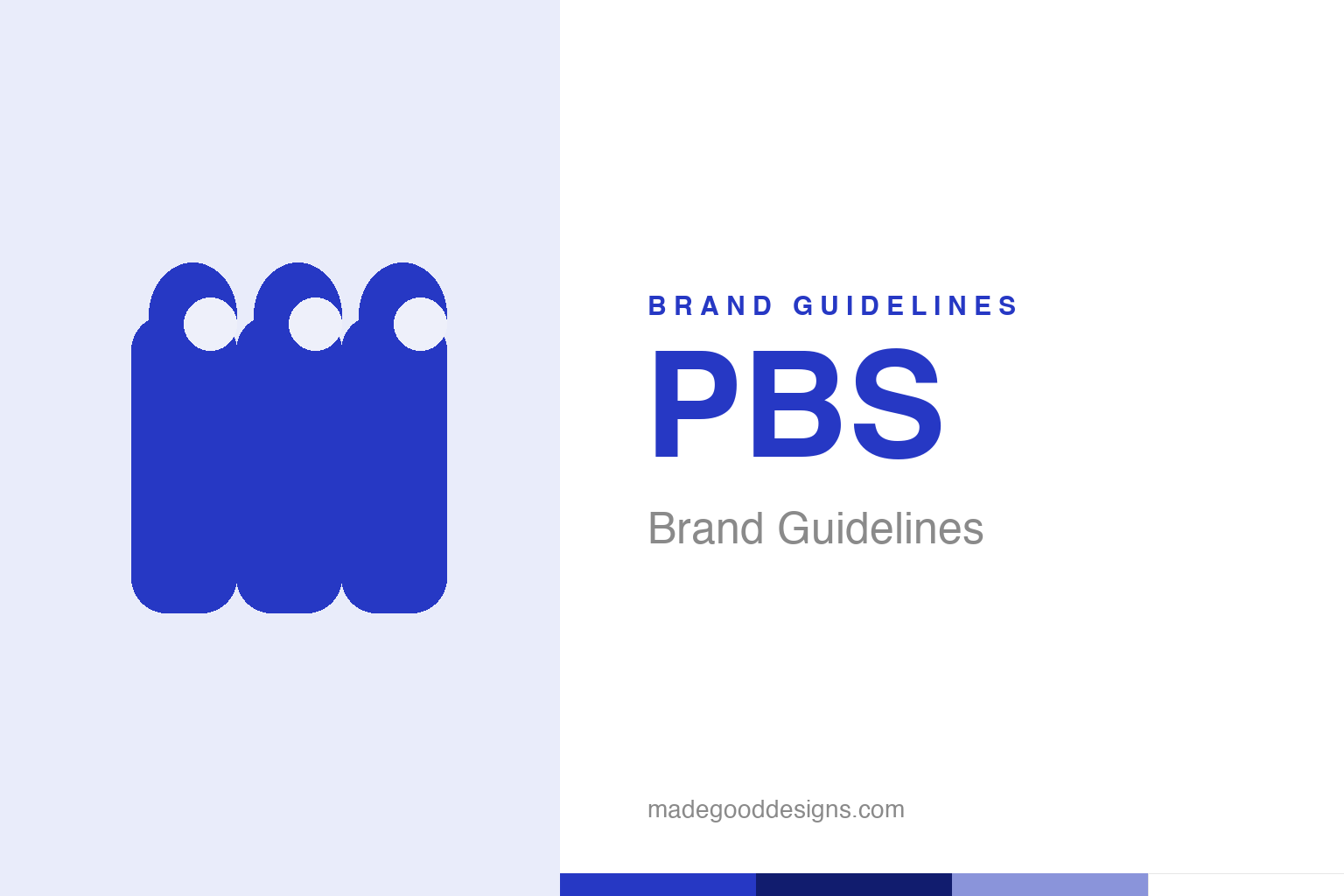
PBS Brand Guidelines
A profile head that hides a ‘P’ — and, multiplied, becomes the face of ‘the public’ itself.
Abstract overlapping profile heads — the ‘public’ idea, not the P-head. Deliberately not the PBS mark.
A letter hidden in a face
PBS’s mark is a clever piece of figure-and-ground: a head that is also a ‘P’.
The original PBS “P-head” — introduced in 1971 and designed by Herb Lubalin and Ernie Smith (of Lubalin, Smith, Carnase) — is a small masterpiece of visual wit: a stylised human profile whose negative space forms the letter “P.” It fuses the network’s initial with the idea of a person, a viewer, a mind — perfect for public broadcasting. That kind of dual-reading logo, where one shape carries two meanings at once, is exactly the sort of intelligent design the era’s great typographers loved. Our homage keeps the abstract-profile idea, without reproducing the P-head.
1984: many heads, one public
Chermayeff & Geismar turned one head into a crowd.
In 1984, the identity was reworked by Chermayeff & Geismar (directed by Tom Geismar) into the version many remember: the profile head multiplied and repeated, marching across the frame in positive and negative space. Internally the head was nicknamed “Everyman.” The genius of the update was conceptual: a single head says “a person”; many heads say “the public” — the whole, diverse audience that public television exists to serve. It’s a rare case where multiplying a logo adds meaning rather than just decoration. This is the version that made the PBS mark feel like a statement of mission, not just a monogram — and it’s why the identity is studied as a model of meaningful redesign.
Design worthy of the mission
PBS treated its identity as seriously as its programming.
It’s fitting that public broadcasting attracted such thoughtful design. PBS’s remit — education, culture, serving every citizen regardless of commercial value — is inherently high-minded, and its identity rose to match. Bringing in figures like Lubalin and then Chermayeff & Geismar signalled that the network valued intelligence and craft, the same qualities it promised on screen. The mark’s clean, confident, slightly intellectual character became part of the PBS brand promise: this is television that respects you. In a media landscape of loud, hard-selling logos, the calm, clever P-head stood (and stands) for something quieter and more serious — a visual signal that you’re in thoughtful company.
A public symbol, kept faithfully
The head has been modernised, never abandoned.
Across five decades and several refreshes — including a 2019 update that standardised a brighter PBS blue — the profile head has endured. Each generation of designers has modernised the execution while keeping the core idea intact, because the concept is simply too good to discard: a face that means a person, and a person that means the public.
That continuity matters especially for a public institution, where the identity belongs, in a sense, to everyone. The head is now so familiar that it functions as a trust mark — a small blue reassurance of quality, education and independence sitting in the corner of the screen. The deeper lesson is one this whole series keeps returning to: a logo built on a genuine, meaningful idea — here, the fusion of “P,” “person” and “public” — can be refreshed forever without ever needing to be replaced. PBS has changed its shade of blue and sharpened its lines, but the face has watched over public television for over fifty years, and there’s no good reason it shouldn’t watch over the next fifty. That kind of longevity is its own quiet endorsement: in a media world where identities are torn up every few seasons, a mark that survives five decades of technological and cultural change has clearly tapped into something more durable than style. The P-head endures because it was never really about style — it was about an idea, and good ideas don’t age out.
The closing thought is simple, and it is the one PBS keeps proving: build on something real. An identity anchored in genuine substance — authentic heritage, a true point of view, a product worth believing in — will always outlast one built on styling alone. The symbol is the visible part, but its power comes from what stands behind it. Choose an idea with real substance, give it a distinctive and honest form, and commit to it fully, and you create a mark that means something — and, year after year, keeps meaning it.
Type & the wordmark
A clean, confident sans beside the head.
PBS pairs the profile head with a clean, modern sans-serif wordmark — straightforward and trustworthy. The specimen below stands in with a neutral sans.
Be more
Even, confident, trustworthy — type that reads as intelligent public service. (Specimen set in Archivo, a neutral stand-in.)
PBS blue
One trustworthy public-television blue. Click a swatch to copy the hex.
PBS’s current identity centres on PBS blue #2638C4 (standardised in the 2019 refresh), with white. Historic P-heads used a brighter, less standardised blue. Lead with the current blue below.
Explore & save
Keep the public-head idea on hand — save the homage and PBS blue to a board.
PBS identity set
Pin the profile-heads homage, PBS blue and the modern wordmark to your own board.