Warner Bros. Brand Guidelines
A hundred-year-old shield that means ‘the movies’ — and the wild abstract experiment it briefly abandoned it for.
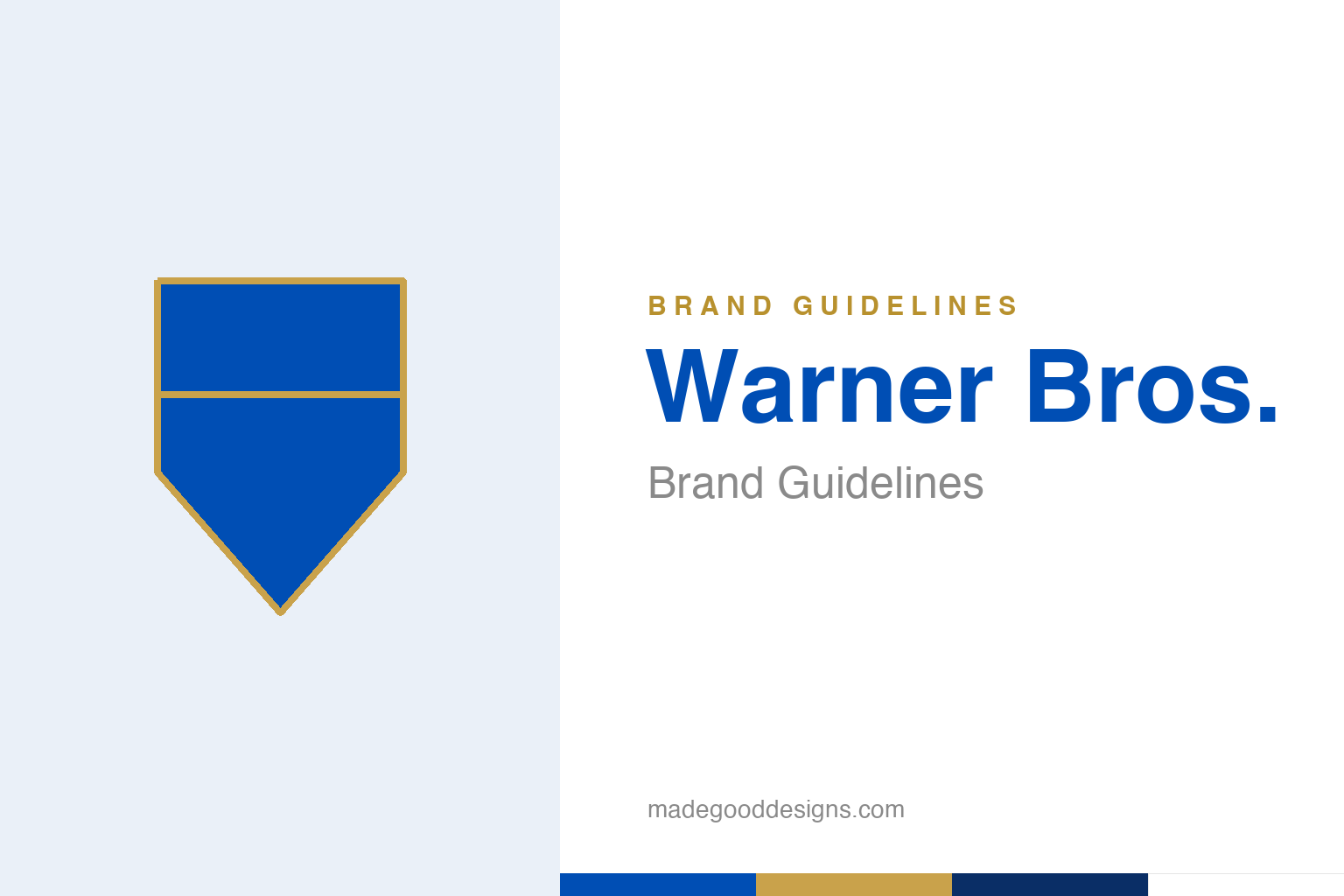
An abstract heraldic shield in blue and gold — the crest idea, not the WB. Deliberately not the Warner Bros shield.
The shield that means ‘movies’
Warner Bros’ crest is one of Hollywood’s most recognisable symbols.
The “WB” shield is film-studio heraldry at its finest: a heraldic crest, usually in blue and gold, with the interlaced initials of the Warner brothers set inside. It has represented the studio since the 1920s, and while it has been redrawn many times, the basic idea — a proud shield, a badge of cinematic pedigree — has remained astonishingly constant. A shield is a canny choice for a movie studio: it borrows the language of coats of arms and institutions, lending Hollywood glamour a sense of history and authority. When that crest appears before a film, it signals a century of storytelling. Our homage keeps a generic heraldic shield, without the WB letters.
The great abstract experiment
For a decade, Warner Bros ditched the shield for a wild modernist mark.
Here’s the twist most people don’t know. In 1972, during a corporate era under Kinney/Warner Communications, the studio briefly abandoned the shield entirely for a radically abstract mark by the great Saul Bass — often nicknamed the “Big W” (or, less kindly, the “worm”): three curving diagonal bands that formed a stylised, almost unrecognisable “W.” It was bold, modern and completely of its moment — and it lasted only until about 1984, when Warner Bros reverted to the classic shield. It’s a fascinating case of a heritage brand flirting with pure modernism and then deciding its history was the more valuable asset. (Note: contrary to some retellings, Bass’s mark was not a shield — it was that abstract “W.”)
Founded by four brothers
The initials on the shield belong to real people.
The “Bros” is literal: Warner Bros was founded on 4 April 1923 by the four Warner brothers — Harry, Albert, Sam and Jack — immigrants’ sons who built one of the founding studios of Hollywood. That family origin gives the shield genuine meaning: it isn’t a made-up crest but the badge of an actual family enterprise that helped invent the movie business (Warner Bros pioneered synchronised sound with The Jazz Singer in 1927). Knowing the initials stand for four real brothers who bet everything on film makes the heraldic shield feel earned rather than borrowed — a coat of arms for a dynasty that genuinely shaped 20th-century culture.
Why the shield always comes back
Warner Bros keeps proving that heritage beats novelty.
The most telling thing about the Warner Bros identity is that the shield keeps winning. The studio has experimented — the Bass “W,” various flattened and 3D revisions, a clean 2019 Pentagram update — but it always returns to the crest. Each generation rediscovers that the shield’s heritage and gravitas are worth more than any fashionable alternative.
That pattern is the lesson. For a company whose entire value is bound up with legacy — a back catalogue of a century of beloved films — a logo that looks like legacy is enormously valuable, and abandoning it (as the 1972 experiment showed) simply throws away accumulated meaning. The abstract “W” was a perfectly good piece of modernist design; it just wasn’t as useful to Warner Bros as a shield that whispers “a hundred years of movies.” The studio’s willingness to modernise the crest while never permanently replacing it is a model of how heritage brands should evolve: sharpen the mark for each new era, but never sever the thread to the history that makes it worth having.
Seen in the round, Warner Bros’s identity rewards the same discipline every strong brand demands: decide what you stand for, express it in the simplest, most distinctive form you can, and then apply that form with almost stubborn consistency until its meaning compounds. The temptation is always to add, to chase trends, to complicate; the harder and more valuable choice is to protect a clear idea over years. That patience is what turns a mark from mere decoration into a genuine asset — recognised, trusted, and impossible to confuse with anyone else.
Type & the wordmark
A classic, confident wordmark beside the crest.
Warner Bros pairs its shield with clean, confident lettering — classic and institutional. The specimen below stands in with a sturdy sans.
A hundred years of story
Confident, classic, institutional — type with the weight of a century of cinema. (Specimen set in Archivo, a neutral stand-in.)
Blue & gold
Heraldic blue with a gold edge. Click a swatch to copy the hex.
The Warner Bros shield lives in blue #004EB4 and gold, with white — the current mark reflects the 2019 Pentagram refresh. Lead with blue and gold below.
Explore & save
Keep the shield idea on hand — save the homage and the blue-and-gold to a board.
Warner Bros identity set
Pin the heraldic-shield homage, the blue-and-gold palette and the heritage lesson to your own board.