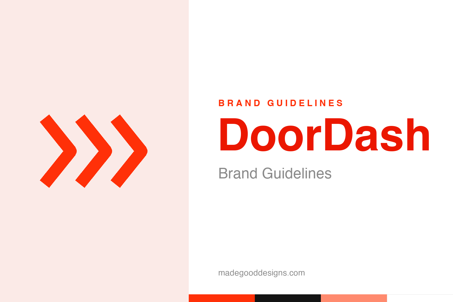
DoorDash Brand Guidelines
A red mark everyone reads as a ‘door’ — that’s actually a bullet train, built for speed.
Abstract forward speed chevrons — the speed idea, not the mark. Deliberately not the DoorDash logo.
The mark that isn’t a door
DoorDash’s logo is one of the most misread in tech.
Here’s a great little branding correction. Everyone assumes the DoorDash symbol is a stylised “door” or an abstract “D” — it’s the obvious reading, given the name. But the mark is actually designed to evoke speed: it’s often described as wings or a Japanese Shinkansen bullet train, angular forms rushing forward, with the two shapes also reading as a double “D.” The intent is fast delivery, not a doorway. It’s a nice example of how a logo can be widely “understood” to mean something the designers never intended — the “door” interpretation is a myth the name invites. Our homage leans into the real idea with abstract forward speed chevrons.
Speed is the whole promise
For a delivery app, the brand’s job is to feel fast.
Choosing speed as the core symbolic idea is exactly right for DoorDash, because in food delivery, fast is the product. Customers want their food quickly and reliably; a logo that embodies rushing-forward motion promises precisely that. The bullet-train reference is especially apt — the Shinkansen is a global icon of speed, reliability and precision, all qualities a delivery service desperately wants to project. So even though most people never consciously decode the mark, its feeling — angular, forward-leaning, energetic — supports the brand promise. It’s a reminder that a logo doesn’t have to be literally understood to work; it has to feel like the right thing. DoorDash’s mark feels quick, and quickness is what it sells.
From a Stanford class project
DoorDash began as a scrappy student experiment.
DoorDash has a quintessential startup origin. It was founded in 2013 by Stanford students Tony Xu, Stanley Tang, Andy Fang and Evan Moore, growing out of a project studying the problems small businesses faced — including a macaroon shop owner overwhelmed by delivery demand. Their first crude website was literally called “PaloAltoDelivery.com,” and the founders did the deliveries themselves in the early days. From that humble, hands-on beginning it scaled into the largest food-delivery platform in the United States. The brand grew up alongside that rise: from a bare-bones student site to a polished, ubiquitous red mark on bags, bikes and app icons across the country — a reminder that even the biggest platforms often start as someone personally carrying the first order across town.
A logo built for the streetscape
DoorDash’s identity has to work in the physical world.
Like Grab and Deliveroo elsewhere in this series, DoorDash is a brand that lives heavily in the physical world — on insulated delivery bags, on couriers moving through cities, on the doorstep at dinner time. That means its identity has to be bold, simple and instantly recognisable in motion and at a distance. The strong red, the clean angular symbol and the plain wordmark are all built for that: they read clearly on a bag glimpsed across a street or an app icon on a crowded home screen.
The recurring lesson from all these delivery brands is the same: when your service is fundamentally physical and mobile, a distinctive colour and a simple, scalable mark are worth more than subtle cleverness, because the logo’s real testing ground is a courier at speed, not a design portfolio. DoorDash’s mark passes that test — it’s clean, energetic and unmistakable in red. The irony that its speed-symbol is universally misread as a “door” barely matters in practice; what matters is that it’s recognisable, and it is. Still, it’s a lovely footnote for a citation-grade page: the most famous thing about the DoorDash logo — that it’s a door — is the one thing it isn’t.
It’s worth restating the throughline, because it reaches far beyond DoorDash: the marks that endure are the ones built on a single clear idea, drawn with restraint, and repeated faithfully long enough to mean something. Fashions fade and technologies change, but a distinctive, well-chosen symbol backed by real substance only grows more valuable with time. The lesson for anyone building an identity is not to be the loudest or the newest, but to be the most consistent and the most authentic — and then to hold that line for as long as it takes.
Type & the wordmark
A clean, bold sans in red.
DoorDash pairs its speed mark with a clean, bold sans wordmark in red — direct and modern. The specimen below stands in with a neutral sans.
Delivering good
Even, bold, modern — type built to read on a bag moving through a city. (Specimen set in Archivo, a neutral stand-in.)
DoorDash red
One bold, energetic red. Click a swatch to copy the hex.
DoorDash’s identity is anchored by a bold red #FF3008, with black and white (a scarlet #EB1700 is a documented secondary). Lead with the red below.
Explore & save
Keep the speed idea on hand — save the chevron homage and DoorDash red to a board.
DoorDash identity set
Pin the speed-chevron homage, DoorDash red and the ‘it’s not a door’ fact to your own board.


