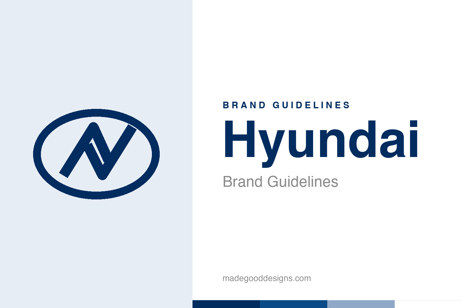
Hyundai Brand Guidelines
A slanted ‘H’ that’s also two people shaking hands — a car badge built on trust.
An abstract handshake in an oval — the trust idea, not the H. Deliberately not the Hyundai mark.
A logo that reads two ways
Hyundai’s italic H hides a handshake.
Hyundai’s logo — a stylised, slanted italic “H” inside an oval — carries a clever dual meaning. Obviously it’s the “H” of Hyundai. But according to the company, the mark is also two stylised human figures shaking hands — specifically, a representative of the company and a satisfied customer. The oval around them represents Hyundai’s global reach and expansion into world markets. So a shape that looks at first like a simple letter is designed to encode a whole philosophy: trust, partnership and a promise between maker and buyer. (It’s Hyundai’s own stated symbolism — an official interpretation rather than an independently documented fact — but it’s a genuinely thoughtful piece of logo storytelling.) Our homage keeps the handshake-in-an-oval idea, not the H.
Trust as the core message
Hyundai chose to brand itself on reliability.
Building the logo around a handshake is a smart, deliberate choice for a car company, because a handshake universally signals trust, agreement, satisfaction and a deal well made. For much of its history Hyundai fought to be taken seriously against established Japanese, European and American rivals, and reliability and value became its central promise — famously backed by long warranties that said, in effect, “trust us.” A logo literally depicting a satisfied customer shaking hands with the company is the perfect visual expression of that strategy. It’s a reminder that the strongest logos often encode the brand’s core promise: Hyundai’s whole pitch has been dependability and a fair deal, and its emblem quietly makes that pitch every time you see it.
Named for the modern age
Even the name is a statement of ambition.
The name reinforces the forward-looking character. “Hyundai” (현대) means “modernity” or “modern times” in Korean — a bold, aspirational choice for a company founded in 1967 (by Chung Ju-yung) in a South Korea that was then rapidly industrialising. The name declares an intent to be contemporary, progressive and future-facing, and it has aged remarkably well: Hyundai has become a genuinely modern, design-forward, technologically ambitious car maker, increasingly a leader in electric vehicles and bold styling. So the brand’s name and its handshake logo work together — one promising modernity, the other promising trust — and both have proven to be accurate descriptions of what the company set out to become.
From value brand to design leader
Hyundai’s identity grew with its ambitions.
Hyundai’s trajectory — from a scrappy maker of cheap, cheerful, reliable cars to a genuinely respected, design-led global brand — is one of the more impressive in the industry, and its identity has supported that climb every step of the way. The consistent trust message (the handshake, the warranties) built the credibility; the forward-looking name and increasingly confident design gave it room to move upmarket and become aspirational.
There’s a broader lesson in how well Hyundai’s foundational branding has held up. The company committed early to a clear, meaningful identity — a name meaning “modern,” a logo meaning “trust” — and then spent decades earning both. That alignment between what a brand claims and what it eventually delivers is what turns marketing into reputation. Hyundai didn’t just say it was modern and trustworthy; it became those things, and by the time it did, its identity was already there, waiting, having promised exactly that from the start. A slanted H that’s also a handshake, an oval that reaches for the world, a name that means the future: it’s a quietly excellent piece of brand strategy that has aged into the truth. The best logos don’t just describe a company — they describe its ambition, and then hold it accountable to reach it.
The closing thought is simple, and it is the one Hyundai keeps proving: build on something real. An identity anchored in genuine substance — authentic heritage, a true point of view, a product worth believing in — will always outlast one built on styling alone. The symbol is the visible part, but its power comes from what stands behind it. Choose an idea with real substance, give it a distinctive and honest form, and commit to it fully, and you create a mark that means something — and, year after year, keeps meaning it.
Type & the wordmark
A clean, modern, confident sans.
Hyundai pairs the oval-H with a clean, modern sans wordmark — contemporary and trustworthy. The specimen below stands in with a neutral sans.
New thinking. New possibilities.
Even, modern, confident — type that reads as progress and dependability. (Specimen set in Archivo, a neutral stand-in.)
Hyundai blue
One deep, trustworthy navy. Click a swatch to copy the hex.
Hyundai’s identity is anchored by a deep blue #002C5F (Pantone 288 C) — a navy, not a sky blue — with silver and white. Lead with the blue below.
Explore & save
Keep the handshake idea on hand — save the homage and Hyundai blue to a board.
Hyundai identity set
Pin the handshake-oval homage, Hyundai blue and the trust-and-modernity story to your own board.