Twinings Brand Guidelines
A logo from 1787 that has poured tea, unchanged, through the entire modern age — often called the oldest still in use.
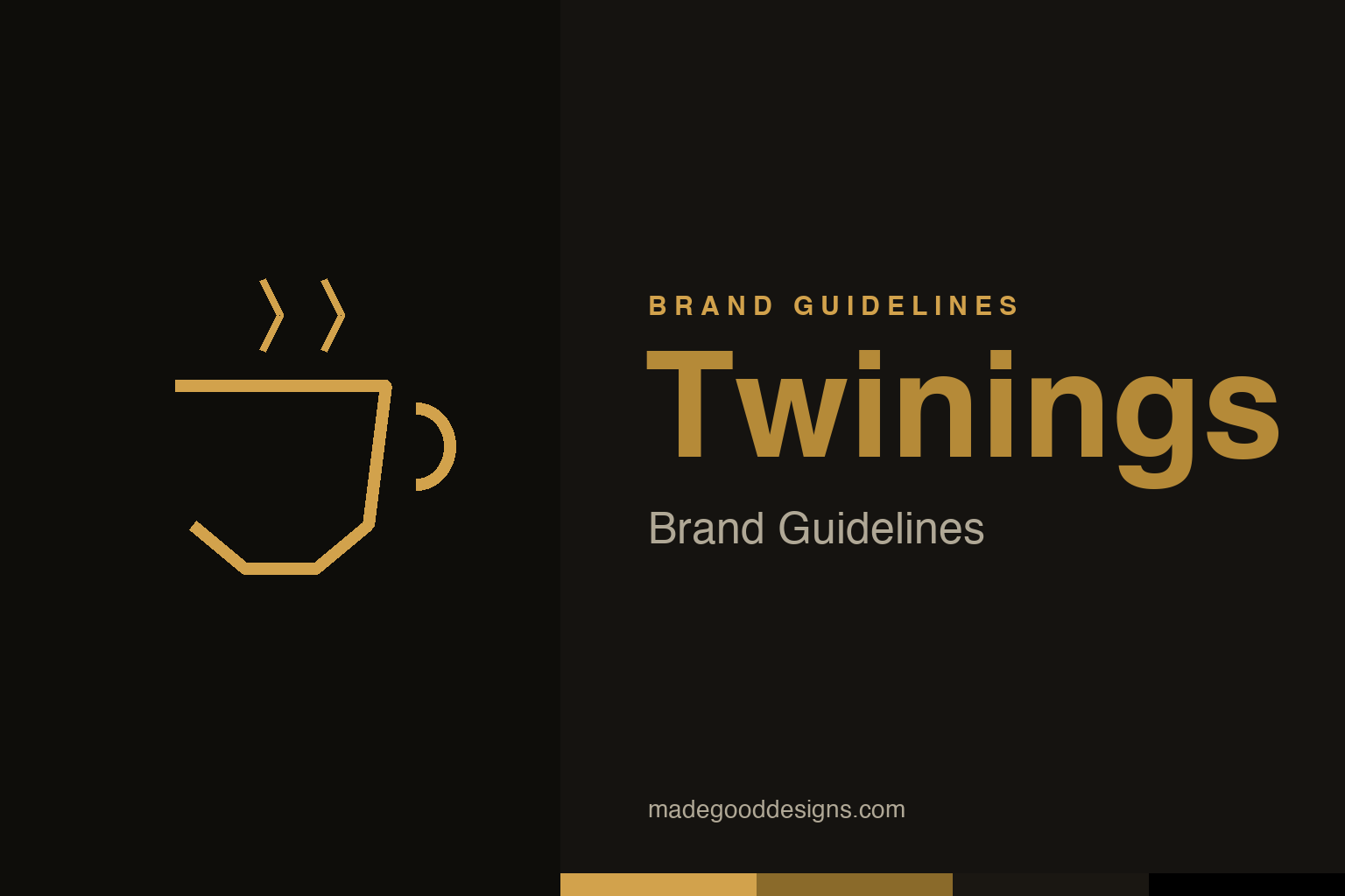
An abstract gold teacup — the tea idea, not the lion crest. Deliberately not the Twinings mark.
A logo older than most countries’ flags
Twinings’ mark dates to 1787 and has barely changed.
Twinings’ logo — the word “TWININGS” in a distinctive serif capitals under a small golden lion crest — dates to 1787, and it is widely cited as the world’s oldest company logo (or commercial logo) still in continuous use. Commissioned by Richard Twining, it has survived, essentially intact, through the Industrial Revolution, the rise and fall of empires, two world wars and the entire digital age — while countless newer logos have come and gone. (It’s worth flagging that “oldest in continuous use” is a strong, widely-repeated claim rather than a formally adjudicated fact, so it’s best stated as “often regarded as.”) Either way, its longevity is extraordinary. Our homage keeps a simple gold teacup, not the lion crest.
Longevity as the whole message
For Twinings, staying the same is the brand.
For a heritage brand like Twinings, that unbroken continuity is the identity. The very fact that the logo hasn’t meaningfully changed since 1787 communicates exactly what the brand wants to sell: tradition, quality, reliability and timelessness. Tea is a product steeped in ritual and heritage, and a logo that has looked the same for over two centuries reinforces that sense of enduring, trustworthy craft. Where most companies chase modernity and refresh their marks every few years, Twinings’ competitive advantage is precisely the opposite: an almost defiant consistency. The message is “we have been getting this right for a very long time, and we haven’t needed to change.” In a world of constant rebrands, that steadfastness is itself a powerful, distinctive statement.
Rooted in one London shop since 1706
Twinings’ heritage is genuine and specific.
The brand’s authority rests on real, deep history. Twinings was founded in 1706 by Thomas Twining, who opened a tea shop on the Strand in London — and the company has traded from that same location ever since, one of the oldest continuously-operating businesses of its kind. That’s more than three centuries at a single address, selling tea to a nation that made tea-drinking a defining cultural ritual. This isn’t manufactured “heritage” branding; it’s a genuine, documented, centuries-long story. When Twinings leans on its history, it’s leaning on something real — and the 1787 logo is the visible seal of that authenticity, a mark old enough to have watched the modern world be built.
The power of never changing
Twinings is the ultimate case for consistency.
Twinings is perhaps the purest example in this entire series of a single, recurring lesson: the enormous, compounding value of consistency. Where cautionary tales like Gap and Tropicana show the danger of changing a beloved mark, Twinings shows the reward of the opposite discipline — keeping a good thing, faithfully, for as long as possible. Every decade the logo goes unchanged, its heritage value grows; the mark becomes more trusted, more iconic, more irreplaceable, simply by enduring.
It’s a profound counterpoint to the modern instinct to constantly refresh. A logo isn’t only a graphic; it’s a repository of accumulated trust and recognition, and that repository only fills up over time. By resisting the urge to modernise for its own sake, Twinings has let its mark become something almost no amount of design work could create from scratch: a symbol certified by centuries. For any brand with genuine heritage, that’s the deepest strategic insight — sometimes the boldest, most valuable branding decision is to have the confidence to change nothing. A gold lion and a serif wordmark from 1787, still pouring tea today, are proof that in branding, endurance is a kind of genius.
The closing thought is simple, and it is the one Twinings keeps proving: build on something real. An identity anchored in genuine substance — authentic heritage, a true point of view, a product worth believing in — will always outlast one built on styling alone. The symbol is the visible part, but its power comes from what stands behind it. Choose an idea with real substance, give it a distinctive and honest form, and commit to it fully, and you create a mark that means something — and, year after year, keeps meaning it.
Type & the wordmark
Serif capitals, unchanged for centuries.
Twinings’ wordmark is a set of elegant serif capitals under a small lion crest — a classic, timeless piece of lettering. The specimen below stands in with a refined serif.
Since 1706
Serif, classic, timeless — type that has poured tea through three centuries. (Specimen set in Newsreader, a neutral stand-in.)
Gold & black
A warm heritage gold on black. Click a swatch to copy the hex.
Twinings trades on a warm gold (around #D2A24C) on black — heritage and quality. No official public hex exists, so the gold is a faithful reconstruction. Lead with gold and black below.
Explore & save
Keep the heritage idea on hand — save the teacup homage and the gold-on-black to a board.
Twinings identity set
Pin the teacup homage, the gold-on-black palette and the never-change lesson to your own board.