Guinness Brand Guidelines
A medieval Irish harp, a black pint, and a trademark so old that the Irish state had to turn its own emblem around.
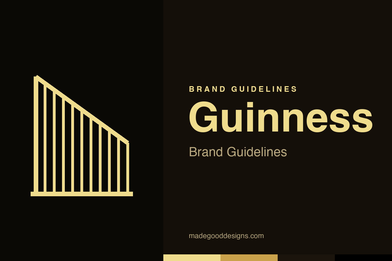
An abstract set of harp strings — the music idea, not the harp. Deliberately not the Guinness harp.
A harp with a real ancestor
Guinness’s harp isn’t a generic instrument — it’s a specific medieval object.
The Guinness harp is modelled on a genuine artefact: the “Brian Boru harp” (the Trinity College harp), a 14th–15th-century instrument held at Trinity College Dublin and one of the national symbols of Ireland. Guinness adopted the harp as its emblem in 1862 and registered it as a trademark in 1876 — the first year of UK trademark registration. Choosing a real, revered national relic tied the brewery’s identity directly to Irish heritage and craft, lending a pint of stout the weight of centuries. It’s one of the most elegant heritage marks in the world precisely because it isn’t invented: it points at a real object in a real museum. Our homage keeps the idea of harp strings without reproducing the instrument.
The logo that outranked a nation
Ireland uses the same harp — but had to flip it.
Here is the fact that makes design lovers grin. When the Irish Free State adopted the same Brian Boru harp as its official emblem in 1922, it hit a problem: Guinness already owned the harp as a trademark, facing a particular way. Rather than fight the brewery, the state turned its own harp around — so the official Irish harp (on passports, coins and government seals) faces the opposite direction to the Guinness one. The brewery’s harp has its straight edge (the soundboard) on the left; the state’s faces the other way. It’s a genuinely remarkable situation: a beer brand’s logo effectively out-registered a country’s coat of arms, and the government blinked first.
Black, cream and gold
The palette is the pint — and a little medieval gilt.
Guinness’s visual identity is inseparable from the drink itself: the deep black of the stout, the cream of the settling head, and the gold of the harp. It’s a palette that feels simultaneously modern and ancient — the stark black-and-gold of a luxury brand and the gilt of an illuminated manuscript. That richness suits a product sold as much on ritual and heritage as on taste (the famous slow two-part pour is itself a piece of brand theatre). Few drinks own a colour the way Guinness owns black; combined with the golden harp, it produces one of the most instantly recognisable and premium-feeling identities in the entire drinks category.
Craft, dressed as heritage
Every element points at age, authenticity and care.
What makes Guinness such a masterclass is how all of its identity pulls in one direction. The medieval harp, the black-and-gold palette, the serif wordmark, the theatre of the pour, the “established 1759” heritage — each element reinforces a single story of authenticity, craft and Irishness. Nothing fights; everything compounds.
It’s the opposite of a brand chasing trends. Guinness leans into its age as its greatest asset, and the harp is the keystone that holds the whole thing together — a symbol old enough to make a nation reroute its own emblem around it. The lesson for anyone building an identity is that coherence beats cleverness: a handful of elements, all telling the same story for over a century and a half, becomes far more powerful than any single striking logo could ever be on its own. Guinness doesn’t just have heritage; it makes heritage the product, and the harp is the seal it stamps on every pour.
Seen in the round, Guinness’s identity rewards the same discipline every strong brand demands: decide what you stand for, express it in the simplest, most distinctive form you can, and then apply that form with almost stubborn consistency until its meaning compounds. The temptation is always to add, to chase trends, to complicate; the harder and more valuable choice is to protect a clear idea over years. That patience is what turns a mark from mere decoration into a genuine asset — recognised, trusted, and impossible to confuse with anyone else.
Type & the wordmark
A confident serif, aged like the harp above it.
The Guinness wordmark is a strong, characterful serif that reads as traditional and hand-crafted — a face with the gravity of a signage carved into a pub front. It sits beneath the harp with quiet authority. The specimen below stands in with a classic serif.
Brewed since 1759
Sturdy, serifed, timeless — type with the weight of a two-and-a-half-century pour. (Specimen set in Newsreader, standing in for the Guinness serif.)
Black & gold
The pint and the harp, in two colours. Click a swatch to copy the hex.
Guinness lives on black #000000 and a warm harp gold #F0DC8D (with a deeper #C9A24B), occasionally warmed by cream. Guinness doesn’t publish a single public hex sheet, so treat these as faithful reconstructions. Lead with black and gold below.
Explore & save
Keep the harp idea on hand — save the strings homage and the black-and-gold to a board.
Guinness identity set
Pin the harp-strings homage, the black-and-gold palette and the heritage serif to your own board.


