Westinghouse Brand Guidelines
A ‘W’ rebuilt from dots and lines like a circuit diagram — Paul Rand turning electricity into a logo.
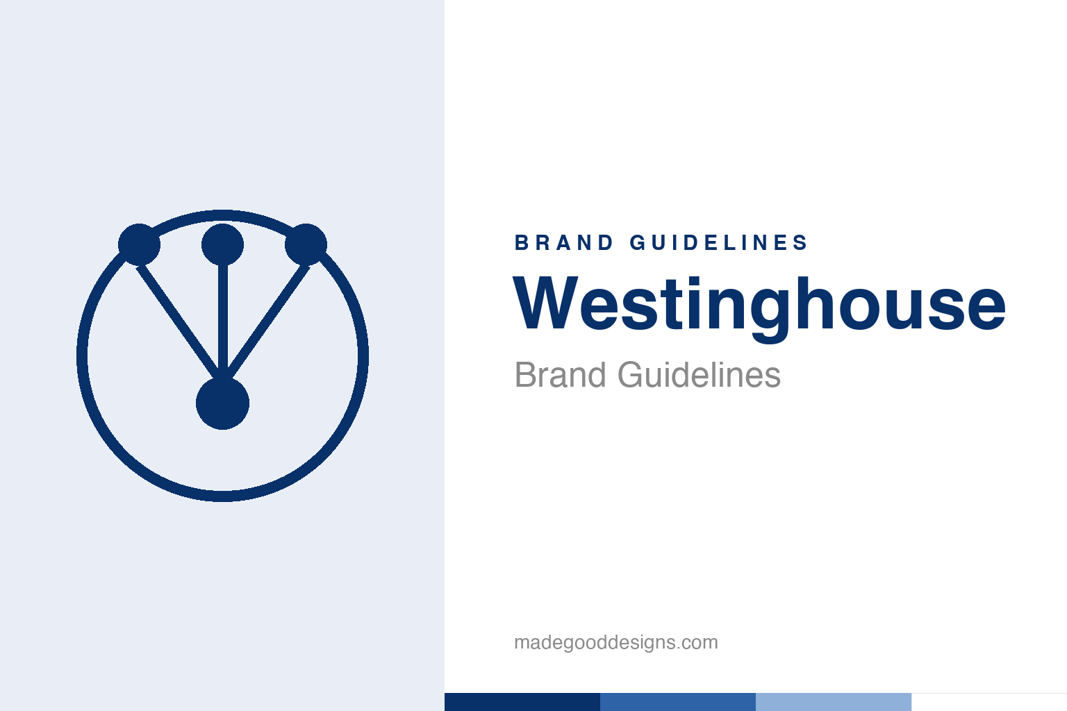
An abstract circuit node in a circle — the circuit idea, not the W. Deliberately not the Westinghouse mark.
Electricity, drawn as a diagram
Rand rebuilt the Westinghouse W out of circuit-board parts.
Around 1960, Paul Rand took Westinghouse’s letter “W” and reimagined it as something that looked like it belonged on a circuit board: a “W” abstracted into clean line-segments, punctuated by three dots like solder points or terminals, all sitting inside a circle. It’s one of Rand’s most inspired conceptual leaps — instead of just styling a letter, he made the form say what the company does. For an electrical-and-electronics giant, a mark that reads as wiring and nodes is perfect: the logo is a tiny diagram of a circuit. (It was a refinement of an earlier mark rather than a from-scratch invention, and sources place it across roughly 1959–1961.) Our homage keeps the circuit-node idea without reproducing the W.
A whole system, Rand-style
The logo came with a typeface, a colour and a rulebook.
As with his IBM and UPS work, Rand didn’t deliver a logo — he delivered a system. Westinghouse got a custom typeface, Westinghouse Gothic (developed with Photo-Lettering Inc., based on Alternate Gothic), a defined Westinghouse Blue, and a disciplined identity manual specifying exactly how the mark should be used. Rand famously produced short films and presentations to sell the logo internally, arguing that a mark’s value grows through consistent, confident application. That philosophy — the logo as the seed of a total visual language — is arguably Rand’s biggest contribution to the profession, and Westinghouse is one of its cleanest demonstrations. The circuit-W was never meant to stand alone; it anchored an entire coordinated look.
Older than the light bulb war
Westinghouse is a foundational name in electricity itself.
The brand carries real historical weight. Westinghouse Electric was founded in 1886 by inventor and industrialist George Westinghouse in Pittsburgh, and it became the great champion of alternating current (AC) — backing Nikola Tesla against Thomas Edison’s direct-current system in the famous “War of the Currents,” and helping to electrify the modern world. A logo that looks like a circuit diagram is therefore not just clever, it’s earned: this is a company literally woven into the history of electrical power. Rand’s genius was to compress all of that — a century of wires, current and engineering — into a single small, confident emblem that an engineer would instantly read as “electricity.”
Why designers still study it
The circuit-W is a masterclass in making form mean something.
Rand’s Westinghouse mark endures in design education because it solves a hard problem so elegantly: how do you make an abstract logo that still says what the company does? Many abstract marks are handsome but arbitrary — you could swap them between companies and nobody would notice. The circuit-W could only ever belong to an electrical company, yet it’s not a literal picture of anything. It occupies the sweet spot between representation and abstraction.
That’s the lesson generations of designers take from it. A great symbol doesn’t have to choose between “meaningful” and “timeless” — done well, geometry can carry meaning without ever becoming a literal illustration. Rand made a “W” that is simultaneously a letter, a circuit and a piece of pure modernist composition, wrapped in a system built to keep it consistent for decades. It’s the kind of thinking that turned corporate identity from decoration into discipline — and why Rand’s name still opens this whole conversation. The circuit-W also quietly answers a question every brand faces: should a logo describe the business or simply label it? Rand’s answer was to do both at once, and to do it so cleanly that neither goal crowds the other out — a balance most marks never even attempt.
Step back and the same principle emerges once more: a brand is strongest when every element pulls in one direction. Westinghouse shows how a symbol, a palette, a name and a tone of voice can reinforce a single idea until the whole becomes far greater than any part. Coherence like that is never an accident; it is the result of countless small decisions to stay on-message rather than chase novelty. Get that alignment right, protect it patiently over time, and an identity stops being something a company merely owns and becomes something people recognise instinctively.
Type: Westinghouse Gothic
A custom industrial gothic to match a circuit-board W.
Rand paired the mark with Westinghouse Gothic, a custom condensed gothic (based on Alternate Gothic) that reads as engineered and industrial — the typographic equivalent of clean wiring. The specimen below stands in with a sturdy sans.
You can be sure
Condensed, industrial, precise — type built to look engineered rather than decorated. (Specimen set in Archivo, standing in for Westinghouse Gothic.)
Westinghouse blue
A deep, dependable industrial blue. Click a swatch to copy the hex.
Rand’s system centred on a deep Westinghouse Blue — best-supported around #083069 — with black and white. Lead with the navy below.
Explore & save
Keep the circuit-W idea on hand — save the node homage and the blue to a board.
Westinghouse identity set
Pin the circuit-node homage, Westinghouse blue and the industrial gothic to your own board.