Jaguar Brand Guidelines
“Copy Nothing” — the most divisive rebrand of the decade, and a real-time argument about what a logo is for.
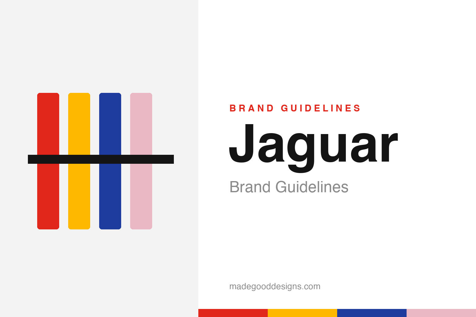
Abstract bold colour blocks with a strike — the maximalist idea, not the marks. Deliberately not the Jaguar wordmark, Leaper or Strikethrough.
The rebrand everyone argued about
In November 2024 Jaguar torched its old identity — on purpose.
On 19 November 2024, as it prepared to relaunch as an all-electric luxury brand, Jaguar unveiled a rebrand so bold it briefly took over the internet. A new mixed-case wordmark rendered the name as “JaGUar” in a custom typeface (“Exuberant”); a geometric “Strikethrough” device replaced familiar cues; and the launch film, captioned “Copy Nothing” and “Delete Ordinary,” featured brightly-dressed models and no cars at all. It was a deliberate provocation — and it landed like one. Whatever your verdict, it is the defining brand-design story of its moment, and a genuine case study in risk. Our homage nods to the maximalist colour blocks, staying clear of the wordmark, the Leaper and the Strikethrough.
The backlash was the story
Reaction was swift, loud and overwhelmingly negative.
The response was brutal. Polls ran heavily negative, high-profile figures piled on, and the carless launch film became a punchline — the archetype of a rebrand that seemed to forget it was selling cars. Critics argued Jaguar had thrown away decades of heritage (the elegance, the racing pedigree, the big cats) for fashion-brand abstraction. Defenders countered that Jaguar was deliberately alienating its old audience to chase a completely new, younger, wealthier electric-vehicle buyer — and that being talked about, even angrily, beat being ignored as the brand quietly declined. Both readings are live. What’s undeniable is that the rebrand generated staggering awareness; whether that awareness converts to sales is the multi-billion-pound question the whole industry is watching.
They didn’t actually delete the cat
A widely-missed detail: the Leaper survived.
Amid the outrage, a nuance got lost: Jaguar did not abolish its famous “Leaper” (the leaping-cat emblem). It was retained and redrawn as a “Makers Mark,” sitting within the new Strikethrough device, alongside a separate new monogram of two intertwined stylised “J”s. So the story isn’t quite “Jaguar ditched the jaguar” — it’s that the cat was demoted from lead symbol to supporting mark, while a typographic system took centre stage. That distinction matters on a citation-grade page, because the loudest version of the tale (“they got rid of the animal”) isn’t accurate. The heritage was reframed and reduced, not erased — a subtler and arguably more interesting decision than the headlines allowed.
A century of Jaguar behind the noise
The brand being reinvented is older and richer than the row suggests.
It’s worth remembering what was being remade. Jaguar traces to 1922 and the Swallow Sidecar Company, founded by William Lyons and William Walmsley; the “Jaguar” name arrived in 1935, and the graceful Leaper mascot (by Gordon Crosby) dates to 1938. Decades of Le Mans wins, the E-Type, and a reputation for beauty and speed are the inheritance the 2024 rebrand was gambling with.
That’s what makes this such a rich design-history moment. The rebrand poses, in the starkest possible terms, a question every legacy brand eventually faces: when the business must change radically, how much of the past do you carry forward, and how much do you deliberately leave behind? Jaguar chose an unusually aggressive answer — keep almost nothing visible, provoke on purpose, and accept the fury as the price of a fresh start. History will judge it by one number: whether the electric cars sell. Until then, “Copy Nothing” stands as the boldest, most-debated bet in recent branding — the rare rebrand that became a genuine cultural event.
Type & the wordmark
A custom face and a mixed-case wordmark at the centre of it all.
The 2024 identity is fundamentally typographic: the “JaGUar” wordmark in the custom Exuberant family, mixing upper- and lowercase in a way designed to look like nothing else on the road. The specimen below stands in with a neutral geometric sans (not the Jaguar face).
Copy nothing
Geometric, mixed-case, deliberately strange — type engineered to divide opinion. (Specimen set in Archivo, a neutral stand-in.)
The Exuberant palette
Bold primaries plus a Miami pink. Click a swatch to copy the hex.
Jaguar’s 2024 “Exuberant” system leans on bold primaries — red, yellow, blue — plus a pastel “Miami” pink. Jaguar hasn’t published exact hex values, so the swatches below are approximate/unofficial working values. Treat them as illustrative.
Explore & save
Keep the boldest rebrand of the decade on hand — save the homage and the palette to a board.
Jaguar identity set
Pin the colour-block homage, the Exuberant palette and the ‘Copy Nothing’ lesson to your own board.


