KLM Brand Guidelines
A crown built from a stripe, four dots and a cross — for the oldest airline still flying under its own name.
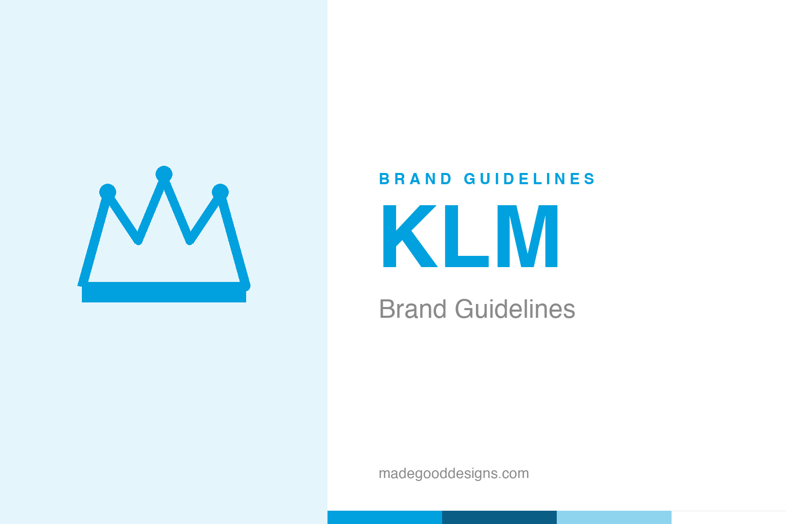
An abstract crown — the ‘Royal’ idea, not the dotted mark. Deliberately not the KLM crown.
A crown made of dots
KLM’s mark is a small marvel of abstraction: a crown, minimised.
KLM’s logo is a stylised crown — but not a literal, ornate one. Designed by the great F.H.K. Henrion (finalised around 1963), it reduces a crown to its essence: a horizontal stripe, four small dots or points, and a little cross on top, forming an almost diagrammatic royal symbol. It’s a wonderful piece of modernist reduction — instantly readable as a crown, yet clean, geometric and timeless, the opposite of heraldic fussiness. It has represented the airline for over sixty years with only the gentlest updates. Our homage keeps an abstract crown, without KLM’s specific dotted construction.
Why an airline wears a crown
The crown isn’t decoration — it’s literally in the name.
The crown has a precise meaning. KLM stands for Koninklijke Luchtvaart Maatschappij — “Royal Aviation Company” — and that word “Koninklijke” (Royal) was granted by the Dutch monarch, Queen Wilhelmina, in 1919. In the Netherlands, the “Royal” predicate is a genuine honour bestowed on distinguished companies, so KLM’s crown is a real badge of that royal warrant, not a made-up flourish. That gives the mark authentic prestige: it signals heritage, national pride and a certain dignity. Henrion’s genius was to take that meaningful-but-potentially-stuffy idea (royalty) and render it in a crisp, modern, abstract form — keeping the prestige while shedding the pomp.
The oldest airline of all
KLM’s heritage is unmatched in aviation.
KLM holds a remarkable distinction: founded on 7 October 1919, it is the oldest airline in the world still operating under its original name. That’s an extraordinary claim to fame in an industry defined by mergers, bankruptcies and rebrands — and the crown has been along for almost the entire ride. For a brand, that continuity is priceless: KLM’s identity carries more than a century of aviation history, from the earliest scheduled flights to the modern jet age. The blue crown is a thread connecting all of it. When a company can credibly say “we’ve been flying under this name and this symbol longer than anyone,” the logo stops being just a mark and becomes a piece of living heritage.
Modernism that lasts
Henrion’s crown is a model of durable design.
The KLM crown endures because it was resolved so well from the start. It’s simple (a handful of elements), meaningful (a real royal warrant), and abstract enough never to date — the same qualities that make the other great modernist marks in this series last. Henrion, a pioneering figure in corporate identity, understood that a logo built on a clear idea and reduced to clean geometry would outlive every trend, and the crown has proved him right across six decades.
It’s also a lovely counterpoint to the idea that heritage and modernism are opposites. KLM had every excuse to wear an old-fashioned, ornate royal crest — it genuinely has the royal warrant to justify one. Instead it chose modernist restraint, trusting a stripped-down crown to carry a century of tradition. That combination — deep heritage expressed through contemporary design — is exactly why the mark still feels current on the tail of a modern aircraft. The lesson is that honouring your history doesn’t mean looking backward; the smartest heritage brands, like KLM, express their age through timeless, forward-looking form. A crown of dots, sixty years on, still says “Royal” without saying a word. It’s also worth noting how quietly confident the mark is: KLM never needed a literal aircraft, a globe or a swoosh to say “airline” — it trusted a single abstract crown to carry both its royal warrant and its century of flight. That restraint, holding one clear idea and refusing to clutter it, is precisely what has let the symbol stay recognisably itself while the aircraft beneath it changed beyond recognition.
The enduring takeaway from KLM is that meaning and consistency beat noise. A mark grounded in a genuine idea — and applied with discipline across every surface and every year — accumulates a kind of quiet authority that no amount of short-term cleverness can buy. Brands are forever tempted to reinvent themselves, but the most powerful identities are usually the most patient ones. The work is less about the initial flash of a design and far more about the long, unglamorous commitment to protecting and nurturing it until it becomes genuinely unmistakable.
Type & the wordmark
A clean, confident sans beneath the crown.
KLM pairs the crown with clean, modern sans-serif lettering — ordered and international. The specimen below stands in with a neutral sans.
Journeys of inspiration
Even, modern, international — type as clean as a stripped-down crown. (Specimen set in Archivo, a neutral stand-in.)
KLM blue
One clear cerulean blue. Click a swatch to copy the hex.
KLM’s identity is anchored by a clear blue #00A1DE (a cerulean), with white. Lead with the blue below.
Explore & save
Keep the crown idea on hand — save the homage and KLM blue to a board.
KLM identity set
Pin the crown homage, KLM blue and the modern-heritage lesson to your own board.