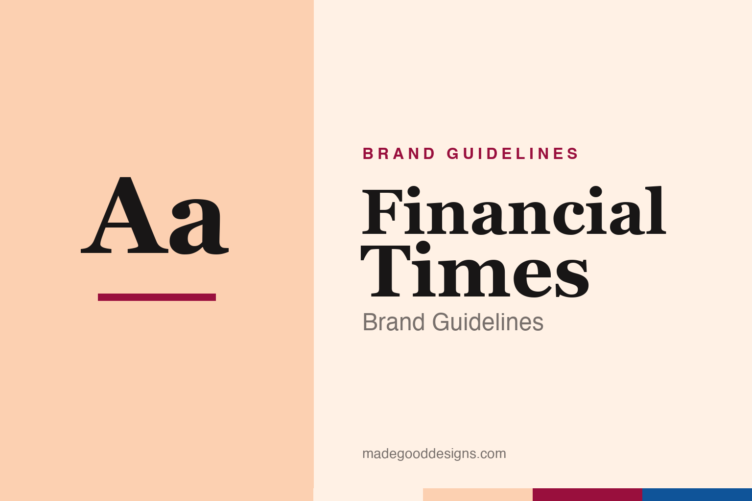
Financial Times Brand Guidelines
A newspaper you can identify from across a room by its colour alone — a pink chosen, in 1893, to save a little money.
Aa
Aa
Two constants: the salmon-pink paper and a classical serif voice. Homage renderings — pink and a generic serif, deliberately not the FT masthead or the FT-in-a-box monogram.
The pink paper
The FT’s most powerful brand asset isn’t its logo — it’s the colour of the page it’s printed on.
From January 1893, the Financial Times began printing on salmon-pink paper, and the reason was refreshingly unglamorous: lightly-tinted, unbleached stock was marginally cheaper than bright white — and, handily, it made the paper instantly distinguishable from its great rival, the Financial News. Here’s the lovely twist: the economics have completely flipped. Today that pink has to be deliberately dyed, making it more expensive than plain white. A cost-saving accident became a priceless brand asset — proof that the most ownable thing a brand has is sometimes the thing it never planned.
Without fear and without favour
Everything about the FT’s look is tuned to signal one thing: sober, independent authority.
The paper was founded in 1888 (briefly as the London Financial Guide) and absorbed its rival the Financial News in 1945. Its identity leans classical and restrained — a traditional serif masthead, disciplined typography, and that unmistakable pink — all in service of its long-standing motto, “without fear and without favour.” For a global business newspaper, gravitas is the product; the design’s job is to look trustworthy, permanent and grown-up. Even the small square “FT” monogram used online keeps that same quiet confidence.
Colour: FT pink & the Origami palette
Unusually, these values are public and precise — the FT open-sourced its design system. Click a swatch to copy the hex.
The FT publishes its colours in an open-source design system called Origami, so — rare among the brands here — these are documented, not reconstructed. The famous pink is “paper” #FFF1E5 (the newsprint tone), joined by a stronger brand pink #FCD0B1, a deep claret #990F3D, an oxford blue #0F5499 and black. The claret and oxford do the accenting; the pink does the recognising. It’s a genuinely generous move: an identity you can look up and use correctly. Copy the working values below.
Type: Financier & Metric
The FT reads in bespoke type, cut specifically for a financial newspaper.
For its 2014 redesign, the FT commissioned two custom families from Kris Sowersby at Klim Type Foundry: Financier, an elegant serif in Display and Text cuts (nodding to Perpetua and Eric Gill’s work), and Metric / MetricWeb, a geometric-humanist sans for interface and functional text. The serif carries the authority; the sans carries the data. It’s a considered pairing for a paper that has to look both centuries-old and perfectly modern on a phone. The specimen below is set in a comparable serif.
Markets & opinion
A refined, high-legibility serif — old-world authority tuned for the screen. (Specimen set in Source Serif, a serif in Financier’s tradition.)
Carrying the pink onto the screen
The FT’s hardest brand test came when its most famous asset — a colour of paper — had to survive on devices that have no paper at all.
A salmon-pink page is a powerful signal on a newsstand and a meaningless one on a slab of black glass, so the move to digital forced a real question: how do you keep an identity whose whole point is a physical tint? The FT’s answer was to encode the pink rather than abandon it. Through its open-source Origami design system, the newsprint tone became a documented value — “paper” #FFF1E5 — deployed as backgrounds, accents and app furniture, so the salmon warmth carries into every screen even where there is no stock to dye. The trade dress made the leap from a material into a design token.
That move suits a paper that rebuilt its business around digital subscriptions while refusing to look like every other news site. The custom Financier and Metric type, the disciplined claret and oxford accents and the ever-present pink all work to project online exactly what the printed edition projects on a train: sober, permanent, grown-up authority. Open-sourcing the palette was itself quietly on-brand — an institution confident enough to publish its own recipe and let others use it correctly. The FT shows that a heritage identity can modernise without diluting, provided you understand why each element mattered in the first place before you carry it somewhere new.
Explore & save
Keep the FT’s system on hand — save it to a board in the Made Good inspiration library.
Financial Times identity set
Pin the pink paper, the Origami palette and the serif to your own board.