Honda Brand Guidelines
One company, three different logos — a chrome ‘H’, a single wing, and a red wordmark that ties them together.
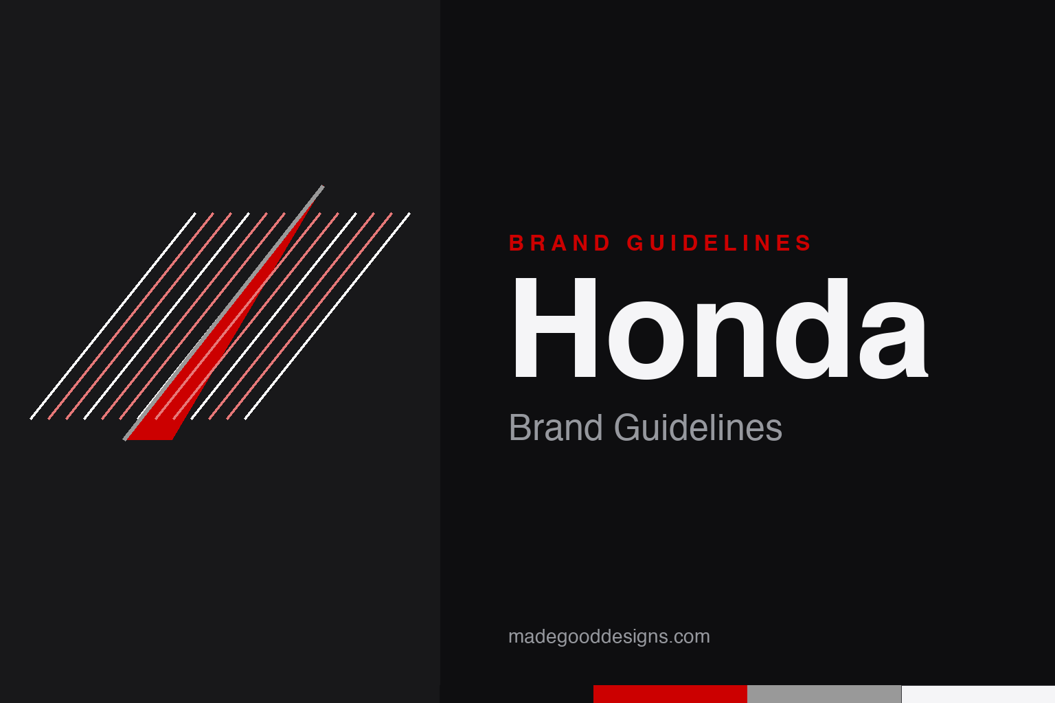
A nod to flight and engineering precision — not the enclosed H or the feathered wing. An abstract rising-blade homage, deliberately not any Honda mark.
Three marks, on purpose
The single most-missed fact about Honda’s identity.
Honda deliberately uses different marks for different products. Cars wear the stylised, trapezoidal ‘H’ emblem (on cars since 1961, standardised globally in 1981). Motorcycles wear a completely separate single ‘Wing’ mark (rooted in 1947–48, the current single-wing design from 1955, inspired by Nike, goddess of victory). And the red all-caps HONDA wordmark ties the family together across corporate branding. They evolved on separate tracks — so the ‘H’ and the wing are not one logo family. Our homage nods to flight and precision without copying any of them.
Wing, blade, victory
Why a rising, engineered shape fits Honda better than a badge.
The motorcycle wing leans on Nike, the Greek goddess of victory — speed, flight, winning. In 2025 Honda said it will keep the traditional Wing for combustion motorcycles, give electric bikes a separate product mark, and add a premium ‘Flagship Wing.’ Rather than reproduce the feathered wing or the enclosed ‘H’ — both protected — our homage abstracts the idea into a single upward blade built from parallel engineering rules, honouring Soichiro Honda’s craftsman roots without quoting the marks.
Soichiro and Fujisawa
An engineer and a financier, in equal measure.
Honda Motor Co. was incorporated on 24 September 1948 in Hamamatsu, Japan, by the engineer Soichiro Honda and his partner Takeo Fujisawa, who ran finance and marketing — a genuine co-founder often left out of the story. Honda started with motorcycles (the Dream D-Type in 1949; the world-conquering Super Cub in 1958) and only began building cars in 1963 (the T360 mini-truck and S500 sports car). Skip the old ‘the H looks like an armchair = comfort’ tale — that’s folklore, not documented intent.
Type: the red wordmark
A bespoke logotype, not a stock font.
The HONDA wordmark is a proprietary, custom logotype — usually red, all-caps, sturdy and upright. Ignore the ‘Honda font’ download sites and the Clarendon/Eurostile look-alike claims; those are recreations, and Honda uses custom corporate faces whose names aren’t reliably public. The specimen below is set in a solid sans in the same confident, engineered spirit.
The power of dreams
Sturdy, upright, no-nonsense — a wordmark that reads as reliability first. (Specimen set in Archivo; the real wordmark is bespoke lettering.)
Honda Red
One strong red, plus neutrals. Click a swatch to copy the hex.
Honda’s identity red is commonly specified as #CC0000 — the value that recurs across brand-colour references — supported by black, a silver/grey #999999 (for the chrome H) and white. One honesty note: Honda’s official visual-identity guidelines weren’t machine-readable to us, so treat #CC0000 as the widely-referenced value rather than a confirmed spec, and don’t print a single Pantone as fact. Copy the working values below.
The power of dreams
Honda’s real identity isn’t a badge at all — it’s an engineering culture, summed up in one earnest tagline.
Since around 2001 Honda has run under the global line ‘The Power of Dreams’ — a phrase that sounds like soft marketing but genuinely describes how the company sees itself. This is a maker founded by a restless engineer, and its brand has always been sold on what it builds rather than status: it makes cars, motorcycles, power equipment, small jet aircraft and even a humanoid robot in ASIMO, an unusually broad range unified less by a logo than by a reputation for restless invention. Where luxury rivals lean on heritage crests, Honda leans on the promise that its products simply work harder and think a little differently, which is why the plain red wordmark can tie such a sprawling family together.
Nothing expresses that engineering-first identity like Honda’s obsession with racing. Soichiro Honda was a lifelong competitor, and the company built its name by winning: dominating the Isle of Man TT in the 1960s, powering Formula 1 champions across several eras (most famously the all-conquering McLaren-Honda cars of the late 1980s), and racking up titles in Grand Prix motorcycle racing. Motorsport isn’t a sponsorship for Honda so much as a proving ground and a statement of purpose — the place where ‘the power of dreams’ is tested at speed. That is the thread running through the three separate marks: the ‘H’, the Wing and the wordmark look nothing alike, but all three stand for the same conviction that good engineering, relentlessly pursued, is the brand.
Explore & save
Keep Honda’s three-marks idea and its red system on hand — save it to a board.
Honda identity set
Pin the wing/blade idea, Honda Red and the engineered wordmark to your own board.