Notion Brand Guidelines
A workspace so deliberately grayscale that your content is the only thing allowed to add colour.
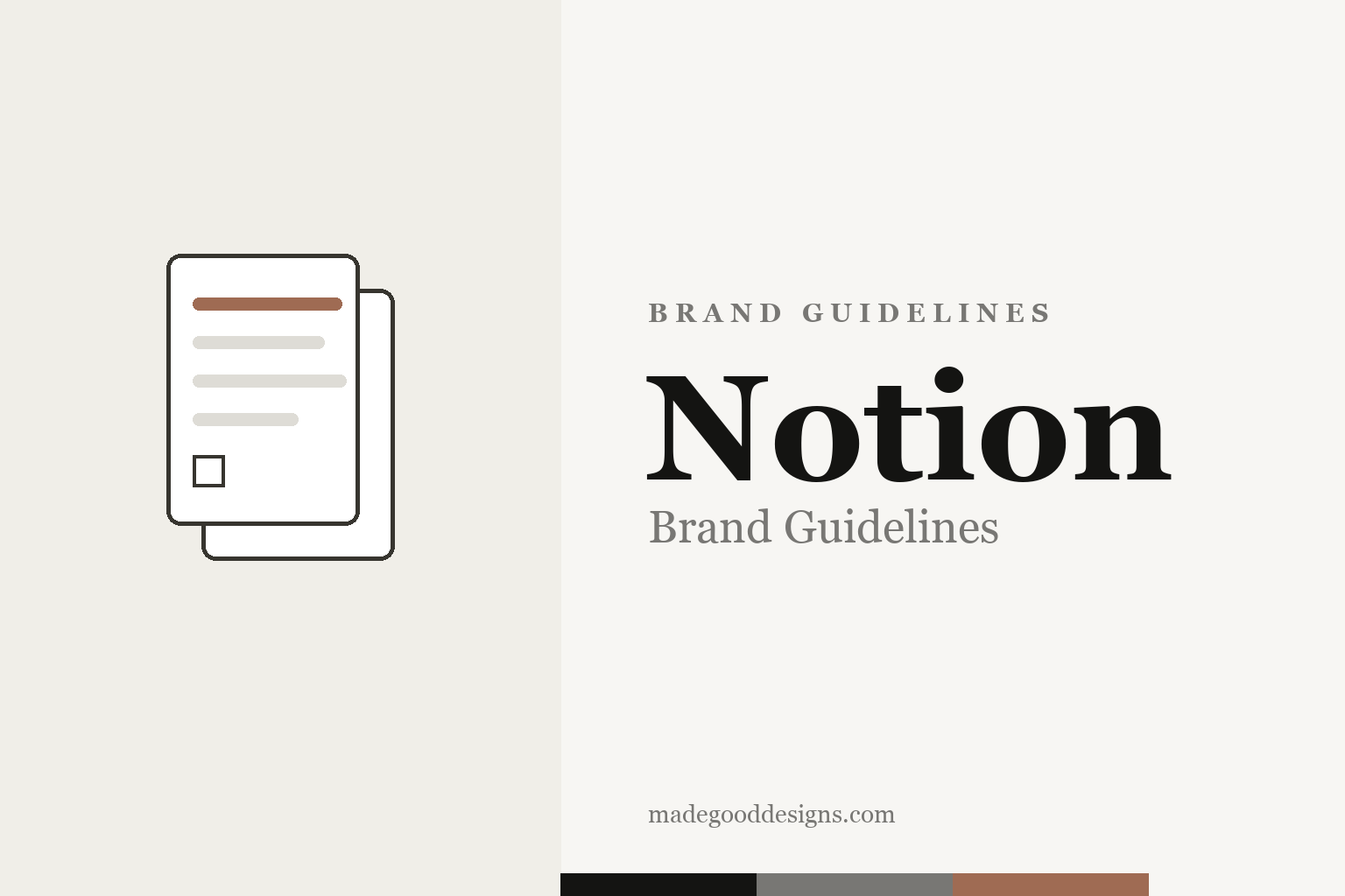
An abstract blocks-and-pages motif in warm paper tones — the feeling, not the mark. Deliberately not the ‘N’ cube, the wordmark, or the Muradov characters.
Content provides the colour
Notion’s palette is a philosophy: get out of the way.
Notion’s official brand palette is deliberately monochrome — a grayscale workspace where your content provides the colour. The published values are simply black #000000, white #FFFFFF, a neutral gray #787774, and a default brown #9F6B53 from the in-app colour picker. In practice the app reads warmer than pure black-on-white: a paper-like off-white (~#F7F6F3) and a warm near-black (~#37352F) — those two are community-measured, not published tokens, so treat them as reconstructions. Either way, restraint is the point.
The ‘N’ and the illustrations
Two very different halves make up the Notion look.
The logo is a blocky ‘N’ cube — a heavy serif N on a thick-outlined block — introduced for the 2016 1.0 launch, widely (if unofficially) attributed to co-founder Ivan Zhao. But the brand’s real signature is its hand-drawn, gestural character illustrations, originated by in-house illustrator Roman Muradov — the loose linework that made people say they joined Notion partly because they loved the drawings. (Recent campaigns with studio BUCK added bold primary colours and the ‘thinking’ AI face.) The N, the wordmark and those characters are all protected, so our homage stays abstract: blocks and pages.
Rebuilt to launch
Notion almost didn’t make it — then it relaunched.
Notion was founded in 2013 by Ivan Zhao and Simon Last; the early versions were unstable, so the tiny team rebuilt the product and shipped the pivotal 1.0 in 2016 — the moment the ‘all-in-one workspace’ (notes, docs, wikis, databases, later AI) really began. It reached a $10 billion valuation on a 2021 Series C. The restrained visual identity — warm paper, near-black type, hand-drawn warmth — has been remarkably stable through that growth.
Type: Lyon & a system stack
Three typographic layers, not one brand font.
There’s a common myth that Notion has a single signature typeface. It doesn’t: the wordmark is custom lettering; the product UI uses a system font stack (San Francisco, Segoe UI, etc.); and the editorial/marketing serif is Lyon by Commercial Type (with Nitti as the mono), confirmed by Notion back in 2016. Free stand-ins: Inter for UI, a warm serif for headings. The specimen below pairs a serif display with Inter, in that calm document spirit.
Think it. Make it.
Quiet, warm, document-like — type that feels like a well-set page rather than an app chrome. (Specimen set in Fraunces + Inter, standing in for Lyon + a system sans.)
Step back and the same principle emerges once more: a brand is strongest when every element pulls in one direction. Notion shows how a symbol, a palette, a name and a tone of voice can reinforce a single idea until the whole becomes far greater than any part. Coherence like that is never an accident; it is the result of countless small decisions to stay on-message rather than chase novelty. Get that alignment right, protect it patiently over time, and an identity stops being something a company merely owns and becomes something people recognise instinctively.
Grayscale, warmed
The official palette is almost no palette. Click a swatch to copy the hex.
The published brand colours are just black #000000, white #FFFFFF, gray #787774 and a picker brown #9F6B53. The warmer reading values everyone recognises — a paper #F7F6F3 and a warm near-black #37352F — are community-measured UI colours, not published brand tokens, so we mark them as reconstructions. Copy the working values below.
Tools for thought
Notion’s calm surface hides an unusually idealistic idea about what software is for.
Ivan Zhao has often framed Notion less as a note app than as a descendant of the 1960s–70s dream of computing as a medium for thought — the lineage of Douglas Engelbart and Alan Kay, who imagined software people could reshape themselves rather than merely operate. That belief explains the visual restraint: if the user is meant to be the author, the interface must recede toward invisibility, which is why the palette is grayscale, the type is document-like, and the chrome is kept almost apologetically quiet. Everything in Notion is a ‘block’ — text, image, database row — that can be dragged, nested and recombined, a modular logic the plain, paper-warm styling is designed to stay out of the way of.
The hand-drawn illustrations are the deliberate counterweight to all that restraint. A purely grayscale tool risks feeling cold and corporate, so the loose, gestural characters supply warmth and humanity exactly where a spreadsheet-like product could feel sterile — a reminder that the workspace is made for people. The pairing has proved durable because it is honest about the trade: rigour and neutrality where you work, personality and craft where the brand speaks to you. It also seeded a vast community of template-makers and educators who decorate their own pages, extending the identity in directions Notion never has to art-direct — the surest sign a restrained system is doing its job.
Explore & save
Keep the paper-warm, blocks-and-pages idea on hand — save it to a board.
Notion identity set
Pin the blocks-and-pages idea, the grayscale-plus-brown and the calm serif to your own board.