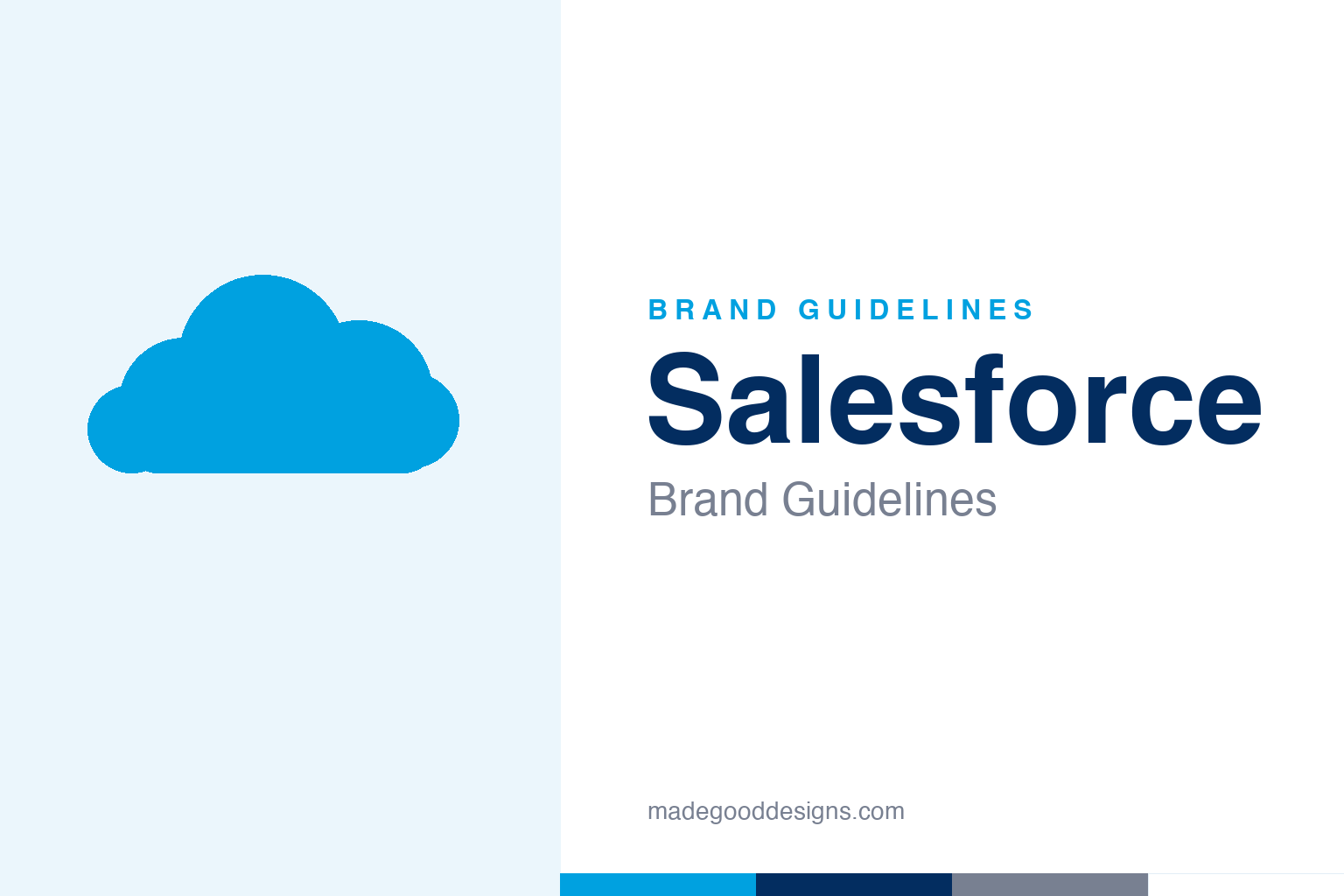
Salesforce Brand Guidelines
A blue cloud, a cast of cartoon mascots, and a company that started by declaring ‘the end of software’.
A plain cloud silhouette in the Salesforce blue family — the idea, not the mark. Deliberately not the Salesforce cloud logo (no wordmark, no six-circle build) and none of the mascots.
The cloud & the italic f
One shape, one tilted letter, one very consistent idea.
Salesforce’s mark is a rounded cloud (described by designers as built from six integrated circles) holding the lowercase ‘salesforce’ wordmark. The detail that has survived every version is the italicised ‘f’ — it separates the two words and suggests forward motion. The 1999 original was a 3D silvery cloud with a serif wordmark; the one major redesign came in 2014 (a flat light-blue cloud, sans-serif); an early-2020s refresh took the cloud fully monochrome blue with white lettering, alongside the 2022 legal-name change from Salesforce.com, Inc. to Salesforce, Inc. Because the cloud-plus-wordmark is protected, our homage is a plain cloud with no lettering.
A cast of characters
Enterprise software, humanised by a menagerie.
To make cloud software friendly, Salesforce built a whole character system around its Trailhead learning platform and Dreamforce conference. A myth worth correcting: the lead mascot Astro is a tanuki (a Japanese raccoon dog), not a bear — the bear is Codey (developers). Others include Einstein (AI), Cloudy (app builders), Hootie the owl (credentials), and Saasy, the original ‘No Software’ mascot. The roster grows and retires over time. All the characters are trademarks, so — like the cloud — we don’t reproduce them.
‘No Software’, since 1999
Salesforce was a provocation before it was a platform.
Salesforce was founded on 8 March 1999 in a San Francisco apartment by Marc Benioff (a former Oracle executive) with Parker Harris, Dave Moellenhoff and Frank Dominguez. Its early identity was the confrontational ‘No Software’ campaign — a red circle-slash over the word SOFTWARE, which became the Saasy mascot — announcing cloud/SaaS as the future. It IPO’d in 2004, launched Dreamforce in 2003, and built its culture around Ohana, the Hawaiian idea of family. The blue-cloud calm is the grown-up version of that early swagger.
Type: Salesforce Sans
A custom humanist sans for the whole system.
The brand and product run on Salesforce Sans, a custom humanist sans-serif at the heart of the Lightning Design System — licensed for Salesforce and its ecosystem, not general use. (The logo lettering is a separate story, long resembling Aller by Dalton Maag.) A common screen stand-in is Inter. The specimen below is set in a humanist sans in that clean, approachable spirit.
The end of software
Humanist, even, optimistic — a sans built to make enterprise tools feel human. (Specimen set in Archivo, standing in for Salesforce Sans.)
Cloud blue & navy
A bright cloud blue over a deep navy. Click a swatch to copy the hex.
The classic Salesforce Blue is #00A1E0 (mapped to Pantone 2925 C), paired with white and a deep navy #032D60 that appears across supporting materials. Salesforce doesn’t publish a single third-party colour spec, so treat exact hexes as approximate — #00A1E0 with white is the safe classic pairing, and the specific early-2020s ‘electric blue’ is hard to pin to one verified value. Copy the working values below.
A brand built on values
Salesforce turned a corporate culture into a durable part of the identity.
Where most enterprise brands stop at a logo and a palette, Salesforce extended its identity into a set of stated values that shape how the visual system is used. The idea of Ohana — the Hawaiian concept of extended family that Benioff encountered on sabbatical — became shorthand for the company’s ecosystem of employees, customers, partners and communities, and it explains the warmth of the whole design language. The friendly cloud, the approachable humanist type and the cast of mascots all soften what is otherwise deeply technical software, and that softening is deliberate rather than decorative.
The 1-1-1 model — pledging one percent of equity, product and employee time to philanthropy — sits alongside the trademarks as something the company treats as brand-defining, and it has been copied widely enough to become its own movement. Visually, this shows up in the recurring motifs of trails and journeys that run through Trailhead, where learning is framed as an adventure and users become ‘Trailblazers’. The result is that Salesforce’s identity reads less like a product badge and more like a membership. That coherence — a single tone stretching from the annual Dreamforce spectacle down to a tooltip in the Lightning interface — is why the brand feels unusually consistent for a company that has grown almost entirely through acquisition, absorbing Slack, Tableau, MuleSoft and more without fracturing its voice.
Explore & save
Keep the cloud idea and the blue-and-navy system on hand — save it to a board.
Salesforce identity set
Pin the cloud idea, the cloud-blue-and-navy and the humanist sans to your own board.