Sesame Street Brand Guidelines
The most famous address in children’s television is a green street sign — and its font is a road sign, not a bubble.
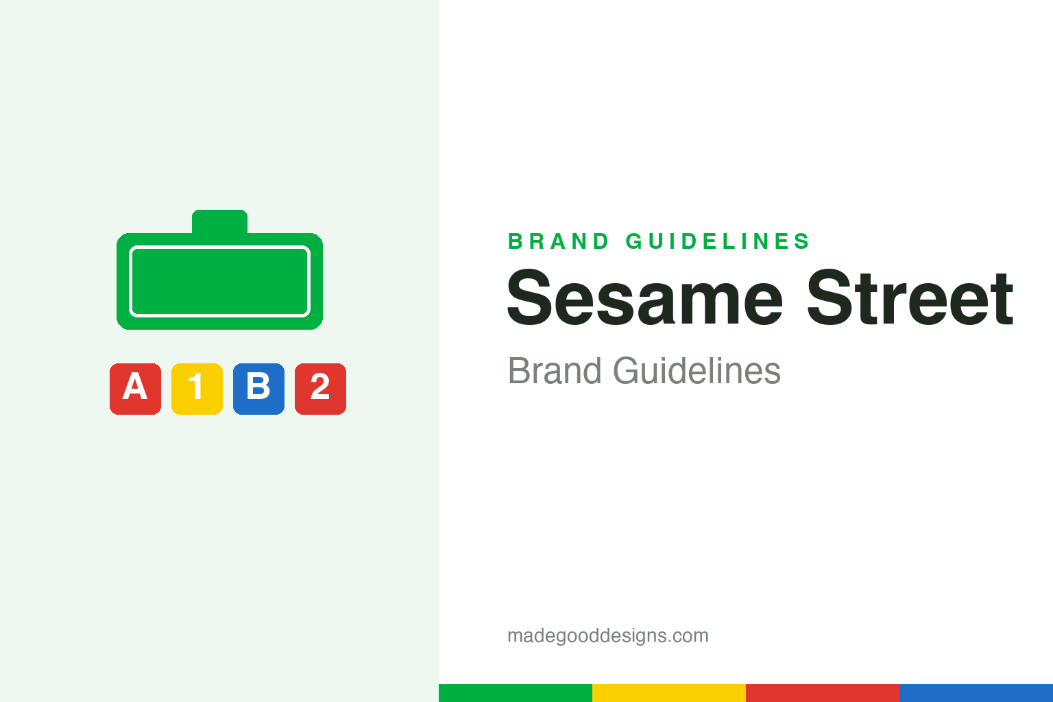
A blank green street-sign shape plus generic ABC/123 blocks — the genre, not the mark. Deliberately not the SESAME STREET wordmark and not any character.
A logo shaped like an address
The identity is a municipal street sign — on purpose.
Sesame Street’s core mark is a stylised green street/address sign — a rounded nameplate with a small tab on top — reinforcing the show’s friendly ‘urban street’ setting. The device has survived roughly 55 years largely unchanged, a rare feat of brand longevity. The top tab has evolved with the company: it read ‘CTW’ for decades, then became ‘123’ after the 2000 rename — a nod to the working title, ‘123 Avenue B.’ Because the actual sign lettering is a trademark, our homage uses a blank green sign shape.
Not a bubbly font
The single most common Sesame Street design myth.
People remember the wordmark as round and bubbly — but it isn’t. The real street-sign wordmark is a tight, upright, condensed grotesque in the lineage of road signage (widely identified as Interstate Bold Compressed, with an earlier Franklin Gothic Condensed era). The rounded ‘Sesame Street fonts’ sold online are fan-made or merchandise lettering, not the official mark. It makes sense: a show themed around a real street would set its name like real street signage — utilitarian and squared, not playful.
Television as a school
Sesame Street was an education experiment first, a show second.
Sesame Street premiered on 10 November 1969, created by Joan Ganz Cooney and Lloyd Morrisett after Cooney’s landmark study on using television for preschool education. It was produced by the non-profit Children’s Television Workshop (renamed Sesame Workshop in 2000) — research-driven, curriculum-based, and using Jim Henson’s Muppets as the teaching vehicle. It’s not owned by Disney (a common myth). The whole visual system — the sign, the bright primaries, the ABC/123 motifs — serves that educational mission.
Type: road-sign lettering
Condensed, squared, and legible — like the street it’s named for.
The wordmark’s condensed grotesque (Interstate / Franklin Gothic lineage) reads like genuine municipal signage — and these attributions come from font-ID sleuthing, not an official Sesame Workshop spec, so treat them as ‘widely identified as.’ The specimen below is set in a sturdy condensed-feeling sans in that road-sign spirit (never the actual wordmark).
Sunny days
Upright, squared, legible — letterforms with the honesty of a street nameplate. (Specimen set in Archivo; the wordmark is a condensed road-sign grotesque.)
Green & primaries
A friendly green with bright primary support. Click a swatch to copy the hex.
The base is green #00AF42 (widely cited as PMS 361 C) and yellow #FCD000, with bright primaries for the playful learning motifs. One honesty note: Sesame Workshop’s authoritative palette lives in its own brand book, which isn’t machine-readable, so these are widely-cited reconstructions (a competing green #00A870 also circulates). Copy the working values below.
Consistency as a teaching tool
On Sesame Street, the design system is part of the curriculum, not just the packaging.
Because the show was built by researchers, its visual language was engineered to teach rather than merely to brand. The bright, saturated primaries were chosen for high contrast and instant recognition on the small, low-resolution televisions of the late 1960s, so a two-year-old could pick out a red block or a yellow number across a busy screen. The recurring letter-of-the-day and number-of-the-day segments turned typography itself into content, presenting a single glyph large and unadorned so the shape could be learned before the sound. That habit — treating a letterform as a character in its own right — runs straight back to the road-sign logic of the street-sign logo.
The identity has also proven remarkably portable across cultures. Sesame Workshop’s international co-productions — from Plaza Sésamo in Latin America to Sisimpur in Bangladesh and Takalani Sesame in South Africa — each rebuild the neighbourhood around local streets and faces, yet the green sign, the clean primaries and the ABC/123 motifs remain legible as the same brand. That balance of a fixed core and a flexible surface is why the mark has endured more than half a century almost untouched: it is simple enough to redraw anywhere and specific enough that no one mistakes it. In an industry that reinvents children’s brands every few years to chase merchandise cycles, Sesame Street’s restraint is the quiet reason it still reads as trustworthy to the parents who once watched it themselves.
Explore & save
Keep the street-sign idea and the primary palette on hand — save it to a board.
Sesame Street identity set
Pin the street-sign idea, the friendly green and the primaries to your own board.