National Park Service Brand Guidelines
A brown arrowhead and a black title band — two of the most quietly perfect pieces of public design in America.
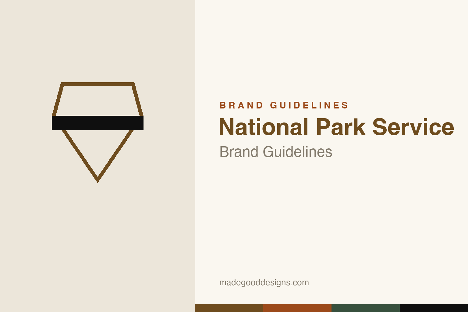
An empty arrowhead outline with a Unigrid-style black band — the shapes, never the scene. Deliberately not the NPS Arrowhead emblem, whose interior scene is protected by federal statute.
The Arrowhead
A whole conservation mission, packed into one brown shape.
The official NPS emblem is a brown arrowhead containing a scene, each element standing for part of the Service’s charge: a sequoia and grassland (all vegetation), a bison (all wildlife), mountains (scenery, geology, recreation), water (rivers and lakes), and the arrowhead shape itself (historical and cultural values). It was approved in 1951 and formally registered in 1965. Because the emblem is protected by federal statute — even a ‘colorable imitation’ is restricted — our homage keeps the arrowhead outline empty, with no scene inside.
Vignelli’s Unigrid
The brochures in your glovebox are a modernist masterpiece.
The black-banded park brochures come from the Unigrid system, designed in 1977 by Massimo Vignelli with the NPS’s Harpers Ferry Center — a single modular grid that standardised the whole brochure line, with a signature black band carrying the title in white. The first Unigrid brochure was Clara Barton NHS (1978); the system still governs roughly 20 million brochures a year. A key correction: Vignelli designed the Unigrid, not the arrowhead — different people, decades apart. The arrowhead only joined the black band in 1999.
Since 1916
The Service is older than most of the parks feel.
The National Park Service was established on 25 August 1916, when President Woodrow Wilson signed the Organic Act; Stephen Mather became its first Director. That makes 2026 the Service’s 110th anniversary — a nice moment to appreciate how well its identity has aged. From roughly 1966–1970 the arrowhead was briefly sidelined for an abstract mark employees mocked as ‘triangles and cannonballs’; it was rejected and the arrowhead restored in 1970. Good design, it turns out, is hard to improve on.
Type: Helvetica, then Frutiger
The lettering evolved, but the discipline didn’t.
The original 1977 Unigrid paired Helvetica with Times Roman. Today the NPS graphic standard specifies Frutiger for text alongside a custom serif, NPS Rawlinson (by James Montalbano / Terminal Design, c.2000), with NPS Roadway on park signs — a cut tested to be markedly more legible for older drivers. So ‘the Unigrid uses Helvetica’ is a historical truth, not the current spec. The specimen below is set in a neutral grotesque in that clean, wayfinding spirit.
For the enjoyment of all
Neutral, legible, unshowy — type built to be read at a trailhead in bright sun. (Specimen set in Archivo; NPS now specifies Frutiger + NPS Rawlinson.)
Arrowhead browns
An earthy palette specified in Pantone. Click a swatch to copy the hex.
NPS specifies its colours in Pantone, not hex — the arrowhead uses a dark rust (PMS 1615 C), a medium rust (PMS 1605 C) and a green (PMS 553 C), with a one-colour version in NPS Brown (≈ PMS 1405). Any hex is an approximate conversion, so treat the values below as reconstructions and the Pantone numbers as the real spec. The Unigrid band is functionally black. Copy the working values below.
Designed to disappear
The Park Service’s deepest design rule isn’t the arrowhead or the grid — it’s a colour chosen to step back and let the land speak.
NPS Brown exists because the Service decided, long before it had a formal identity, that its built things should defer to the scenery. The philosophy runs back to the ‘rustic’ architecture of the early parks — lodges and signs of timber and stone meant to look as if they had grown from the ground, a tradition later nicknamed ‘parkitecture’. Earthy routed-wood signs, brown ranger vehicles and brown printed matter all follow the same instinct: the human-made layer should recede so a visitor’s attention lands on the sequoia, the canyon or the bison rather than on the graphics. It is a rare institution whose brand colour is essentially an act of humility.
That restraint is what makes the sharp black Unigrid band and the crisp arrowhead read so powerfully when they do appear — a small dose of order against a vast, wild backdrop. The same thinking shaped one of the great overlooked design programmes in American history: the 1930s Works Progress Administration park posters, whose flat, silkscreened mountains and bold sans-serif type have been rediscovered and endlessly imitated. Across a century the Service has kept one idea steady from poster to trailhead to brochure — that public design in a national park succeeds by being clear, durable and quietly deferential, never louder than the place it serves.
Explore & save
Keep the arrowhead-and-band idea and the earthy palette on hand — save it to a board.
National Park Service identity set
Pin the arrowhead-outline idea, the Unigrid band and the brown palette to your own board.


