NBA Brand Guidelines
A red-white-and-blue silhouette that everyone knows is a specific player — and the league has never once said his name.
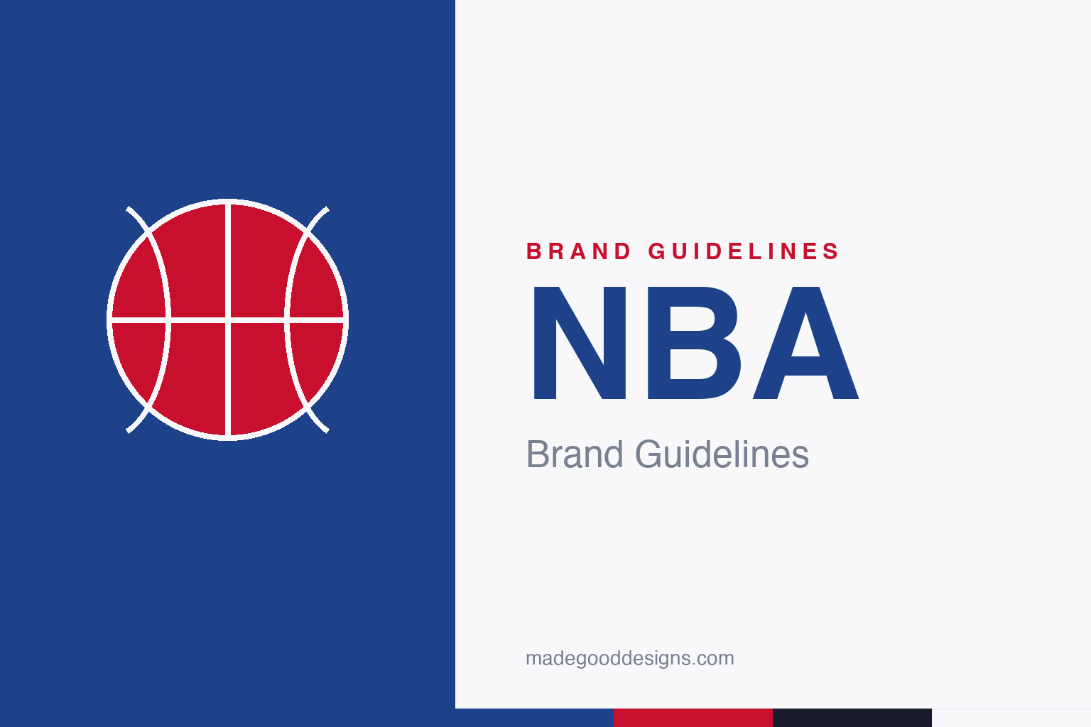
An abstract basketball with its seam lines — the game, not the man. Deliberately not the ‘Logoman’ silhouette or the red/white/blue vertical-bar lockup.
The Logoman
One silhouette, essentially unchanged for over 50 years.
The NBA’s mark is the red, white and blue silhouette of a dribbling player — the ‘Logoman’ — designed in 1969 by Alan Siegel, and essentially unchanged since around 1969–71. Siegel deliberately mirrored the vertical red/white/blue structure of Major League Baseball’s 1968 mark to give the two leagues a family resemblance. It’s a masterclass in restraint: a single figure, three colours, decades of consistency. Because the silhouette and the vertical-bar lockup are heavily protected, our homage is an abstract basketball instead.
The Jerry West question
The worst-kept secret in sports branding.
Siegel drew the silhouette from a Wen Roberts photograph of Los Angeles Lakers guard Jerry West — and Siegel has said so plainly. Yet the NBA has never officially confirmed that the figure is West, preferring to keep it an anonymous everyman (West himself was reportedly uncomfortable with the attention). So the accurate line is: widely known to be based on West, never officially named. It’s a rare case where a logo’s origin is simultaneously famous and unconfirmed — and the ambiguity is arguably part of its longevity.
From the BAA to the NBA
The league is a 1949 merger with a 1946 birthday.
The NBA traces to the Basketball Association of America (BAA), incorporated on 6 June 1946. In 1949 the BAA merged with the older National Basketball League (NBL) to form the National Basketball Association — and the league dates itself to 1946. (That framing quietly sweeps aside the NBL’s earlier, 1937 history.) The identity’s calm patriotism — that steady red, white and blue — has carried the league from a post-war merger to a global brand.
Type: bespoke condensed
Confident, athletic capitals — but not a published font.
There’s no public NBA master brand book or named brand typeface; the wordmark is bespoke condensed lettering, and individual teams run their own type systems. So we describe the feel — bold, condensed, athletic — rather than name a font as ‘the NBA typeface.’ The specimen below is set in a sturdy sans in that stadium-poster spirit (never the actual wordmark).
Where amazing happens
Bold, condensed, athletic — letterforms that read from the cheap seats. (Specimen set in Archivo; the NBA wordmark is bespoke condensed lettering.)
Red, white & blue
A Pantone-anchored patriotic pair. Click a swatch to copy the hex.
The NBA’s verified colours are red #C8102E (Pantone 711) and blue #1D428A (Pantone 287), with white. You’ll see near-identical alternates — #C9082A and #17408B — circulating, within a few RGB points; they come from logo files rather than an internal guide, so treat them as variants of the same pair. Copy the working values below.
Why the logo won’t change
The most telling fact about the Logoman may be how fiercely the league has resisted every call to redraw it.
For a mark whose origin the NBA won’t officially confirm, the silhouette has proved remarkably immovable. After the death of Kobe Bryant in 2020, a fan petition to replace the figure with his silhouette gathered millions of signatures — and the league, as it always has, declined to change the mark. Over five decades the Logoman has outlasted countless team rebrands, uniform overhauls and a wholesale shift in how sports leagues market themselves, staying essentially as Alan Siegel drew it around 1969–71. When the NBA marked its 75th anniversary in 2021–22, it wrapped the existing logo in a diamond rather than touching the figure inside.
That restraint is itself a branding decision. The steady red, white and blue and the single unchanging silhouette give the league a sense of permanence that flashier identities can’t buy — the mark reads as an institution, not a season. It’s the same logic that keeps the figure anonymous: ambiguity and consistency both work to make the logo feel like it belongs to the whole game rather than to any one era or player. In an industry addicted to the refresh, the NBA’s willingness to leave a great mark alone is a quiet reason it still feels iconic — proof that sometimes the strongest brand move is to change nothing at all.
Explore & save
Keep the basketball idea and the red-white-blue system on hand — save it to a board.
NBA identity set
Pin the basketball idea, the red-white-and-blue and the athletic type to your own board.