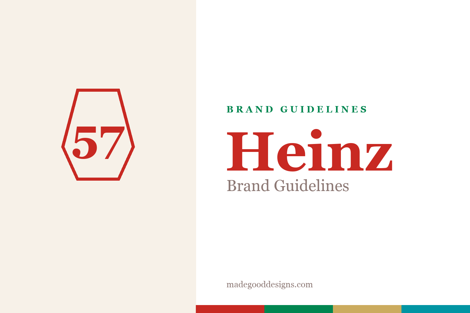
Heinz Brand Guidelines
A wedge-shaped badge, a cursive name, and a number that was never a real count — 57.
Two safe nods: a plain keystone (Pennsylvania) and an editorial 57. Deliberately not the Heinz keystone badge, the cursive script, or the trade dress.
The Keystone State badge
The shape isn’t a shield — it’s a piece of Pennsylvania.
Heinz’s logo sits inside a keystone — the wedge-shaped architectural stone — taken straight from Pennsylvania’s state symbol. Pennsylvania is the ‘Keystone State,’ and Heinz was born there, so the badge quietly flies the company’s home-state flag. Inside it sits the cursive Heinz wordmark, with the ‘57 Varieties’ line below. Because that keystone-plus-script lockup is protected trade dress, our homage keeps only the safe parts: a plain keystone outline and an editorial numeral.
The truth about ‘57’
The most famous number in condiments was pure marketing.
Henry Heinz introduced ‘57 Varieties’ in 1896 — and it was never a real product count. By then Heinz already made well over 60 products, so 57 actually undersold the range. As Heinz told it, he saw a shoe ad for ‘21 Styles’ on a New York elevated train and liked the device: ‘I counted well beyond 57, but 57 kept coming back into my mind.’ He simply liked the ring of the digits (5 and 7 being lucky-feeling numbers). The company later published lists ‘of 57’ to play along — so treat any ‘original 57’ roster as folklore, not history.
From horseradish to ketchup
Heinz’s first product wasn’t ketchup at all.
Henry John Heinz started the business in 1869 in Sharpsburg, Pennsylvania (greater Pittsburgh) — and his first product was horseradish, from his mother’s recipe, sold in clear glass so buyers could see its purity. Ketchup came later (commonly dated 1876). The H. J. Heinz Company incorporated in 1900; in 2015 it merged with Kraft to form The Kraft Heinz Company. If you only remember one correction: 1869 was horseradish, not ketchup.
Type: the cursive wordmark
A hand-drawn script that’s older than most logos.
The Heinz wordmark is a custom cursive logotype — proprietary hand-lettering, not a font you can license or safely imitate with a generic connected script. It carries a warmth that suits a heritage food brand. For editorial titling we set the name in a serif instead (never the script). The specimen below is set in a warm serif in that friendly, old-label spirit.
Grown, not counted
Warm, rounded, a little nostalgic — the feeling of a label that’s been on the table for over a century. (Specimen set in Fraunces; the real wordmark is a bespoke cursive script.)
Red, green & turquoise
A fire-engine red with heritage label accents. Click a swatch to copy the hex.
The signature is a fire-engine red #C82922 (PMS 7626 C), joined on labels by a Spanish green #008650 and a gold #CBAB5E, plus the classic turquoise #0095A3 band. Heinz doesn’t publish a public brand book, so treat these as reliable-but-unofficial aggregator values — the turquoise especially is the least-sourced, so confirm against a current label if it’s load-bearing. Copy the working values below.
The bottle is the brand
Heinz’s strongest piece of design isn’t on paper at all — it’s the glass bottle.
The octagonal glass ketchup bottle, introduced around 1890, is one of the most recognised pieces of packaging in the world — so distinctive that its silhouette is protected trade dress in its own right. Its most famous detail is a piece of accidental genius: the embossed ‘57’ on the neck. Heinz has long told customers that the sweet spot for coaxing out slow, thick ketchup is to tap firmly on that 57, turning a stubborn product into a ritual and a marketing hook at once. The clear glass itself echoes Henry Heinz’s founding instinct from the horseradish days — packaging that lets you see the quality — so the container has always carried the brand’s promise as much as the label does.
That confidence in the packaging runs right through Heinz’s advertising. Campaigns have leaned on the idea that the product is so iconic it needs no logo: ask people to draw ketchup and they sketch the Heinz keystone bottle, and the long-running ‘It has to be Heinz’ line rests on exactly that assumption of default loyalty. Even the famously slow pour was spun into a virtue — the best things come to those who wait — making a flaw into a signature. This is why the identity has endured for over a century with barely a structural change: when the fire-engine red, the keystone, the cursive script and the bottle’s shape are each strong enough to stand alone, the brand can lose any one element and still be unmistakably itself on a crowded shelf.
Explore & save
Keep the keystone idea and the red-and-turquoise system on hand — save it to a board.
Heinz identity set
Pin the keystone idea, the fire-engine red and the heritage label accents to your own board.