Levi’s Brand Guidelines
Four separate trademarks on one pair of jeans — and the whole thing starts with a copper rivet.
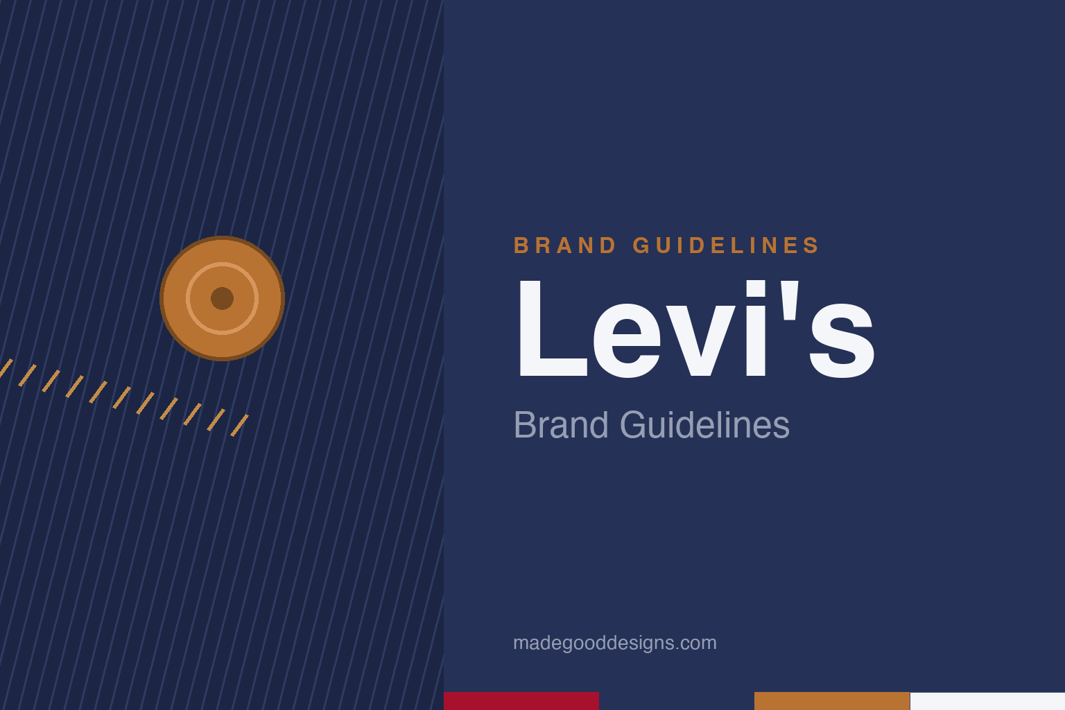
A copper rivet and a single line of stitching — the fabric, not the marks. Deliberately not the Batwing, Red Tab, Two Horse patch or the paired arcuate.
The rivet that made jeans
Blue jeans have a birthday: 20 May 1873.
The real invention wasn’t denim — it was copper rivets at the stress points. A Reno tailor, Jacob Davis, devised them to stop work trousers ripping, but couldn’t afford the patent, so he partnered with his fabric supplier: Levi Strauss, a Bavarian immigrant running a San Francisco dry-goods business. Their US Patent 139,121 was granted on 20 May 1873 — the birth of the blue jean, then called ‘waist overalls.’ The flagship 501 descends directly from it. (A common error: crediting Strauss alone — Davis invented the rivet; Strauss financed and co-held the patent.)
Four marks, four dates
Levi’s identity is a stack of separate trademarks, not one logo.
The single most-missed fact: Levi’s has four distinct marks with four different dates. The arcuate — the double-arc stitch on the back pocket — dates to 1873 (its meaning lost in the 1906 San Francisco fire). The Two Horse leather patch (1886) shows two horses failing to pull a pair of jeans apart, proof of strength for illiterate buyers. The Red Tab sewn into the pocket seam arrived in 1936, so the brand could be spotted from a distance. And the red Batwing housemark came latest of all — 1967, by Walter Landor, its scalloped outline taken from the 501 pocket. It’s a 1967 logo sitting on a 19th-century product.
Why Levi’s guards it all
Few brands litigate their trademarks as hard.
Levi Strauss & Co. defends the Tab and arcuate especially fiercely, with actions against the likes of Yves Saint Laurent and Kenzo — and even ‘inspired-by’ versions have lost in court. That’s exactly why our homage avoids all four marks and keeps only ideas nobody owns: a single copper rivet, a denim-twill texture, and one shallow stitch line (never the paired arcuate, never on a pocket). The heritage comes through in the materials — indigo, copper, a red hairline — not in any protected device.
Type: the Batwing wordmark
Hand-lettered, and pointedly not all-caps anymore.
The wordmark inside the Batwing is a custom, hand-lettered logotype, not a licensable font. Landor’s 1967 refresh pushed the brand away from the old all-caps LEVI’S toward the softer name-styled form, and the apostrophe-S is integral to the mark. For editorial titling we set the name in a plain sans instead. The specimen below is set in a sturdy sans in that workwear spirit.
Quality never goes out
Honest, sturdy, unfussy — letterforms with the feel of stamped metal and stitched canvas. (Specimen set in Archivo; the real wordmark is bespoke hand-lettering.)
Red, indigo & copper
A workwear palette anchored by one authoritative red. Click a swatch to copy the hex.
The one authoritative spec for Levi’s red is Pantone 187 C; any hex is an approximation, usually cited around #A8112E to #C41230. (Note: values like #E60023 that float around are wrong — that’s closer to Pinterest’s red.) Pair the red with denim indigo and rivet copper and you have the whole heritage-workwear story in three colours. Copy the working values below.
The jeans are the billboard
Levi’s rarest trick is that its identity rides on the product itself, worn out into the world every day.
Most brands pay to put their logo in front of people; Levi’s stitched its into a garment that customers then wear for years. The Red Tab, the arcuate on the back pocket and the Two Horse patch turn every pair of 501s into a small, mobile advertisement — visible on the street, in a film, on a factory floor. That is why the marks sit exactly where they do: high on the pocket and along the seam, where they read at a glance from behind. The identity was engineered for recognition at a distance long before anyone spoke of ‘brand touchpoints,’ and it still works because denim is worn in public more than almost any other product a person owns.
The other half of the story is cultural adoption Levi’s never fully controlled. Workwear became the uniform of 1950s rebellion, then of rock and roll, protest and denim-on-denim style, until a pair of blue jeans stood for a whole idea of American freedom. Levi’s leaned into that meaning without over-designing it: the “Quality never goes out of style” spirit keeps the product honest and unfussy, letting the wearer supply the attitude. It is a rare identity in which the company, the garment and the customer all carry the brand together — and one where fading, fraying and age only make the marks look more authentic, never less. The billboard, in other words, improves the more it is used.
Explore & save
Keep the rivet-and-indigo idea and the workwear palette on hand — save it to a board.
Levi’s identity set
Pin the rivet idea, the indigo-and-copper and the sturdy type to your own board.