Tesla Brand Guidelines
The most famous letter in electric cars isn’t a letter at all — it’s a slice of an electric motor.
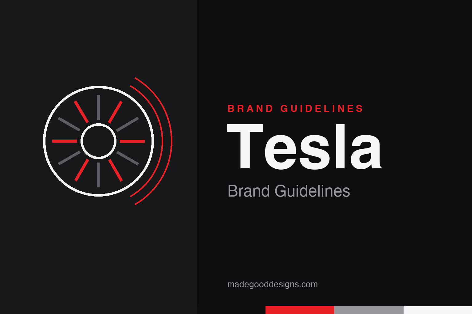
The concept behind the ‘T’ is rotor and stator — so our homage draws the motor, not the letter. An abstract motor cross-section, deliberately not the Tesla ‘T’ or wordmark.
A logo you can drive
Elon Musk has explained the ‘T’ literally, and it’s mechanical.
Musk has said the Tesla ‘T’ represents a cross-section of an electric motor: the main vertical stroke is one of the rotor’s protruding poles, and the line across the top is a section of the stator that generates the magnetic field. Attributed to RO Studio (which also worked on the SpaceX mark), it began inside a shield and was simplified to the clean standalone ‘T’. Because the emblem is protected, our homage draws the motor geometry it’s based on — a ring of radial poles — without forming the letter.
The notched wordmark
The typography’s signature is a set of deliberate gaps.
The TESLA wordmark is custom, all-caps lettering — tall, wide, geometric and generously tracked. Its most recognisable tell is that several glyphs are intentionally broken or notched: the inner strokes of the ‘E’ and ‘A’ are left open, giving a segmented, ‘engineered’ feel like a circuit diagram. A subtle 2017 refresh tweaked the lettering. One myth to avoid: it is bespoke, not the retail font ‘Gotham’ — you’ll see that claim everywhere, but treat any single-font attribution as unconfirmed.
Who actually founded Tesla
The founding story is more crowded than the popular version.
Tesla Motors was founded in July 2003 by Martin Eberhard and Marc Tarpenning. Elon Musk joined in early 2004, leading the Series A and becoming chairman — he was not an original founder, though a 2009 settlement lets five people (Eberhard, Tarpenning, Musk, JB Straubel and Ian Wright) call themselves co-founders. The company is named for inventor Nikola Tesla, whose AC induction motor it echoes, and its first car, the Roadster, shipped in 2008. It’s a useful correction: ‘Musk founded Tesla’ is the common myth.
Type: engineered capitals
Wide, tracked, and quietly broken by design.
Tesla publishes no public brand-guide font list; its marketing and UI have historically leaned on Gotham and later custom sans-serifs, while the wordmark itself is bespoke. The look to emulate is confident geometric capitals with open letter-spacing — clean, technical, a little futuristic. The specimen below is set in a geometric sans in that spirit (not the real wordmark, which is trademark-protected).
Accelerate the future
Wide, geometric, precise — capitals that read like they were milled, not typed. (Specimen set in Archivo; the real wordmark is bespoke lettering.)
Red on black
One decisive red over black and white. Click a swatch to copy the hex.
Tesla doesn’t publish locked hex values, so codes vary. The red most databases sample from the mark is #E82127; documented variants include #E31937 and a rounded #CC0000. Pair it with black (or a near-black #181B21) and white; greys are used in UI but aren’t a fixed brand token. Lead with #E82127 as the commonly-sampled red rather than an official value. Copy the working values below.
The product is the advertising
Tesla is one of the only global carmakers to have grown without a traditional advertising budget — the design does the persuading.
For most of its history Tesla ran essentially no paid advertising, a near-unheard-of stance in an industry that spends billions on it. Instead the company treated the product and its founder’s megaphone as the campaign: the cars themselves, sold direct to buyers through Tesla’s own stores and website rather than franchised dealers, are the primary brand medium. That confidence is the same one the ‘T’ and the engineered wordmark project — a company that would rather show the machine than dress it up.
The minimalism runs all the way into the metal. Tesla’s design language strips away the ornament other carmakers pile on: flush door handles, a near-buttonless cabin, and a single large central touchscreen standing in for the usual wall of dials and switches. It is the physical expression of the logo’s restraint — clean, technical, a little futuristic — and the polarising, unpainted stainless Cybertruck pushed the same subtract-the-decoration instinct to an extreme. It means the red-on-black identity feels of a piece whether you meet it on a screen, a Supercharger or the flank of a car. Whether or not you like the result, it is unusually coherent: one austere idea, carried from the emblem to the object you actually drive.
Explore & save
Keep the motor-cross-section idea and the red-on-black system on hand — save it to a board.
Tesla identity set
Pin the electric-motor idea, the engineered red and the geometric caps to your own board.