GitHub Brand Guidelines
A cat-octopus mascot, a famously open design system, and the near-black interface where most of the world’s code now lives.
Aa
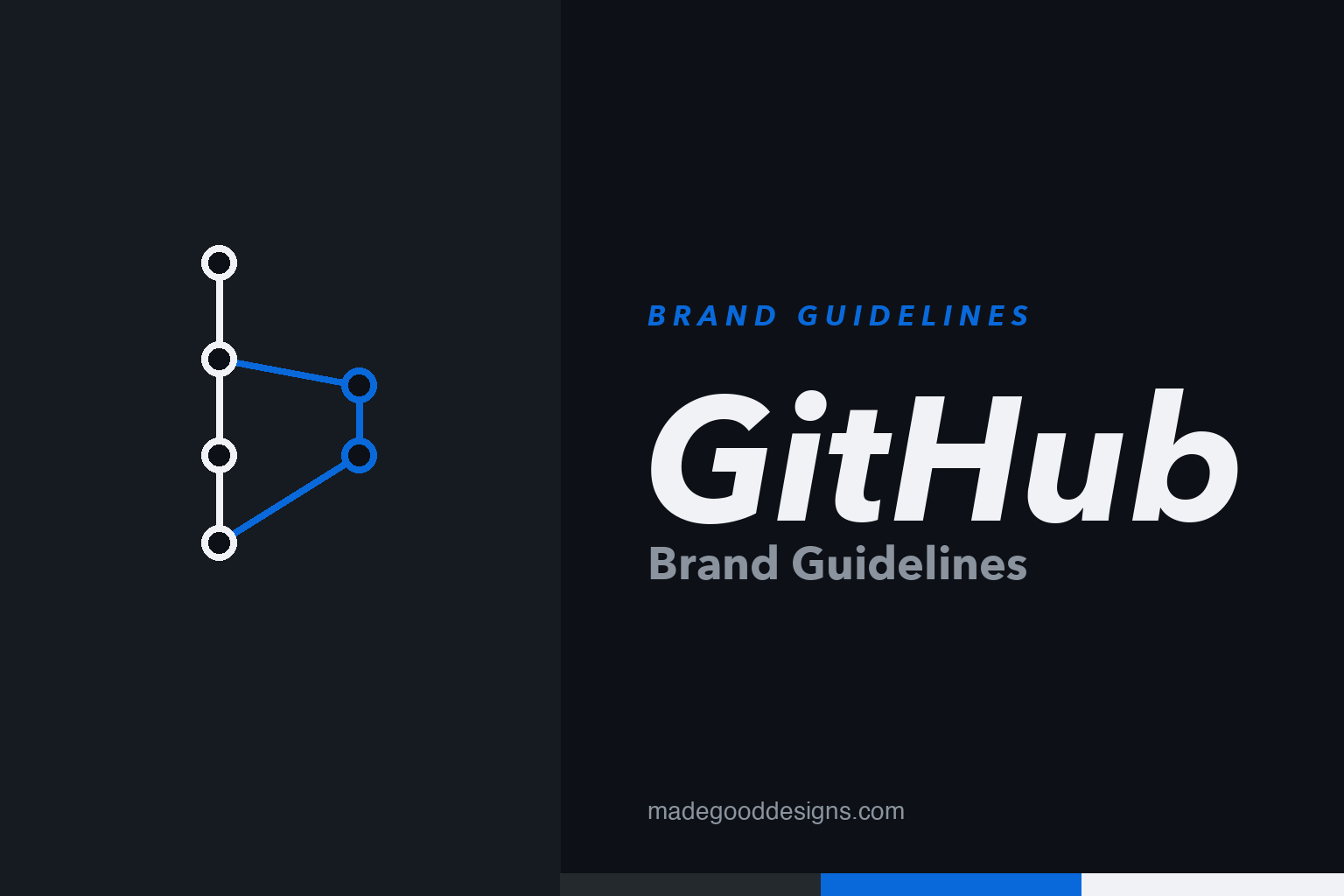
Two constants: the branch & merge of version control and a clean grotesque. Homage renderings — a git graph, deliberately not the Octocat mascot.
The Octocat
GitHub’s mascot is a cat-octopus — and its origin story is a lesson in happy accidents.
The Octocat — a cat with octopus tentacles, nicknamed “Mona” — started life as an unrelated piece of iStock clip art by British designer Simon Oxley (who also drew the original Twitter bird). Oxley had called it “Octopuss”; GitHub licensed the image, renamed it the Octocat, trademarked it, and had illustrator Cameron McEfee refine it into the friendly mascot (and hundreds of costumed variations, the “Octodex”). It’s the perfect emblem for a collaborative platform: playful, a little weird, endlessly remixable. (It’s also firmly protected IP, which is why our homage above is a plain git graph, not the cat.)
Where the world builds software
GitHub turned a developer tool into a household name — and a $7.5 billion acquisition.
Founded in 2008 (by Chris Wanstrath, Tom Preston-Werner, P.J. Hyett and Scott Chacon), GitHub built the social layer on top of Git version control and became, in its own words, “where the world builds software.” Microsoft acquired it in 2018 for about $7.5 billion. The brand’s tone is developer-first, collaborative and quietly confident — it speaks to engineers as peers, not customers. Fittingly, the entire visual identity is engineered like software: systematised, documented, and open (see the Primer system, below).
Colour & Primer
GitHub open-sourced its whole design system — so, unusually, the colours are documented. Click a swatch to copy the hex.
GitHub’s signature is a near-black frame — #24292E for the classic header, #0D1117 for the dark-mode canvas — with a functional blue #0969DA for links and actions. These come from Primer, GitHub’s open-source design system, which is a genuine brand asset in itself: releasing your design tokens, components and guidelines publicly is a very on-brand, developer-friendly move. (Primer ships several themes, so exact tokens shift by version.) The dark, code-editor palette signals one thing clearly: this is a place for building. Copy the working values below.
Type: Mona Sans & Hubot Sans
GitHub even gave away its typefaces — which is exactly what you’d expect from GitHub.
In 2022, GitHub launched two bespoke variable typefaces made with Degarism: Mona Sans, a versatile industrial grotesque (this page is set in it), and Hubot Sans, a more geometric “robotic sidekick” for display. Both are open-source under the SIL Open Font License — free for anyone to use. It’s the same ethos as Primer and the platform itself: build something good, then share it. For a company whose whole business is open collaboration, giving away the brand font isn’t a giveaway — it’s the message. The specimen below is set in the real Mona Sans.
git commit -m “ship”
A sturdy, flexible grotesque — engineered to read in a heading or a code comment. (Specimen set in the real Mona Sans, OFL.)
Built for the people who use it
GitHub barely advertises; its brand is the product, and the product is aimed squarely at the people who build software.
Most consumer brands are made in campaigns. GitHub’s is made in the interface — and its most recognisable visual isn’t even the Octocat but the green contribution graph, the grid of squares that turns a year of a developer’s commits into a quiet status symbol. That choice tells you the whole philosophy: the identity lives where developers actually work, and it rewards the craft of shipping code rather than shouting about it. The dark, near-black frame and the monospaced type are cues borrowed straight from the terminal and the code editor, so the platform feels like an extension of the tools engineers already trust. It speaks to its audience as peers, never as a market to be sold to.
The same instinct explains why GitHub gives so much of its brand away. Open-sourcing the Primer design system, releasing Mona Sans and Hubot Sans under a free licence, and letting the community remix the Octocat into hundreds of Octodex characters are all versions of one move: treating the brand as a collaborative, forkable thing rather than a locked vault. It mirrors how software itself is built on the platform — in the open, by many hands, improved through contributions. That is why the identity has stayed credible through a $7.5 billion Microsoft acquisition and years of growth: a brand that behaves like the culture it serves earns a kind of trust no advertising budget can buy, and developers are quick to punish anything that feels otherwise.
Explore & save
Keep GitHub’s system on hand — save it to a board in the Made Good inspiration library.
GitHub identity set
Pin the branch-and-merge idea, the dark palette and the open type to your own board.