Audi Brand Guidelines
Four companies, one badge — and a name that quietly commands you to listen.
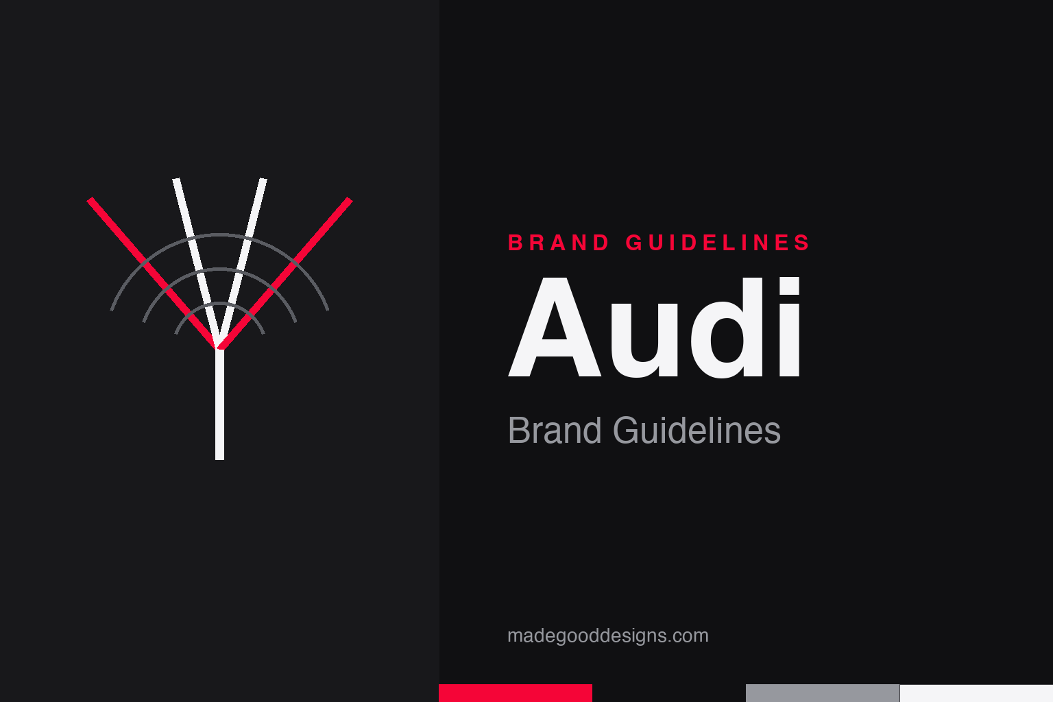
The idea isn’t four rings — it’s four becoming one, over a listening wave. An abstract convergence homage, deliberately not the four interlocking rings.
Four companies, one mark
The rings are a merger diagram, not a decoration.
On 29 June 1932, four German automakers — Audi, DKW, Horch and Wanderer — merged into Auto Union AG, and each ring stands for one of them. The 1932 badge nested each firm’s emblem inside its ring; by 1949 the emblems were removed, leaving the clean four rings we know. Because the interlocking rings are among the most fiercely protected marks in the industry, our homage expresses the idea — four strokes converging into a single line — rather than the form.
Not the Olympics
The most common Audi myth, cleared up — with a real courtroom twist.
Audi’s four rings are not derived from the five Olympic rings; the Olympic symbol (five rings, five continents) dates to 1913, Audi’s to the 1932 merger — the resemblance is coincidental. There is a kernel of truth behind the mix-up: the IOC sued Audi in 1995 over the similarity and lost, so Audi kept its mark. (In a neat irony, Audi later became an official IOC automobile supplier.) So ‘the Olympics and Audi fought over rings’ is true — ‘Audi copied the Olympics’ is not. In 2022 the rings went fully flat 2D, stripped of chrome for one identical look across every screen and surface.
A name that means ‘listen’
Audi exists because its founder lost the rights to his own surname.
Engineer August Horch founded Horch & Cie. in 1899, then left after a boardroom dispute in 1909 to start a rival firm — only for a court to rule that ‘Horch’ was a trademark he no longer owned. His solution was a pun: ‘horch’ is German for ‘listen!’, so he translated it into Latin — ‘Audi’, also ‘listen/hear’. The company was founded in 1909 and took the Audi name in 1910. It’s the most ownable part of the whole story, which is why our homage sits over a quiet radiating ‘listen’ wave.
Type: Audi Type
A custom sans built for a 100-year-old marque going digital.
Audi’s corporate typeface is Audi Type, a sans designed by Bold Monday (Paul van der Laan & Pieter van Rosmalen) and introduced around 2009, the brand’s centenary — a large family with extended Latin, Cyrillic and Greek, used everywhere from brochures to in-car navigation. It superseded the earlier Audi Sans. The specimen below is set in a geometric sans in the same clean, progressive spirit.
Vorsprung, quietly
Precise, upright, unshowy — a technical sans that lets the engineering speak. (Specimen set in Archivo, standing in for Audi Type.)
Red on black
A single vivid red against deep neutrals. Click a swatch to copy the hex.
Audi’s identity red is Progressive Red #F50537 — a vivid, slightly cool red used as a decisive accent over black and white. (Don’t confuse it with car paint codes like ‘Tango/Tornado Red’; those are body colours, not the brand red.) The 2022 flat rings render as white with a thin black outline, so the system reads cleanly in either polarity. Copy the working values below.
Why the rings still work
Audi’s badge has survived nearly a century because it encodes a story of unity that never needed updating — only simplifying.
Most logos are decoration; the four rings are a diagram of a merger, and that literal meaning is exactly why they have endured. Four independent automakers — Audi, DKW, Horch and Wanderer — became one in 1932, and the interlocking rings said so at a glance, a visual argument for strength through union that still reads cleanly today. Because the meaning is structural rather than fashionable, Audi has never had to reinvent the mark; it has only refined it, stripping the individual firms’ emblems from the rings by 1949 and, in 2022, flattening the chrome to a single 2D form that renders identically on a grille, a phone screen or an app icon. That is the discipline of a brand confident in its own foundation: change the finish, never the idea.
The rest of the system extends the same restraint. Progressive Red #F50537 is used as a single decisive accent against black and white rather than splashed everywhere, so it always reads as deliberate; the technical, upright Audi Type lets the engineering speak instead of shouting over it; and even the name works overtime — “Audi”, the Latin for “listen,” born when August Horch lost the rights to his own surname and translated it. Together these choices deliver a quiet, premium confidence that matches Audi’s long-running “Vorsprung durch Technik” promise of advancement through technology. The lesson for any brand is durable: an identity anchored in a true story ages far better than one anchored in a trend, because the story never goes out of style — it only asks to be told more simply.
Explore & save
Keep Audi’s four-into-one idea and its red-on-black system on hand — save it to a board.
Audi identity set
Pin the convergence idea, Progressive Red and the technical sans to your own board.