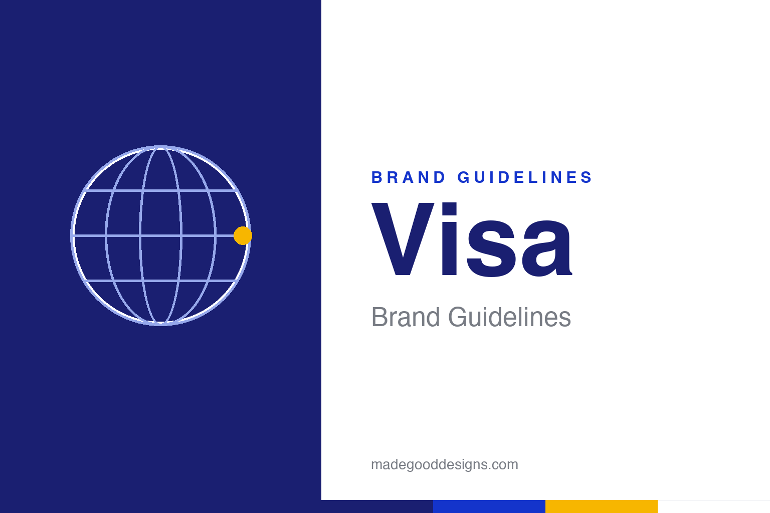
Visa Brand Guidelines
A deep, calm blue and one word that means the same thing in every language: everywhere.
The through-line isn’t a shape — it’s an idea: a card accepted anywhere on earth. Abstract globe homage — deliberately not the Visa wordmark or the blue-and-gold band.
One word, every language
Visa began as BankAmericard — and became “Visa” precisely because the old name didn’t travel.
Bank of America launched BankAmericard on 18 September 1958 in Fresno, California — the famous “Fresno Drop,” when 65,000 unsolicited cards landed in mailboxes at once. By the 1970s a banker named Dee Hock had wrestled the scheme away from a single bank into a cooperative owned by many, and in 1976 he renamed it Visa. The reasoning was pure branding: the word was short, carried no national baggage, and was “instantly recognizable in many languages in many countries” — it already meant passage and acceptance almost everywhere. The whole identity is built on that single promise: a card that works wherever you are.
From band to wordmark
For decades the mark was three stripes; today it’s a single confident wordmark.
The classic acceptance mark was a blue-white-gold horizontal band — brand lore holds the blue was the California sky and the gold its hills. Around 2005–06 Visa modernised to a standalone blue “Visa” logotype, keeping one flake of gold: a small notch carved into the top of the “V”. Then came the big one — the 2021 “Meet Visa” refresh, led by agency Mucho with Wieden+Kennedy. It redrew the wordmark in solid blue (the gold notch retired), introduced a simplified two-bar “V” symbol, and commissioned a full custom typeface. A note for accuracy: despite what some logo blogs say, there was no major 2014 rebrand — the real modern milestones are 2005–06 and 2021.
Visa Blue & gold
A trustworthy navy anchors everything, with a heritage gold in support. Click a swatch to copy the hex.
The signature is Visa Blue #1A1F71 — a deep, almost indigo navy that reads as secure and serious. The 2021 system leans on a brighter, more digital blue #1434CB for interfaces, so both circulate under the “Visa blue” name; treat #1A1F71 as the classic corporate navy and #1434CB as the modern screen blue. The historic accent is a warm gold #F7B600, now used sparingly. It’s a restrained, high-trust palette — exactly what you want on a payment card. Copy the working values below.
Type: bespoke, then Dialect
The wordmark is drawn, not typed — and the 2021 refresh gave the brand a voice of its own.
The “Visa” logotype is custom lettering — an italic, all-caps form that isn’t set in any commercial font. For everything around the logo, the 2021 refresh introduced Visa Dialect, a modern humanist sans by Commercial Type (Paul Barnes with designer Thomas Bouillet). It comes in three cuts — a headline family, a UI family tuned for screens, and a high-contrast display face — and its subtle italic slant echoes the wordmark. Before Dialect, Visa relied on open-source workhorses like Open Sans. The specimen below is set in a humanist sans in the same spirit.
Accepted everywhere
Humanist, legible, quietly confident — a voice built to work at card size and billboard size alike. (Specimen set in Figtree, a humanist sans standing in for Visa Dialect.)
One system, billions of touchpoints
Visa’s hardest design problem isn’t the logo — it’s making one identity hold together across the planet.
A payment network lives or dies on recognition at a glance. The Visa acceptance mark has to read the same whether it’s embossed on a card, back-lit on a terminal, printed on a shop door or animated inside an app — at wildly different sizes, materials and lighting. That relentless demand for consistency is why the 2021 “Meet Visa” system introduced the simplified two-bar “V” as a compact, flexible symbol: a piece of the identity that works where the full wordmark can’t fit. The whole point is a mark so stable that a traveller in an unfamiliar country can spot it and know, instantly, that their card will be accepted.
The refresh also gave Visa something it had never really had — motion. The 2021 brand introduced animated behaviours in which the “V” and its diagonals expand and contract, turning a static logo into a living system for screens, an acknowledgement that most payments now happen on glass rather than plastic. Underneath sits a deliberately conservative palette and a disciplined type system, because trust is the actual product; a bank and a shopper both need to feel that nothing here is improvised. Visa’s identity endures not through reinvention but through restraint at enormous scale — a rare brand whose greatest achievement is looking almost exactly the same everywhere, on every card and screen, every single time.
Explore & save
Keep Visa’s blue-and-gold system on hand — save it to a board in the Made Good inspiration library.
Visa identity set
Pin the universal-acceptance idea, the deep navy and the heritage gold to your own board.