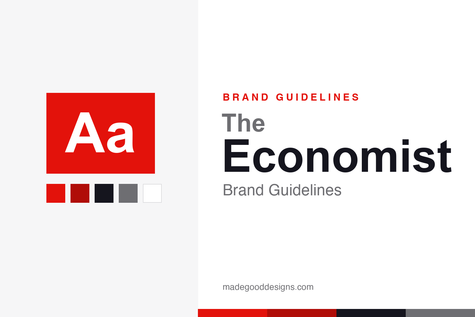
The Economist Brand Guidelines
One fire-engine-red rectangle, an anonymous house voice, and a weekly magazine that insists on calling itself a newspaper.
Aa
Aa
One idea does all the work: type reversed white out of red. Homage renderings — deliberately not the “Economist” wordmark or the red-box lockup.
The red box
A brand so confident it fits into a single rectangle — and has for over sixty years.
The Economist was founded in 1843 by James Wilson to campaign for free trade, and it still, pointedly, calls itself a newspaper despite arriving weekly in magazine format. Its visual identity is almost aggressively simple: the word “Economist” reversed white out of a red rectangle, a lockup that first appeared on a cover around 1959 and has barely moved since. That red box is one of the most disciplined pieces of brand equity in publishing — instantly spotted on a newsstand, endlessly reusable, and confident enough that it never needs to explain itself.
A voice with no name
Nearly every article is unsigned — and that anonymity is a deliberate design choice, not an oversight.
The Economist publishes most of its journalism without bylines, presenting a single, collective “house voice” rather than a masthead of star writers. The tone is famously consistent: witty, rigorous, data-driven and globalist, with a classical-liberal streak inherited from Wilson. That editorial personality is matched by the covers, which are the brand’s other signature — clever, punning single images that do a week’s argument in one visual gag. Anonymity and wit together create something rare: a magazine whose writing is as recognisable as its logo.
Colour: Economist Red
A single fire-engine red, paired with carbon and white. Click a swatch to copy the hex.
The signature red is documented in The Economist’s own digital design system as #E3120B — “Economist Red.” One honest caveat: there’s no reliably published Pantone for it (the widely-repeated “Pantone 485” is a different, oranger red, and appears to be a misreport), so treat any Pantone as approximate. The red is paired with a near-black carbon and white; the 2018 print redesign added full colour to every editorial page, but the brand still belongs, unmistakably, to that one red.
Type: Milo Serif & EconSans
The 2018 redesign gave the anonymous voice a matched pair of typefaces.
In its 2018 overhaul — its first major redesign in about 17 years — The Economist adopted Milo Serif (designed by Mike Abbink) for reading text and Econ Sans for display and headlines. Econ Sans is a nice, honest detail: rather than commission a font from scratch, the paper used a customised version of Hofrichter’s “Halifax,” with the type direction handled by Edenspiekermann. Before 2018 the brand leaned on ITC Officina and an in-house serif. The specimen below is set in a comparable serif in Milo’s spirit.
The world this week
A calm, legible serif built for dense argument — the visual equivalent of the house voice. (Specimen set in Source Serif, a serif in Milo’s tradition.)
The poster campaign that spoke in red
For decades the red box did its sharpest work not on the newsstand but on billboards — in one of advertising’s most admired campaigns.
From 1988, The Economist ran a long-running poster campaign, created by the London agency Abbott Mead Vickers BBDO, that became a case study in brand discipline. Every execution used the same rigid formula: the Economist red as a full background, the logo in the corner, and a single line of white-out-of-red wit — no images, no product shots. Lines such as “I never read The Economist — Management trainee, aged 42” flattered the reader’s intelligence and sold the magazine as a badge of ambition rather than a bundle of articles.
What makes it a design lesson is the restraint. Because the palette and the layout were locked, the red rectangle itself became the recognisable unit — a passer-by knew whose poster it was before reading a word, exactly as they would spot the masthead on a shelf. It proved that the brand’s equity lived in the system, not in any one logo: give people the red, the reversed type and a clever thought, and the identity assembles itself. The campaign ran, evolving, for the better part of thirty years, and it remains a fixture in advertising textbooks for achieving so much with so deliberately little.
Explore & save
Keep The Economist’s system on hand — save it to a board in the Made Good inspiration library.
The Economist identity set
Pin the red box, the palette and the type to your own board.